My definition of abstract: A photo or art piece which is abnormal or strange, and you can't tell what it is and what is happening in the picture.
The dictionary definition of abstract: Relating to or denoting art that does not attempt to represent external reality, but rather seeks to achieve its effect using shapes, colours, and textures.
The formal elements:
Line
The lines in the photo are wavy or straight.
Texture
How the edges of the photo look, and would feel if you could touch it.
Light
The places in the photo that are bright or dark.
Space
Areas in the photo which are either empty or full of patterns.
Shape
Visible shapes in the photo. They can make up a bigger shape if they are put together.
Repetition
Any repeating shapes or textures in the photo.
Focus
How the photo is focused, whether parts are clear or blurry.
Value/Tone
Ranges of tones from light to dark.
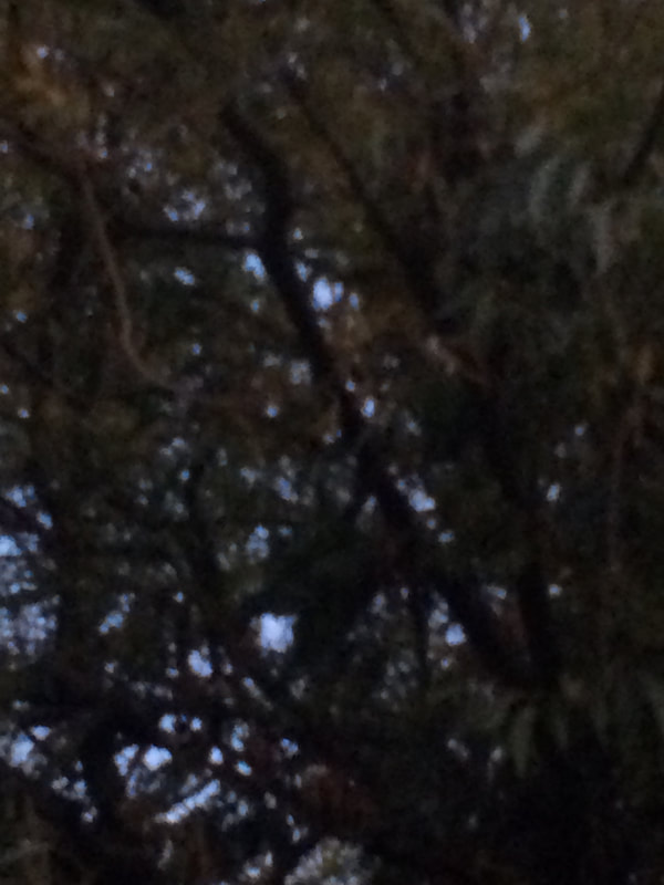
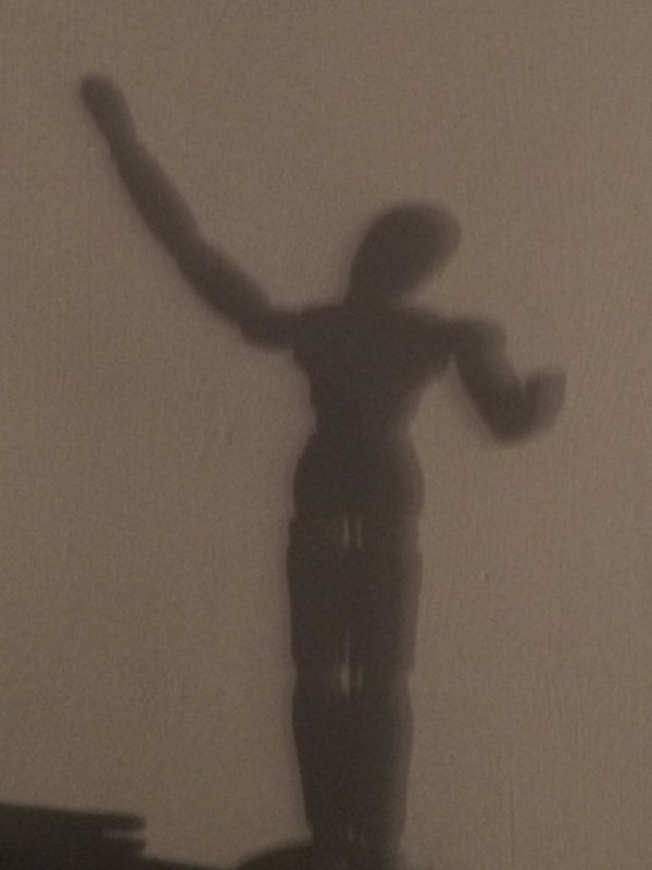
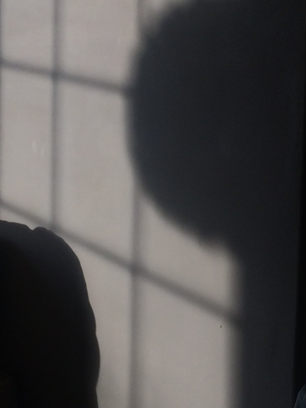
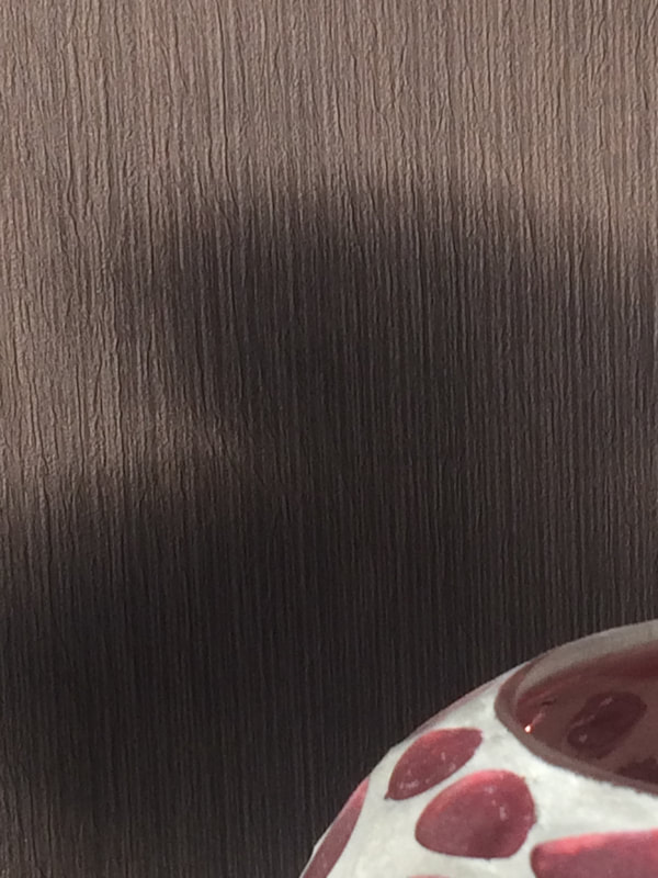
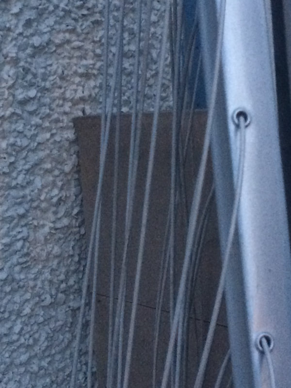
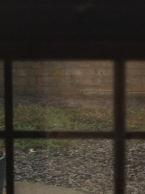
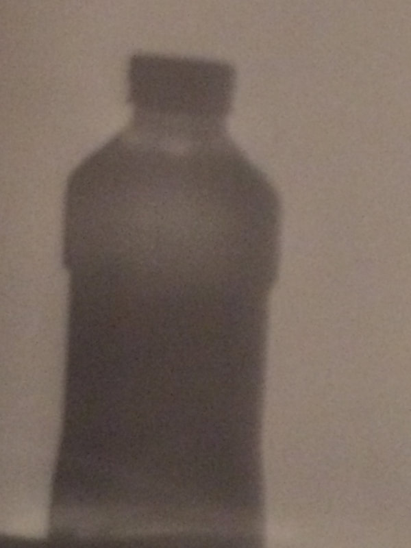
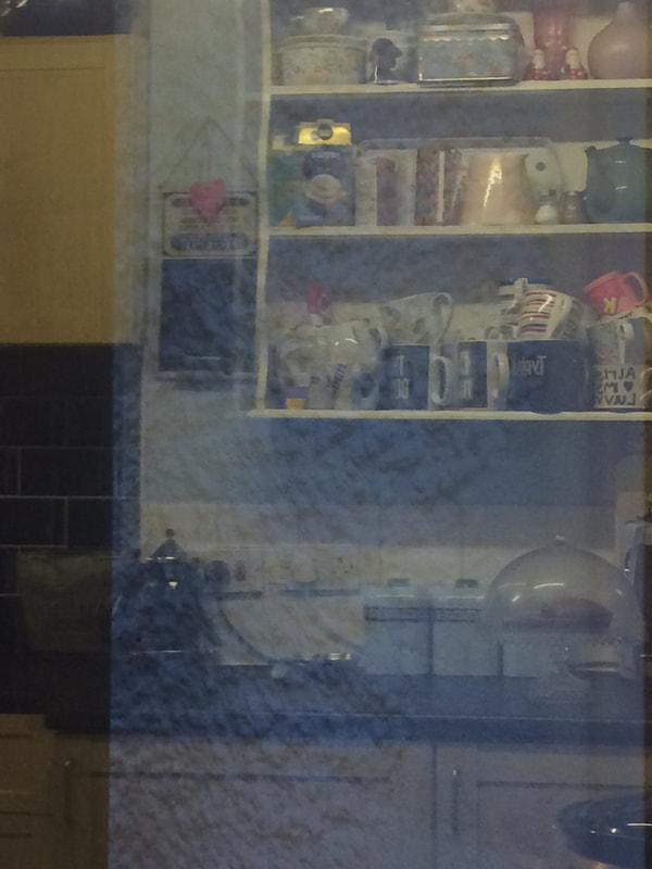
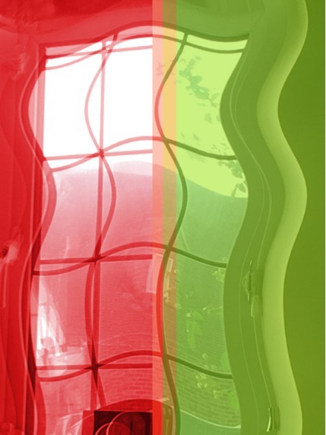
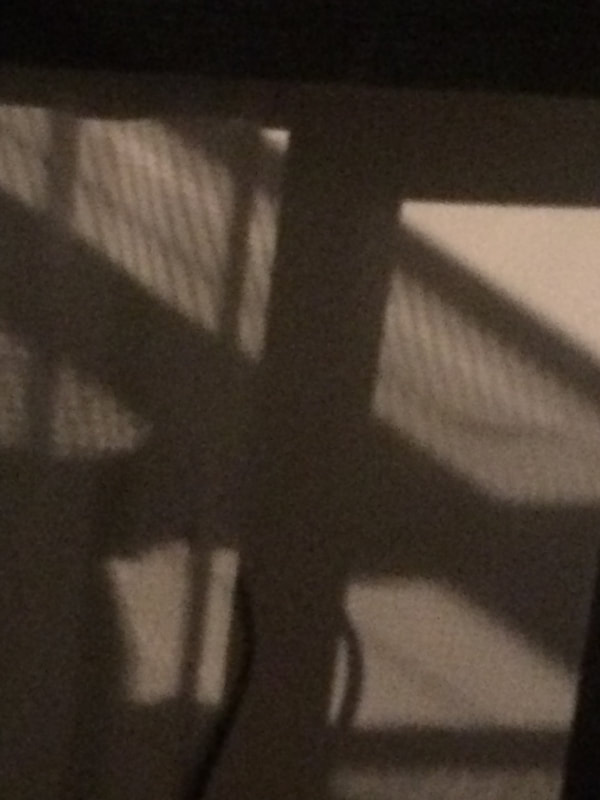
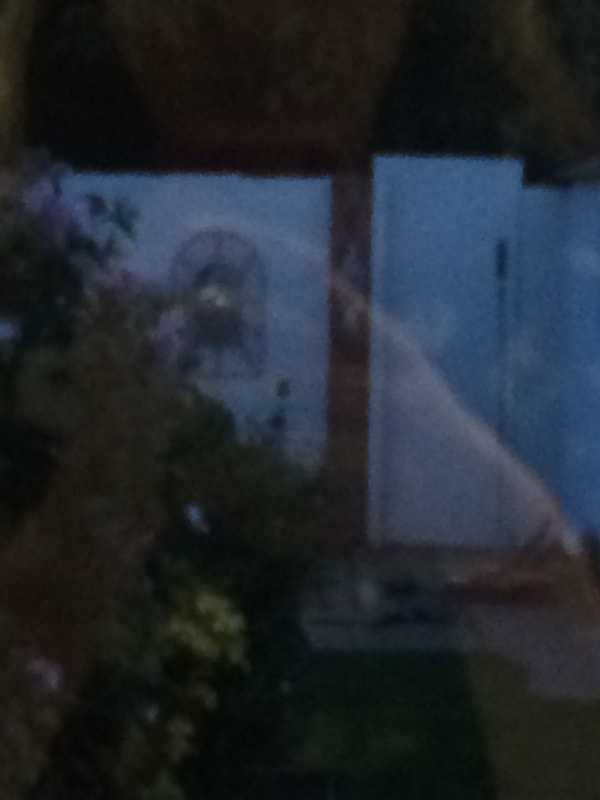
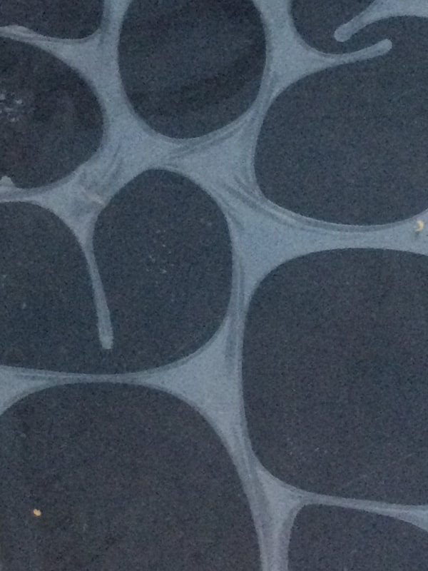
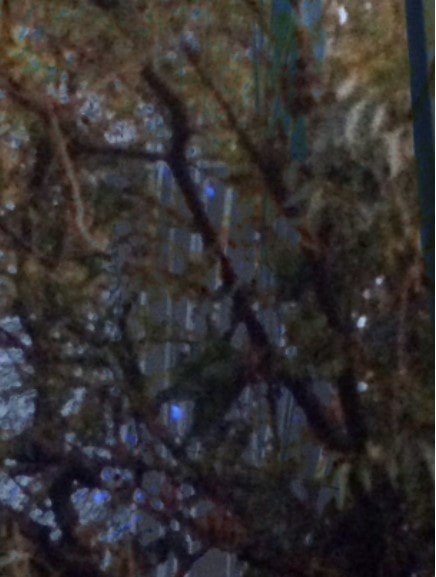
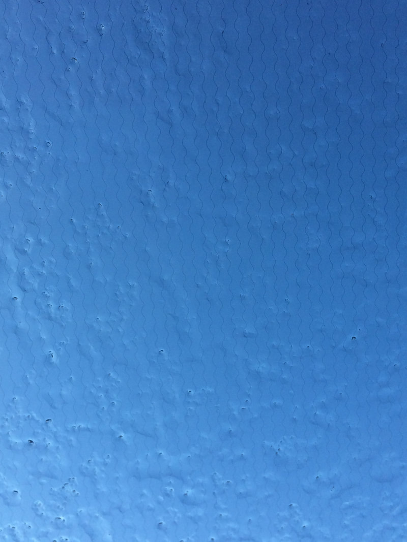
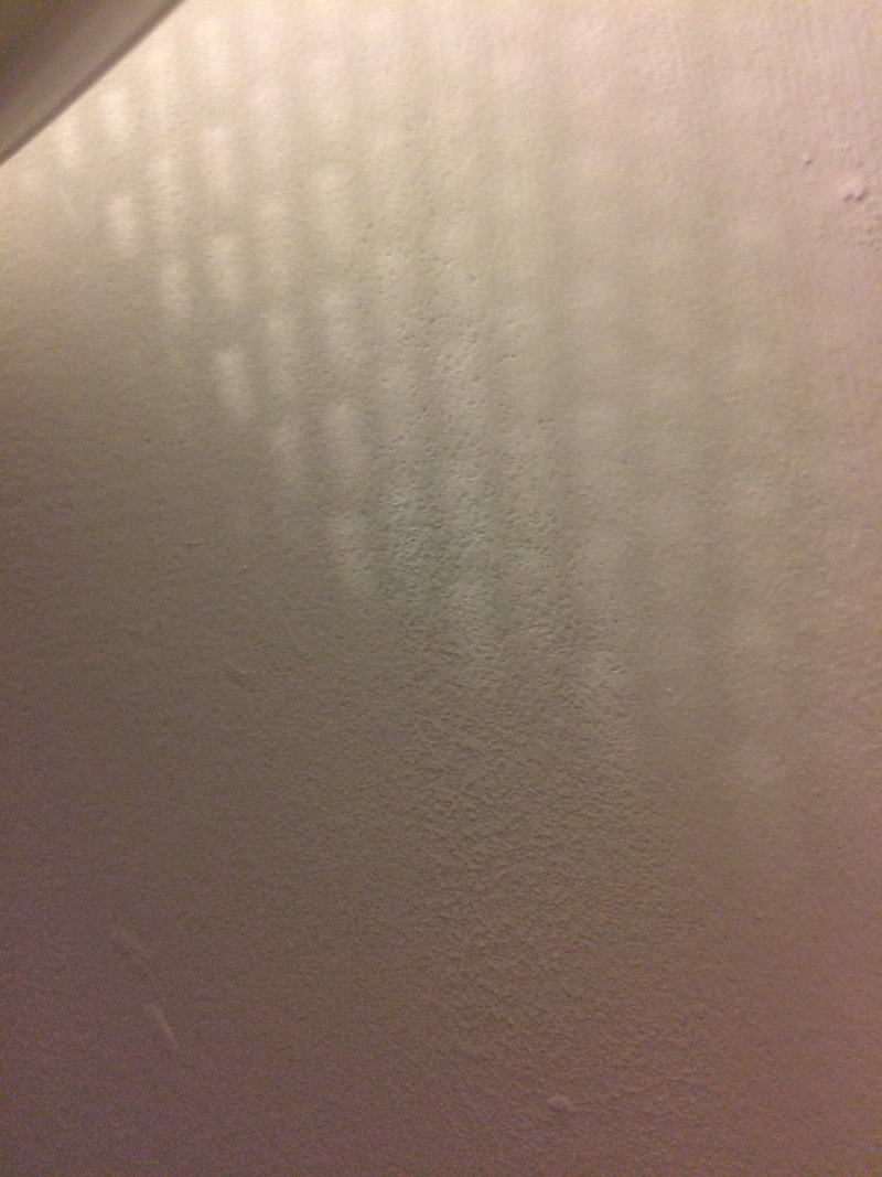
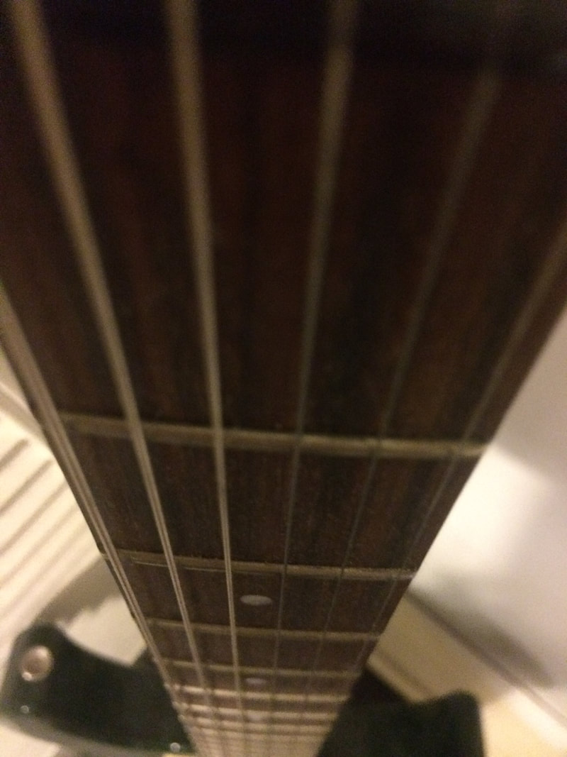
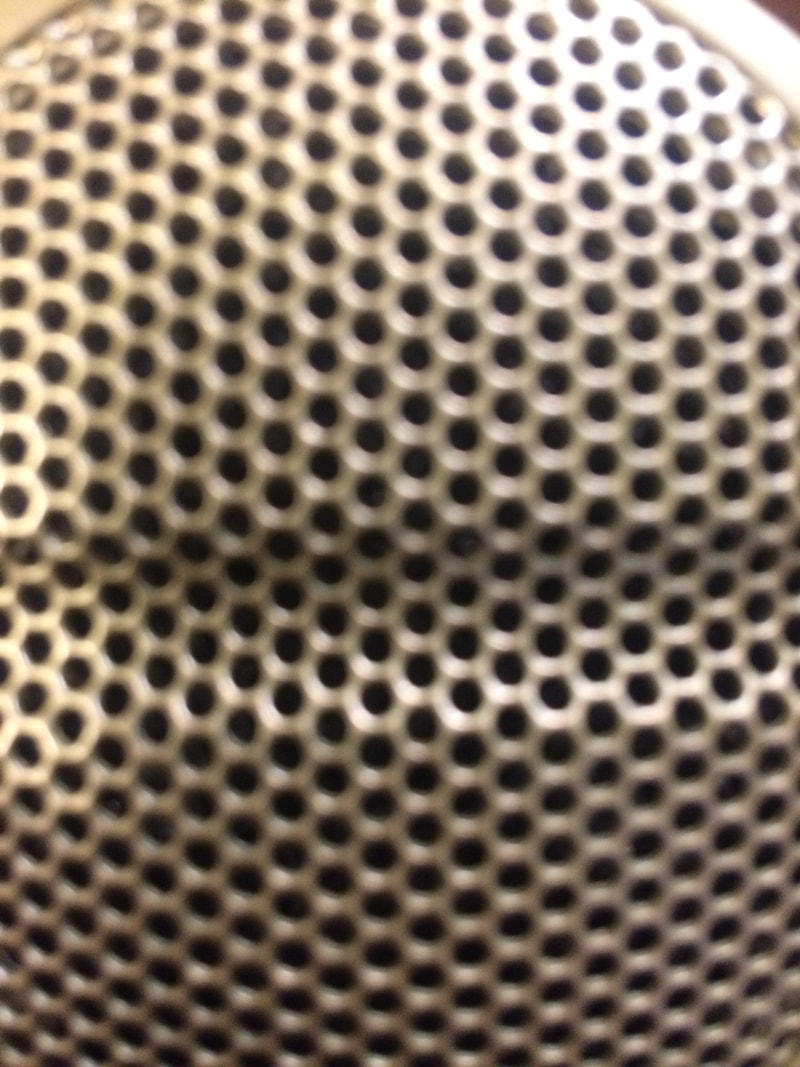
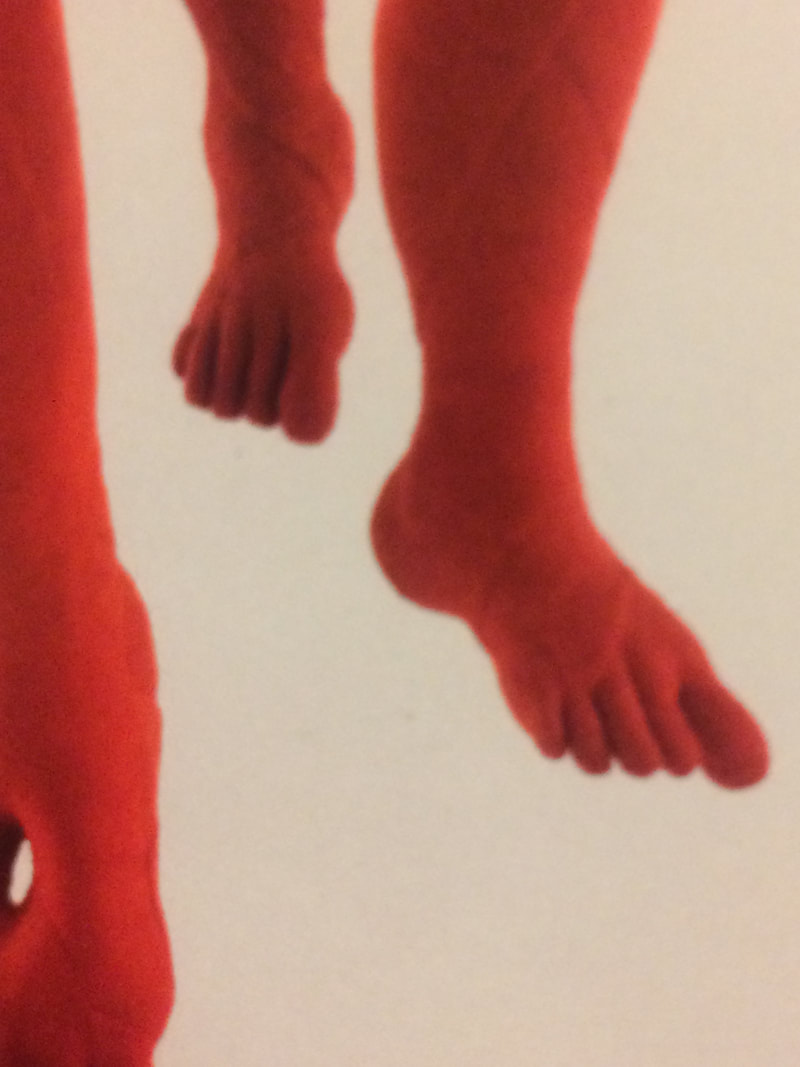
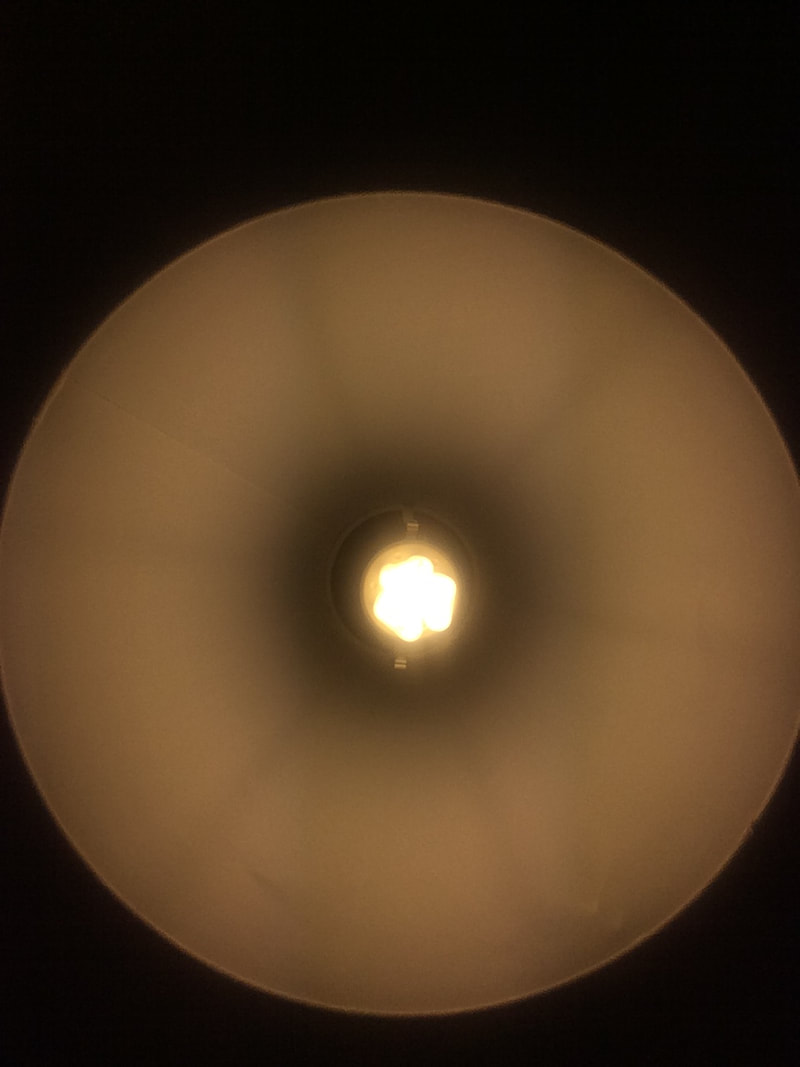
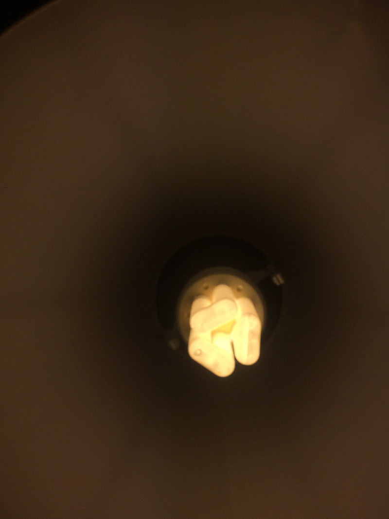
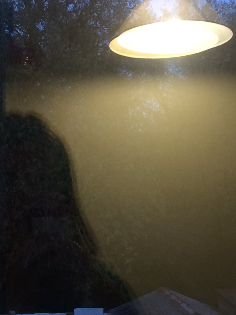
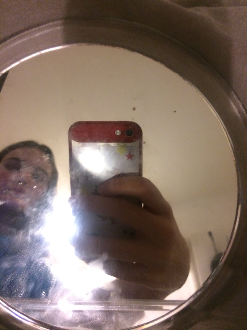
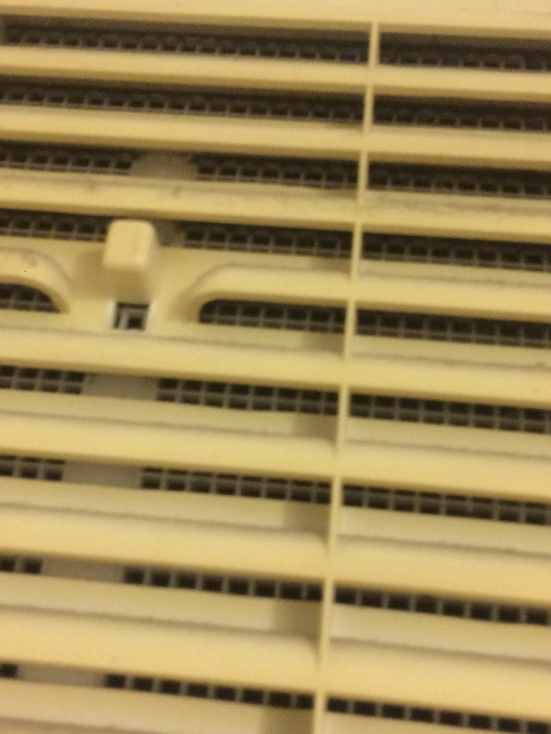
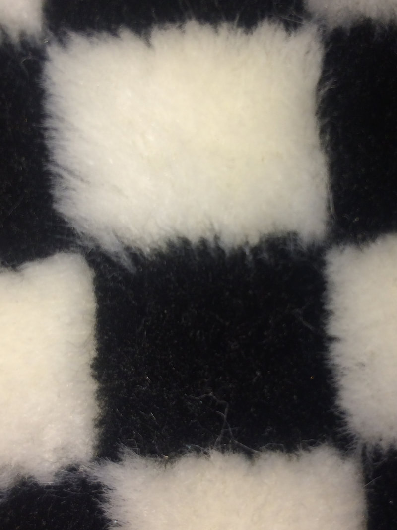
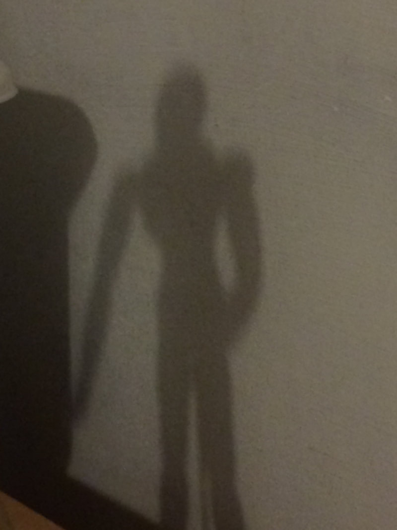
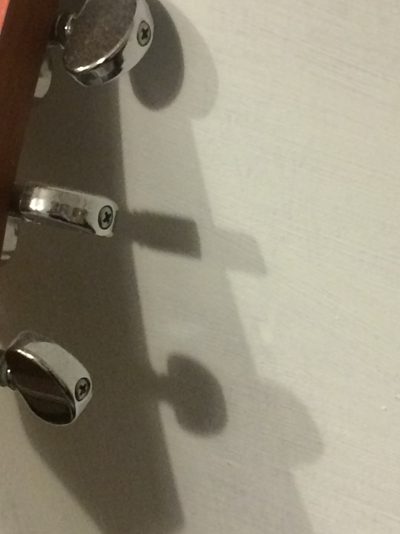
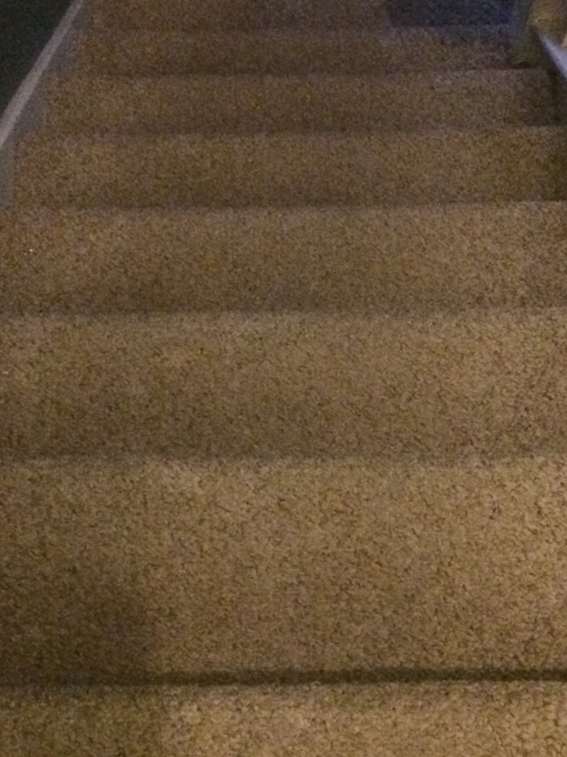
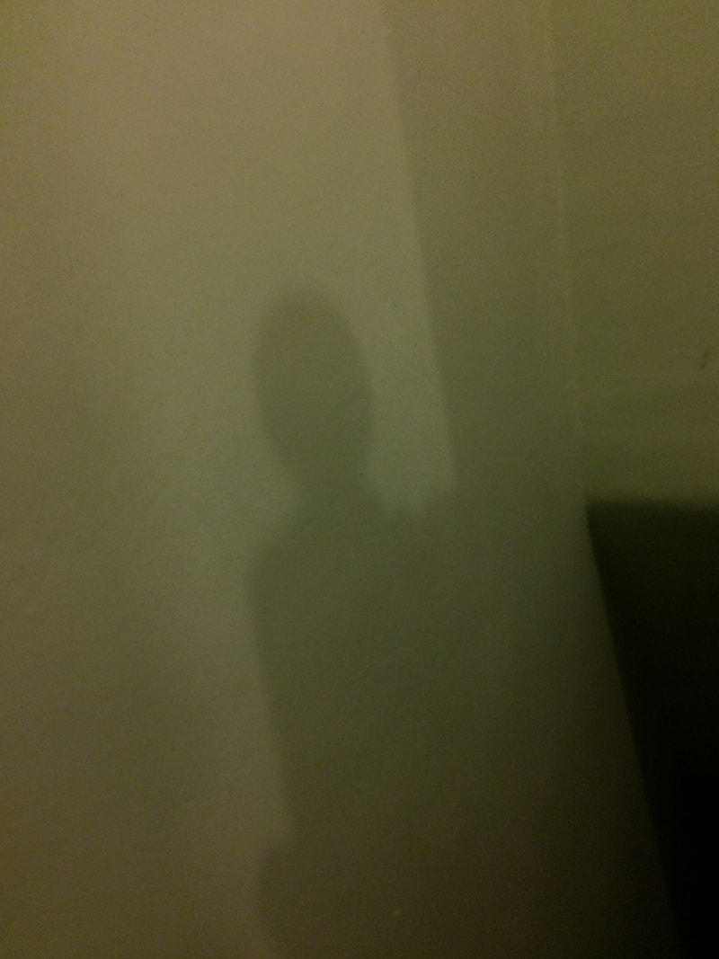
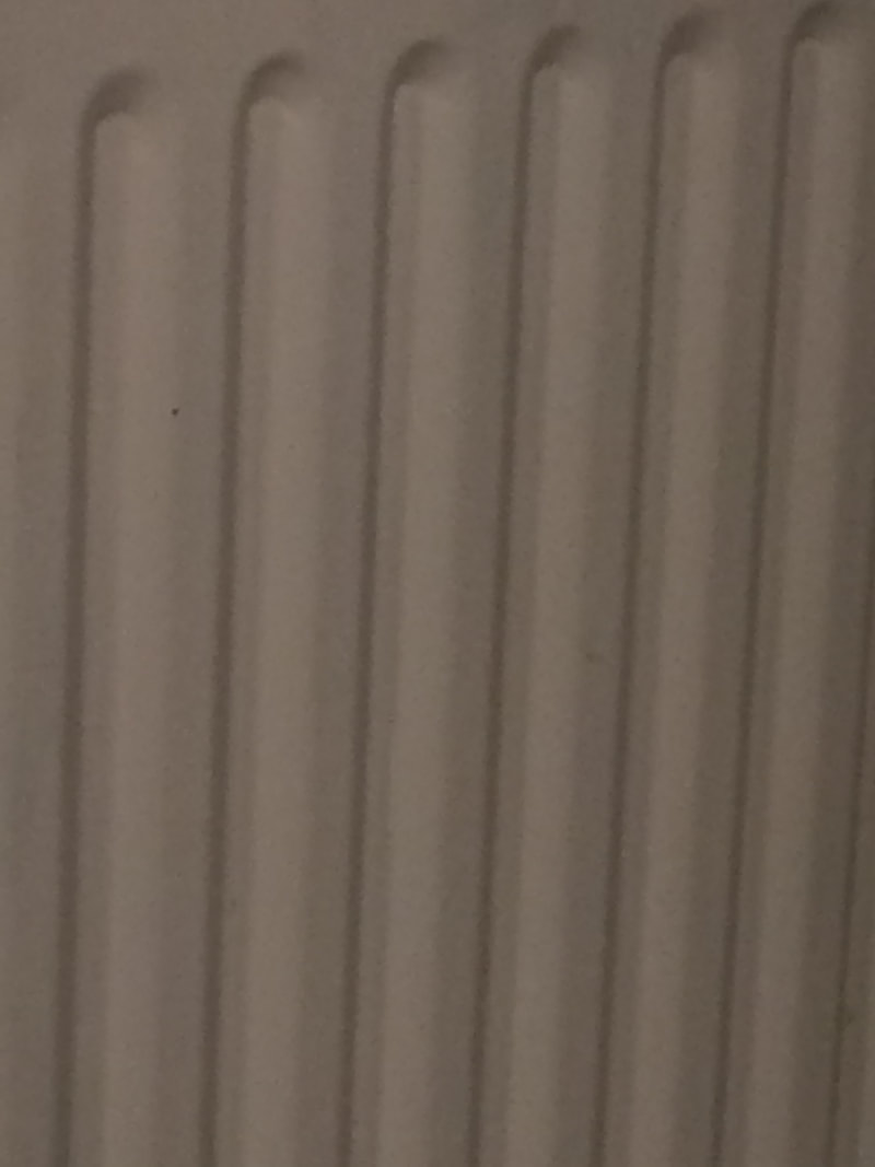
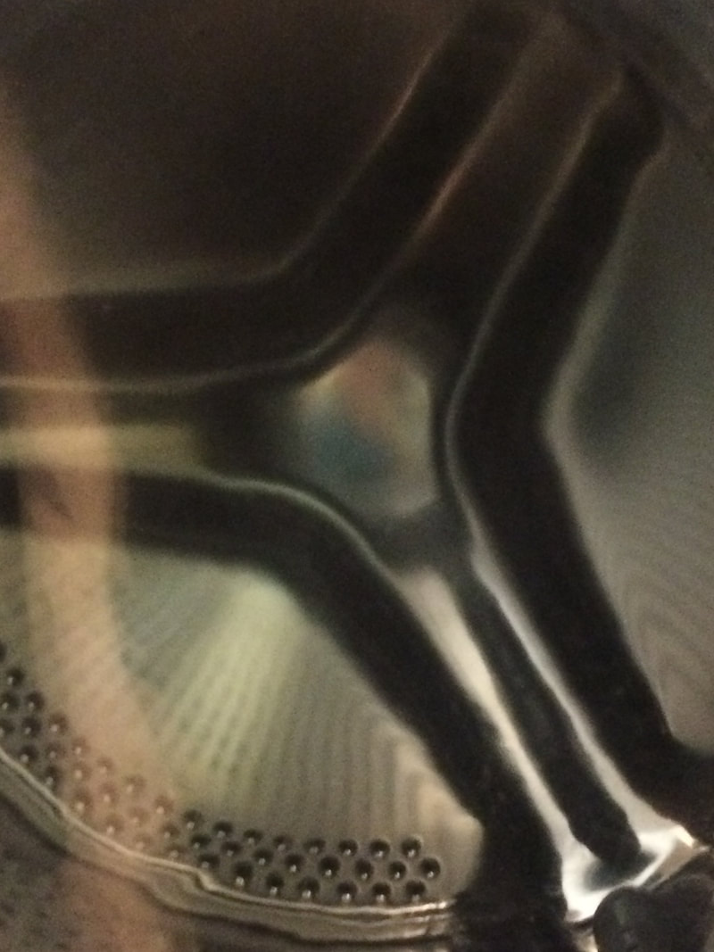
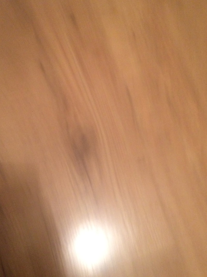
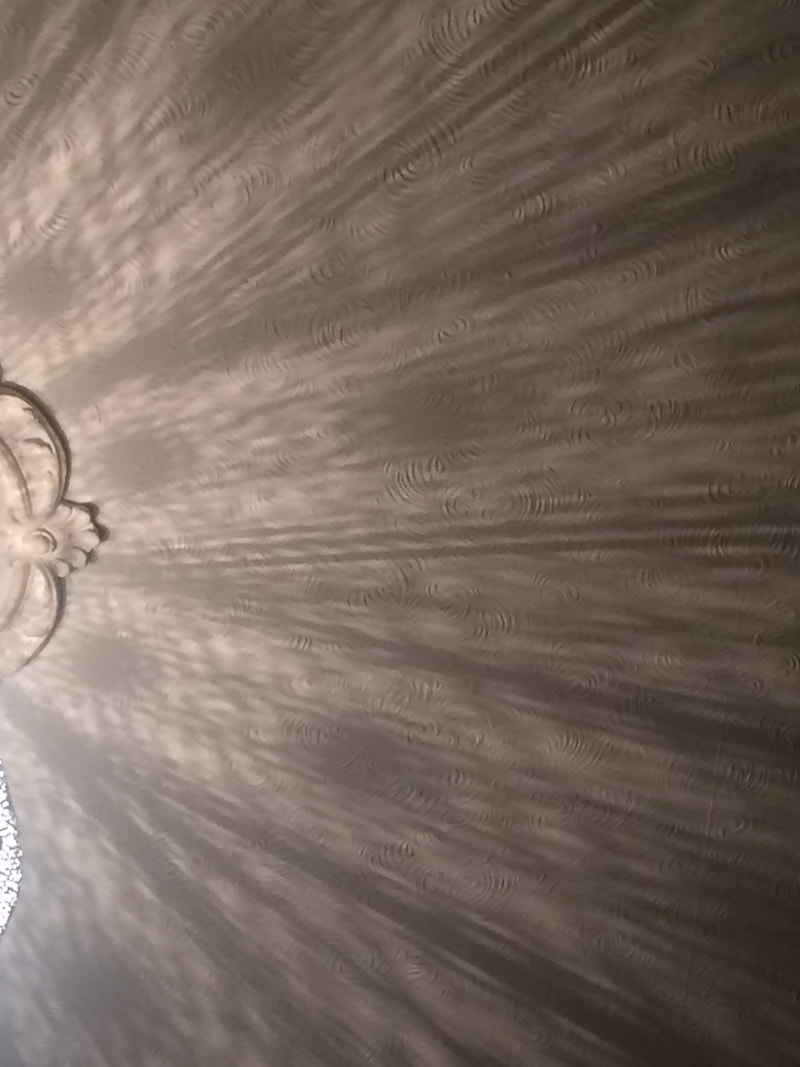
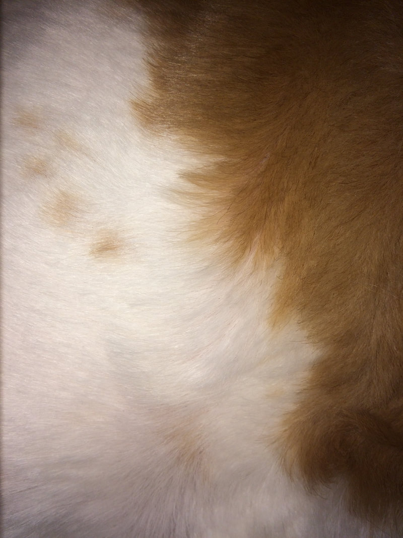
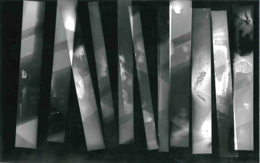
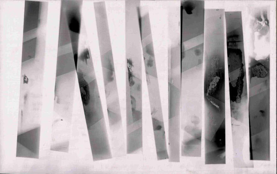
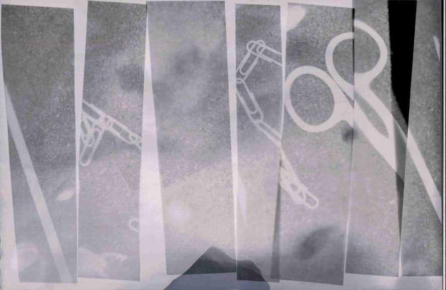
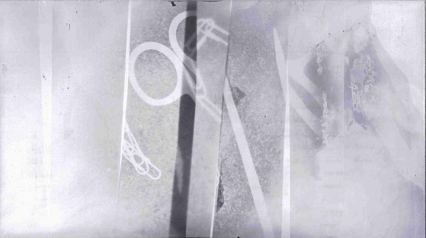
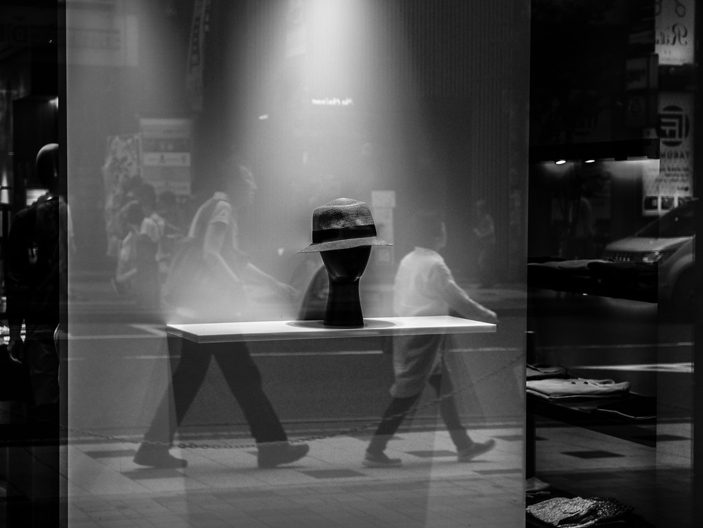
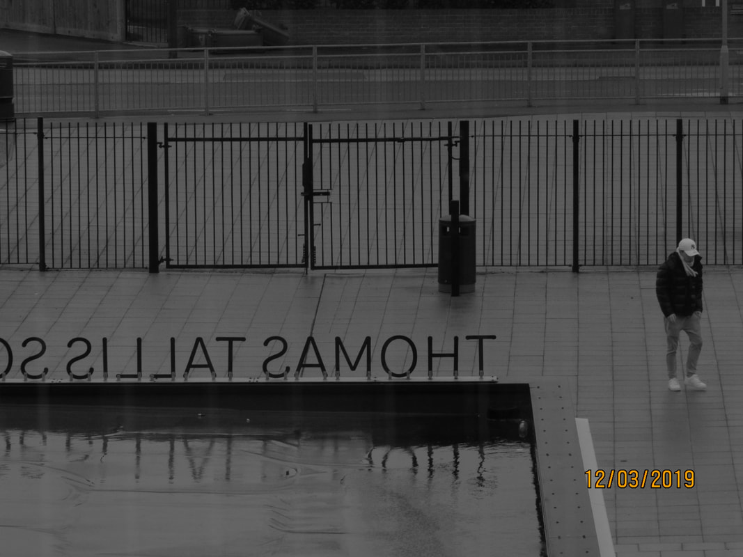
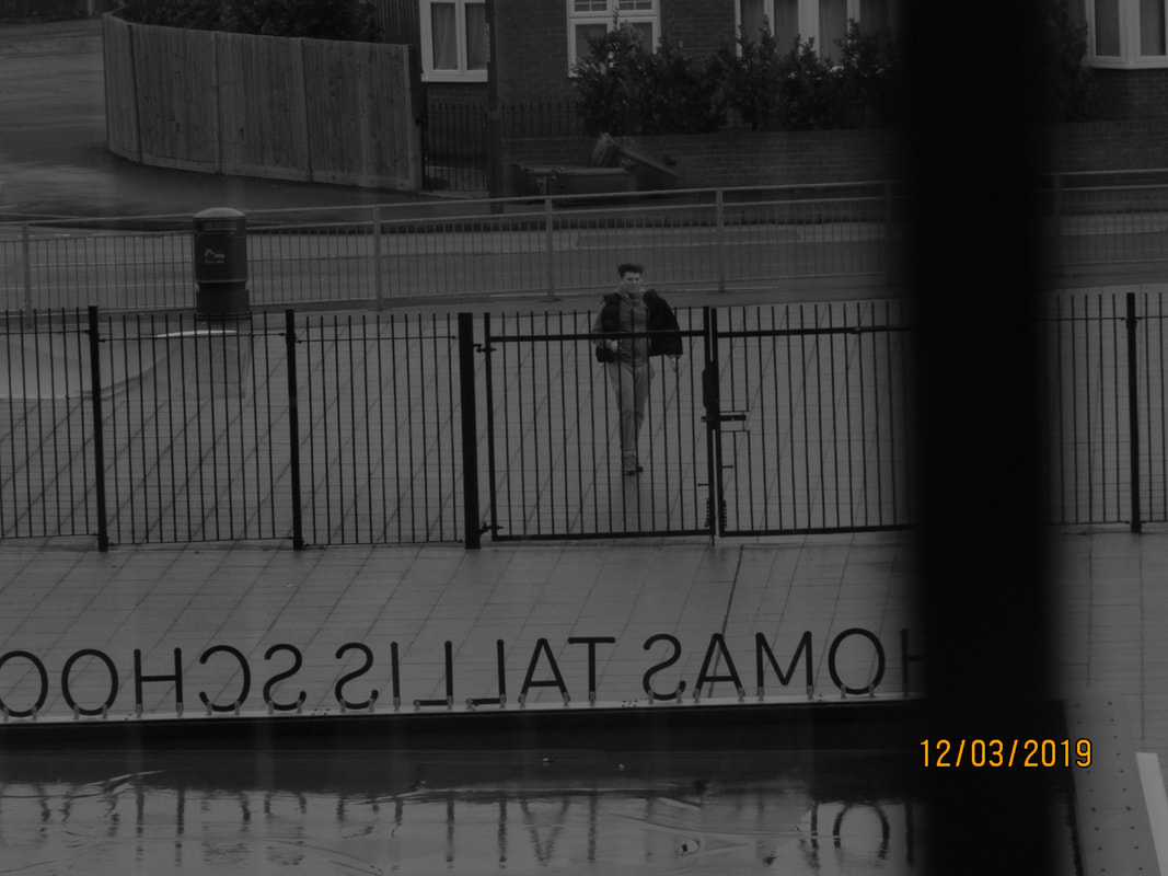
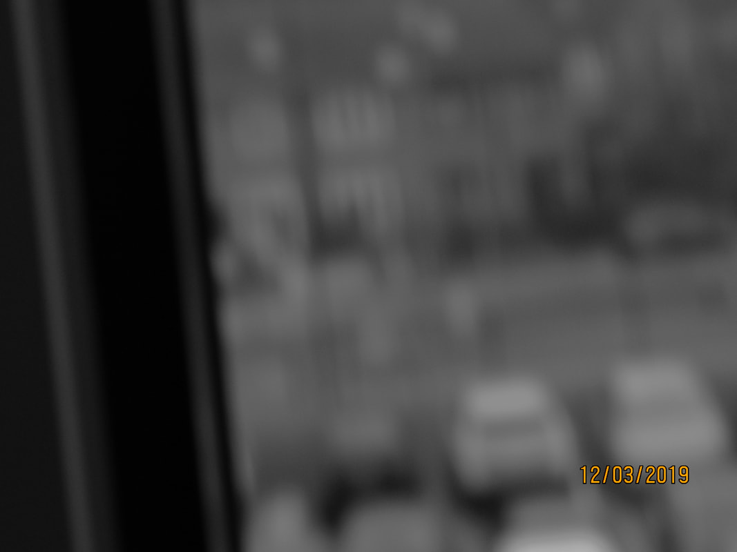
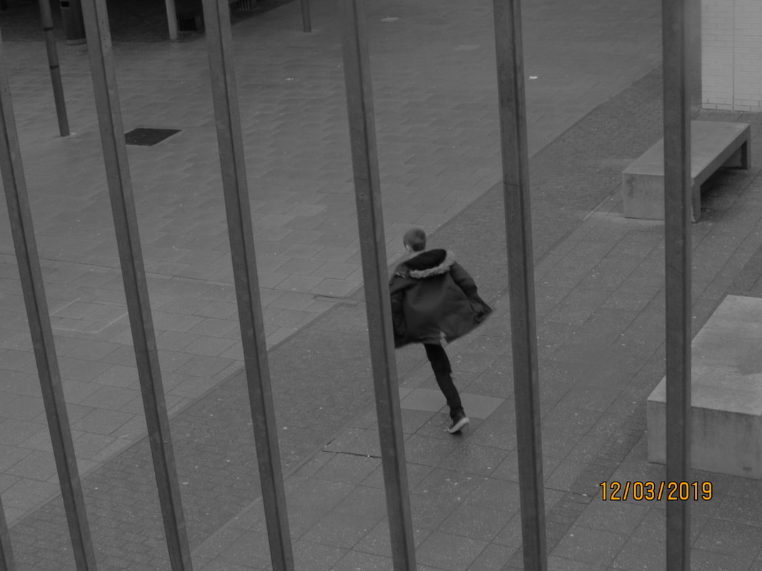
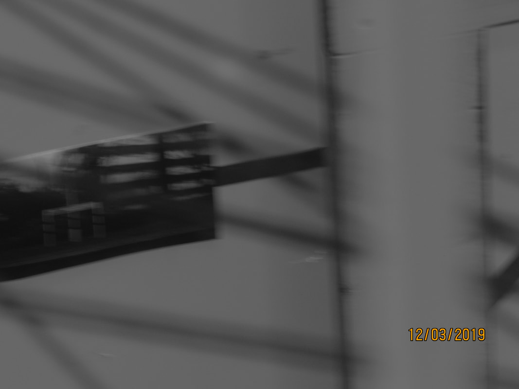
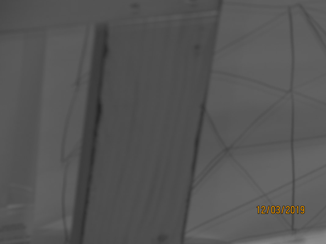
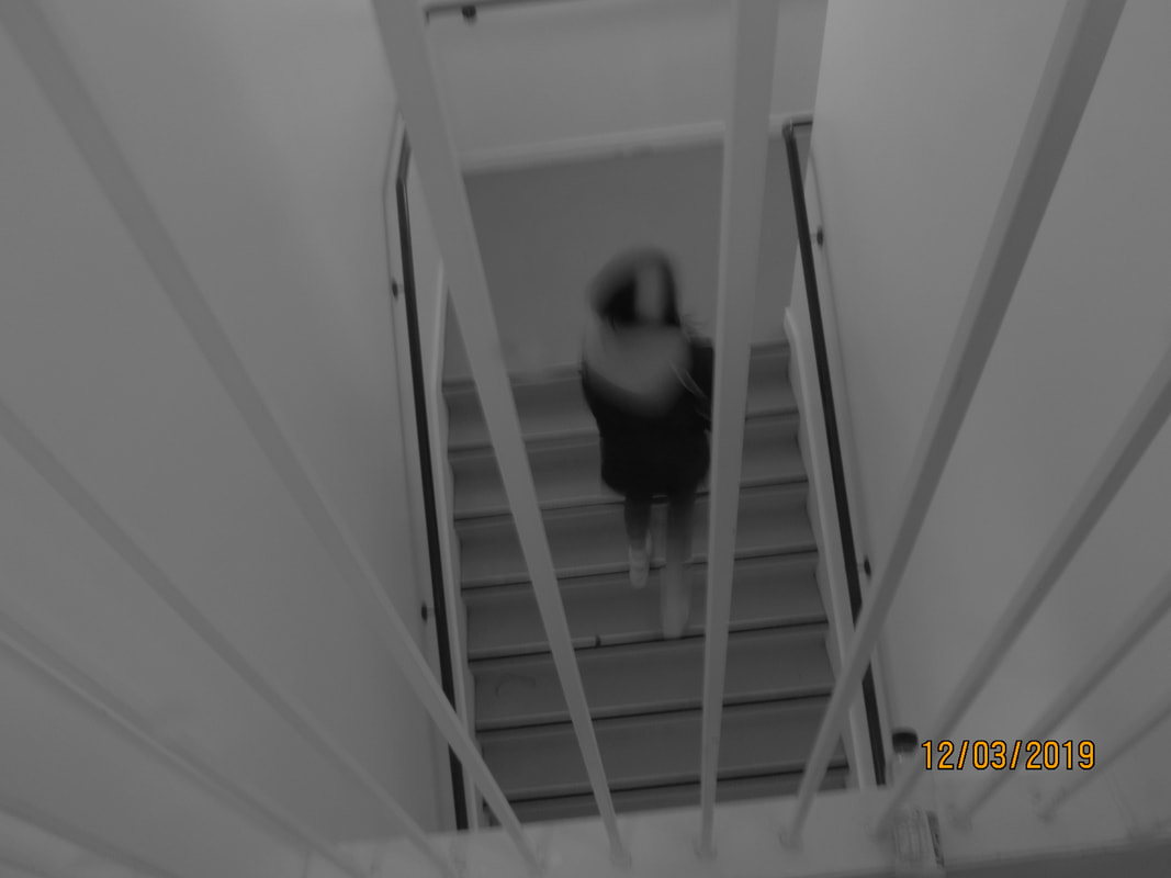
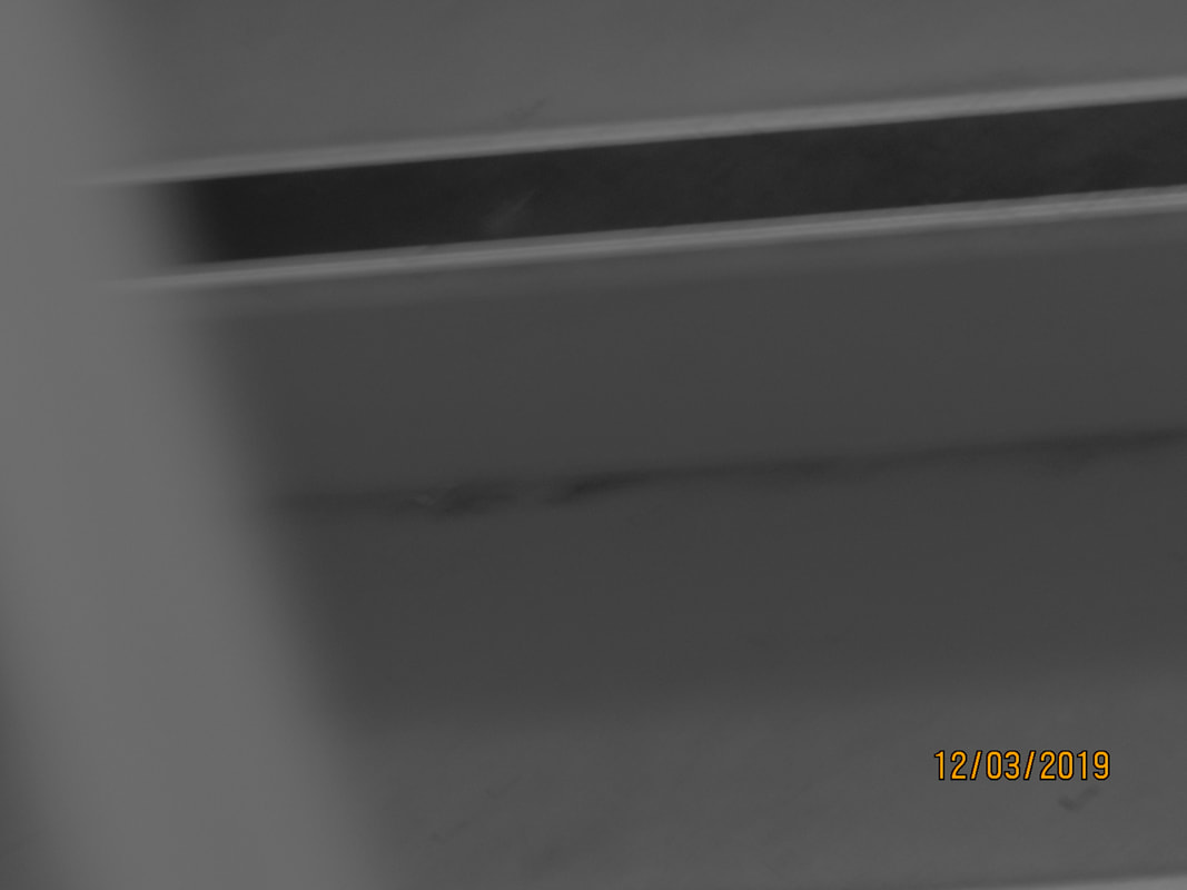
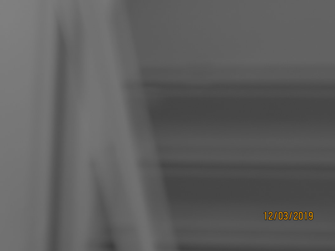
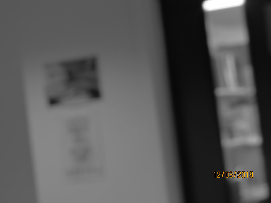
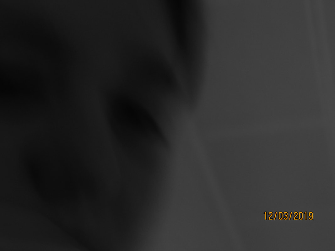
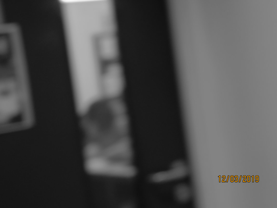
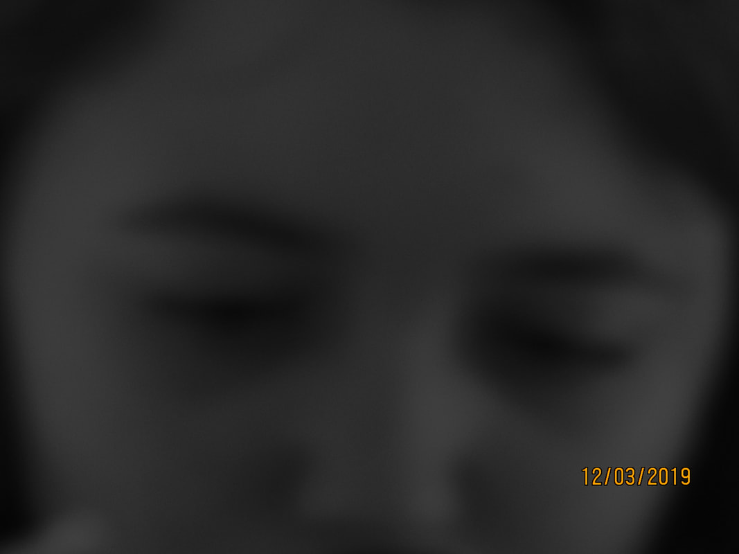
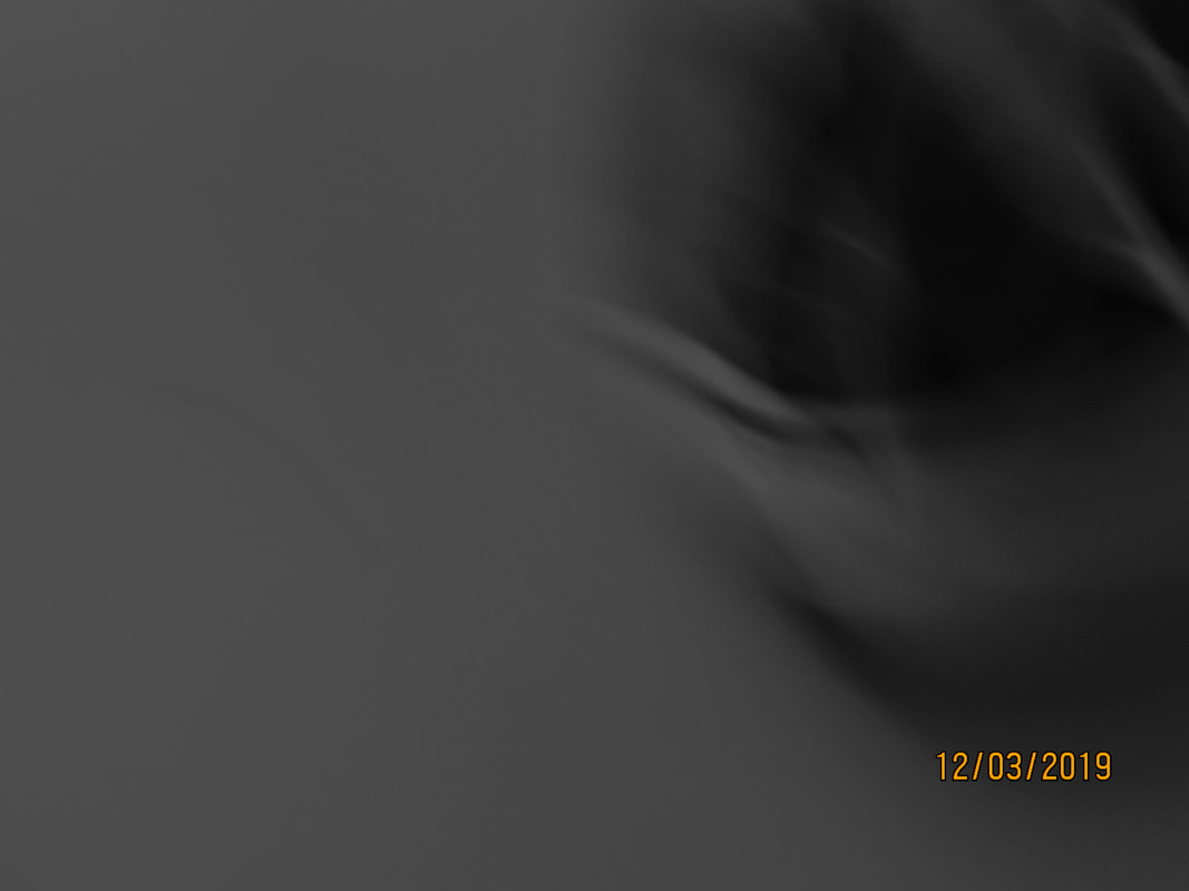
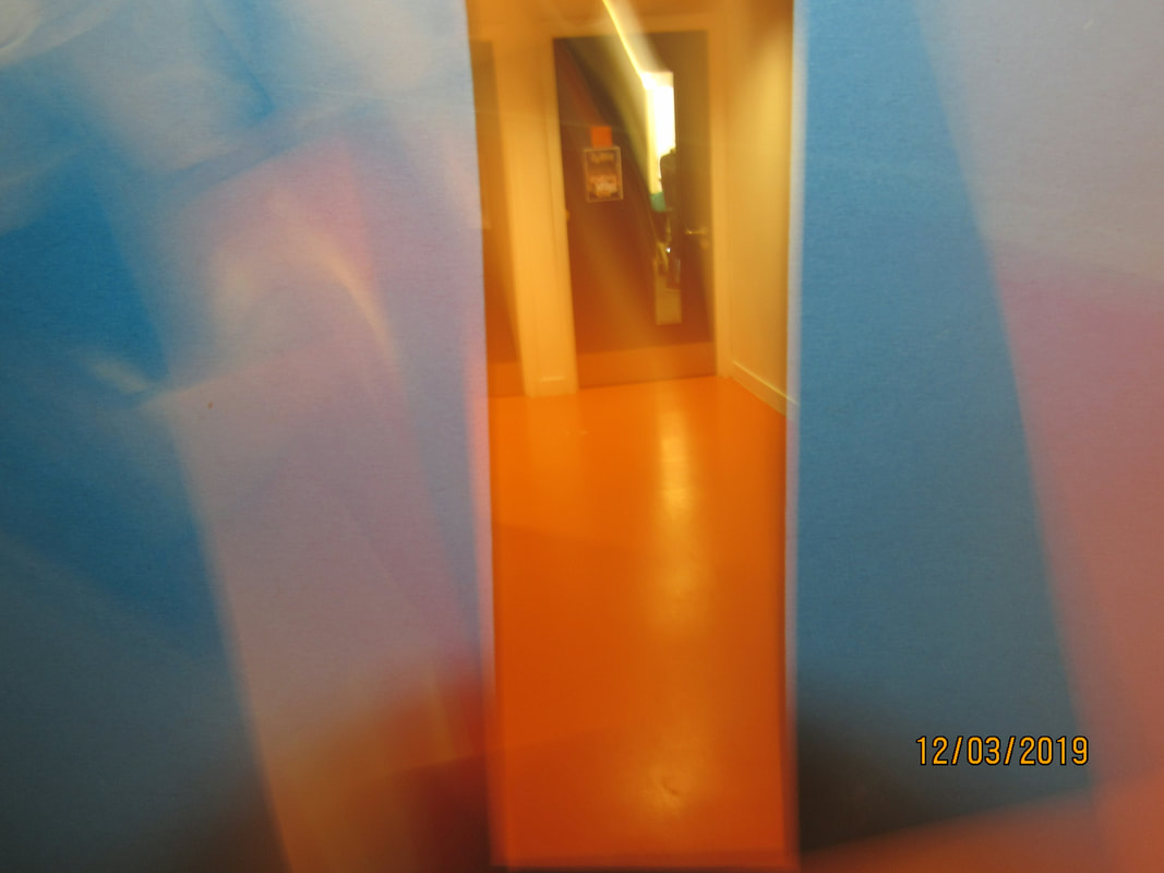
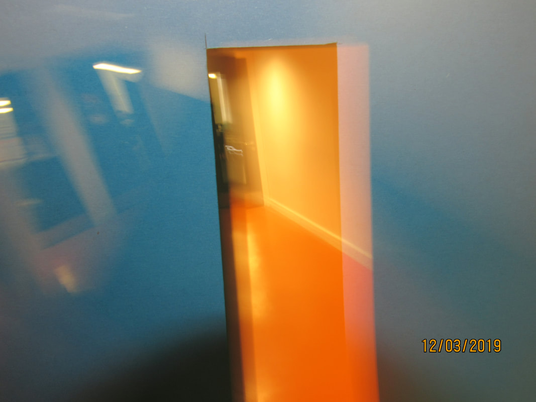
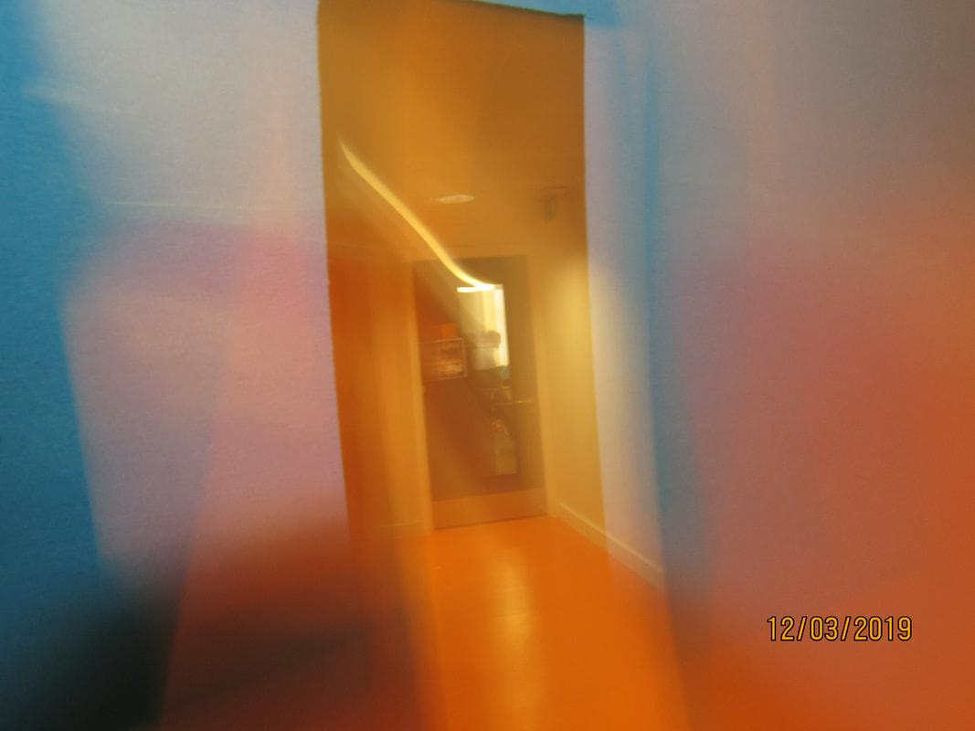
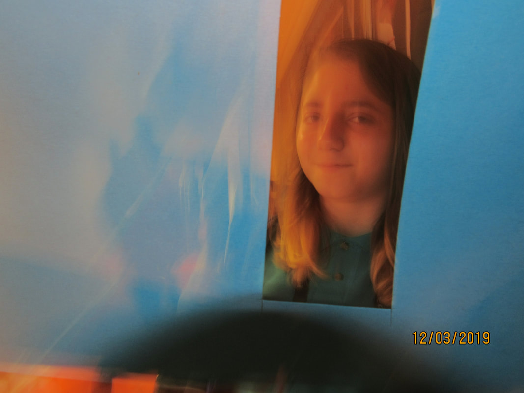
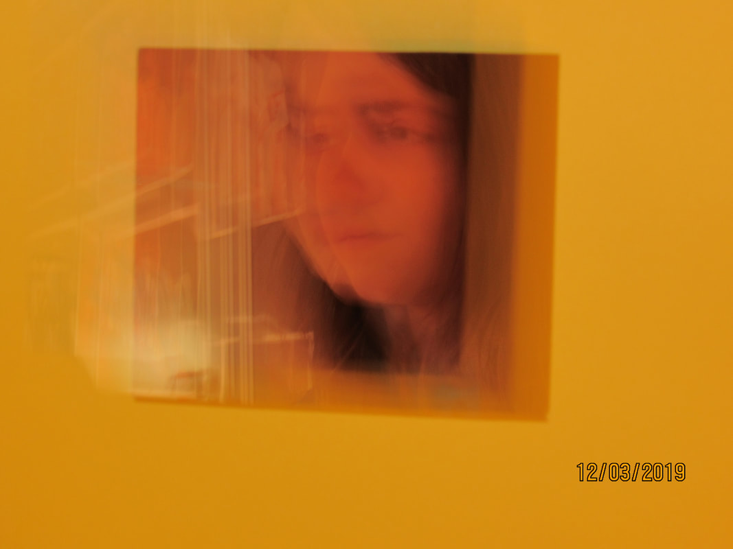
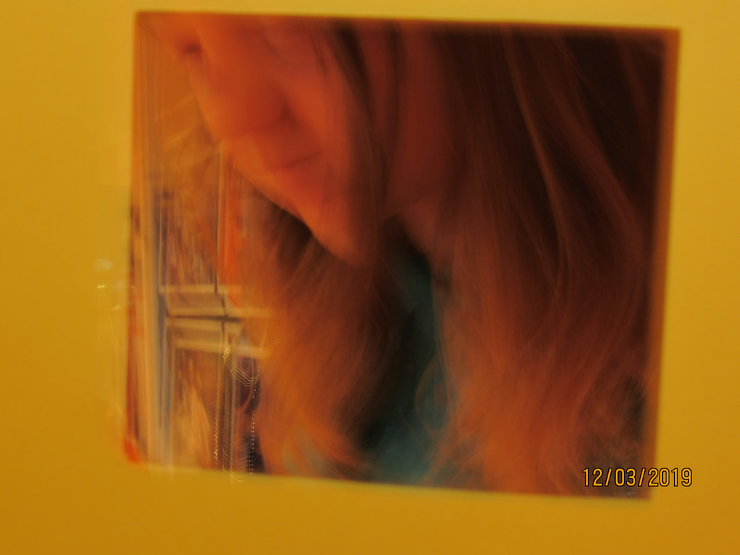
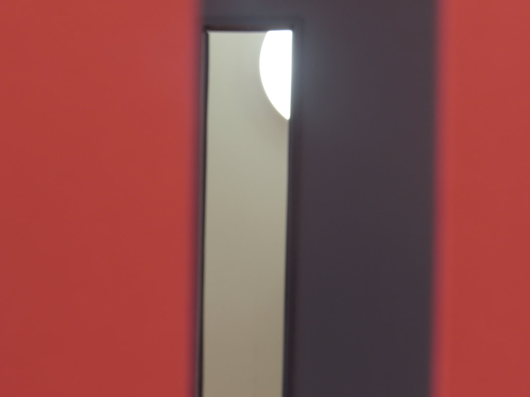
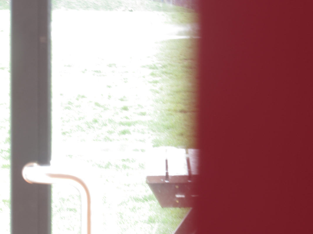
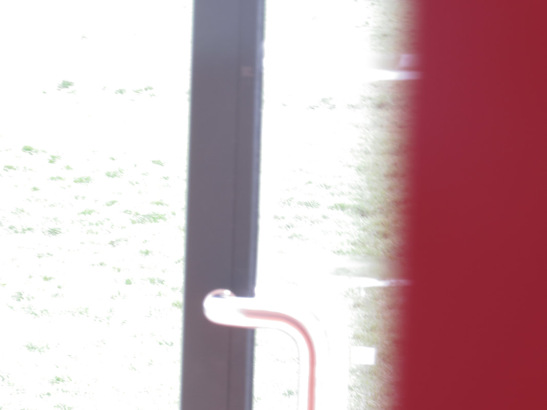
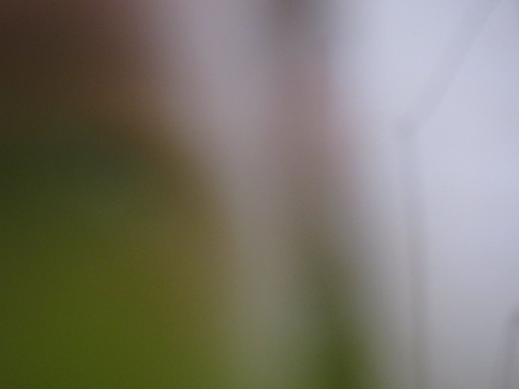
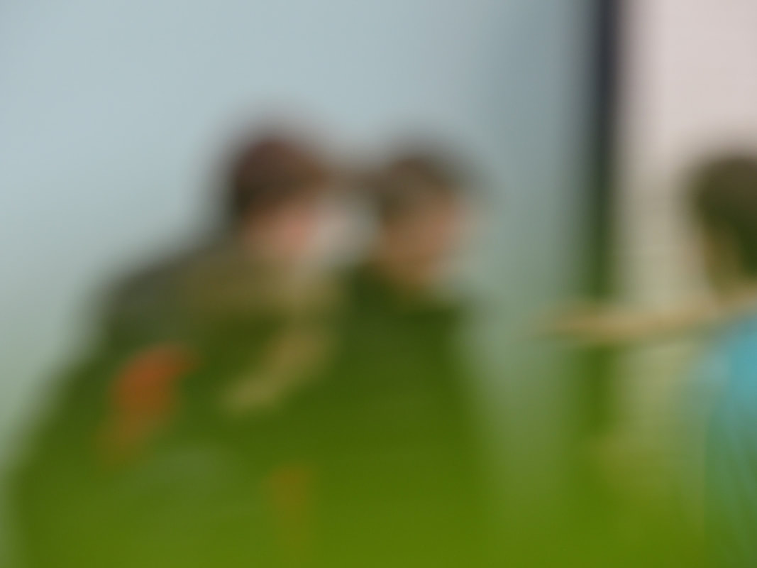
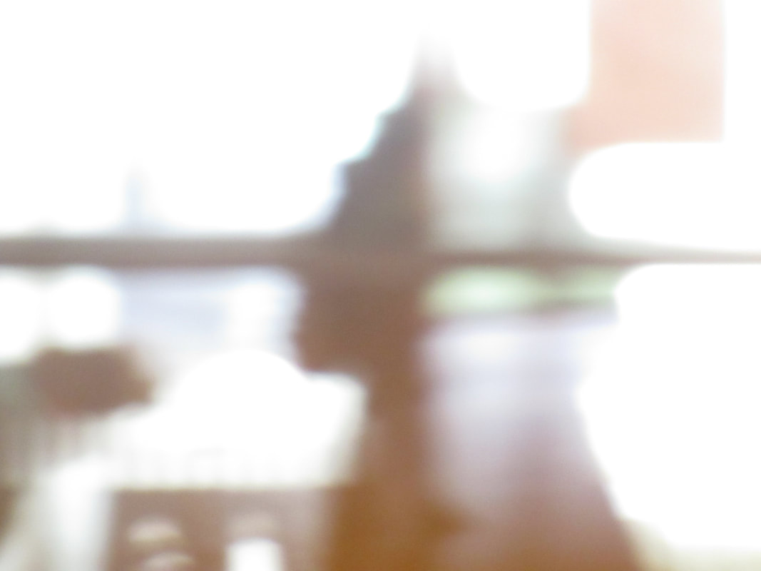
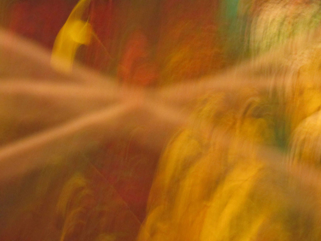
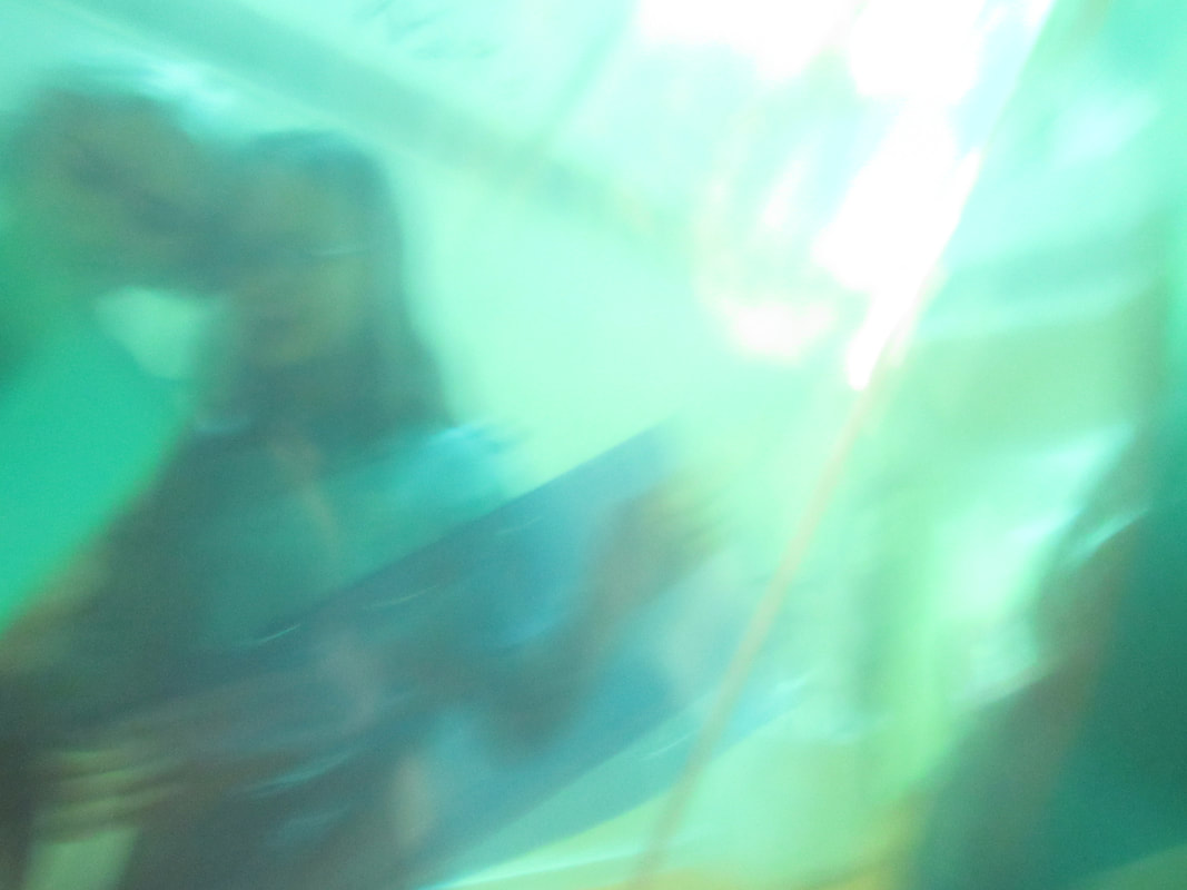
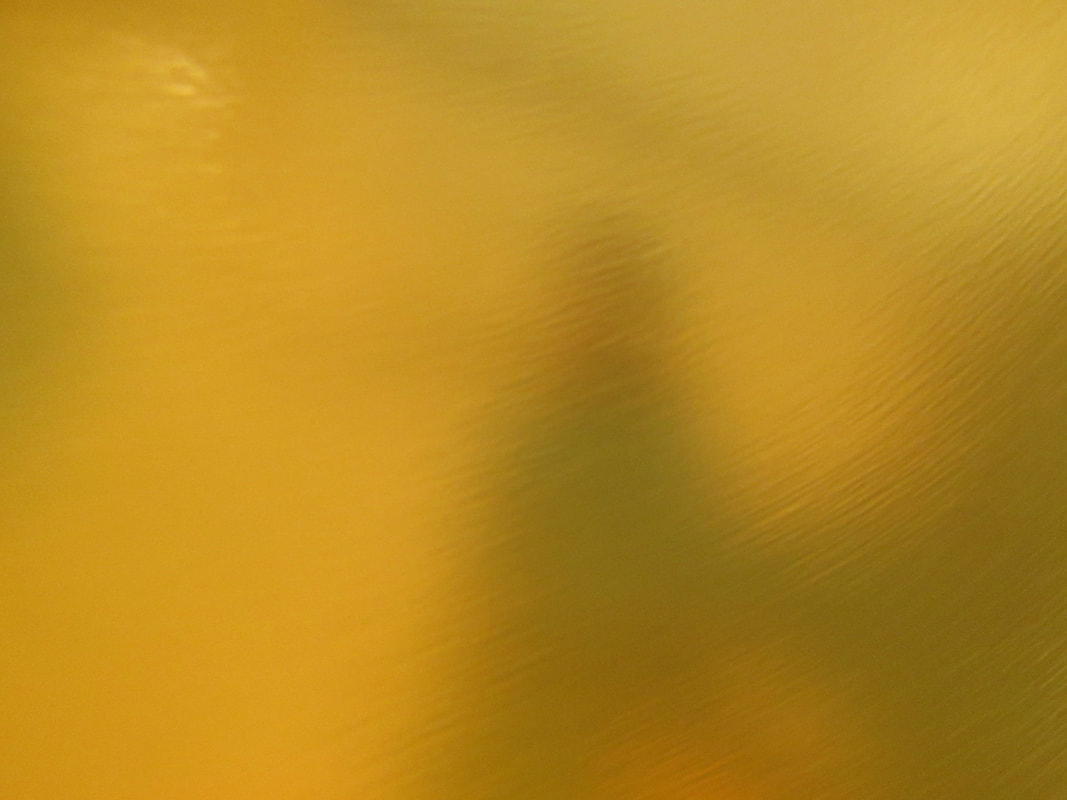
Our task was to go out with our cameras and take as many abstract photos as we could with one of the words above in our mind. I chose the word 'line', and these are the photos I took.
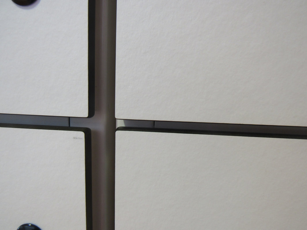
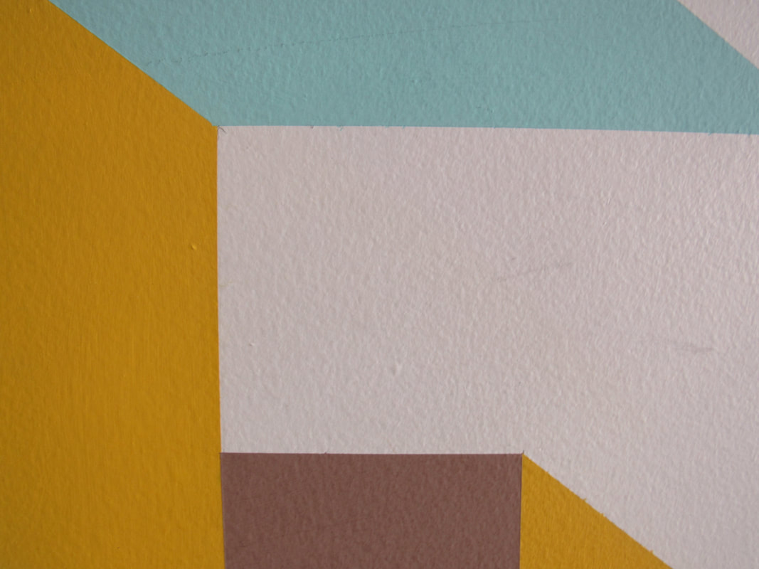
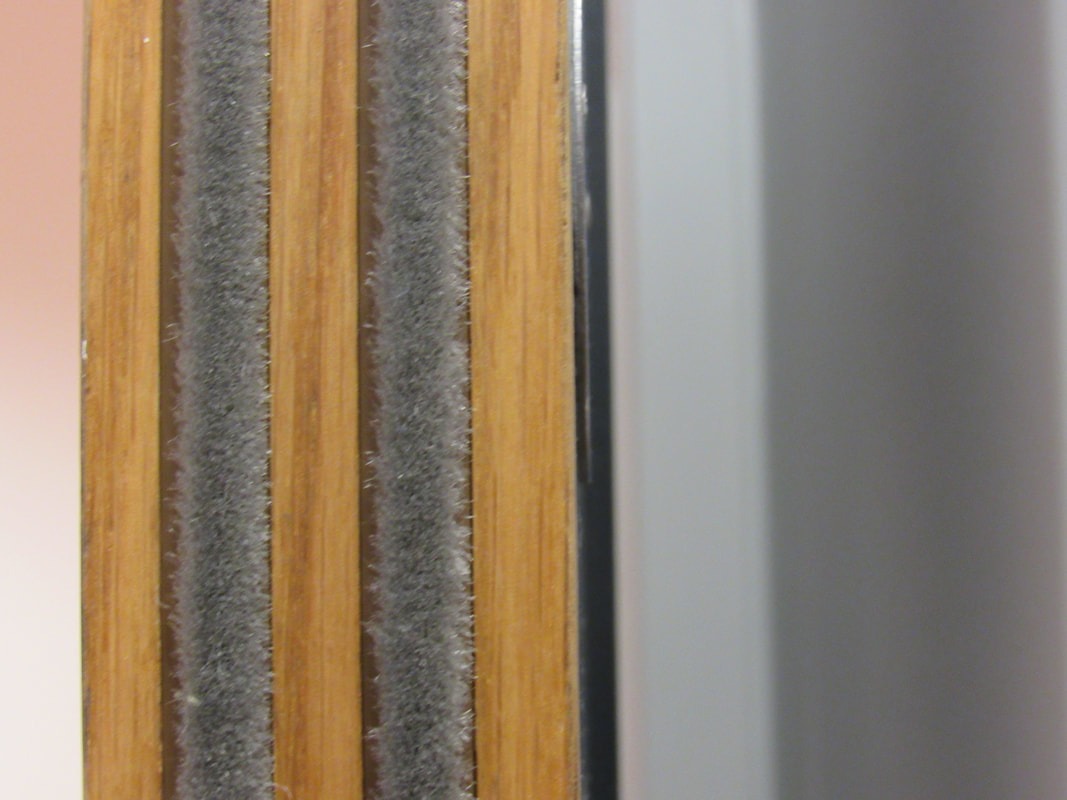
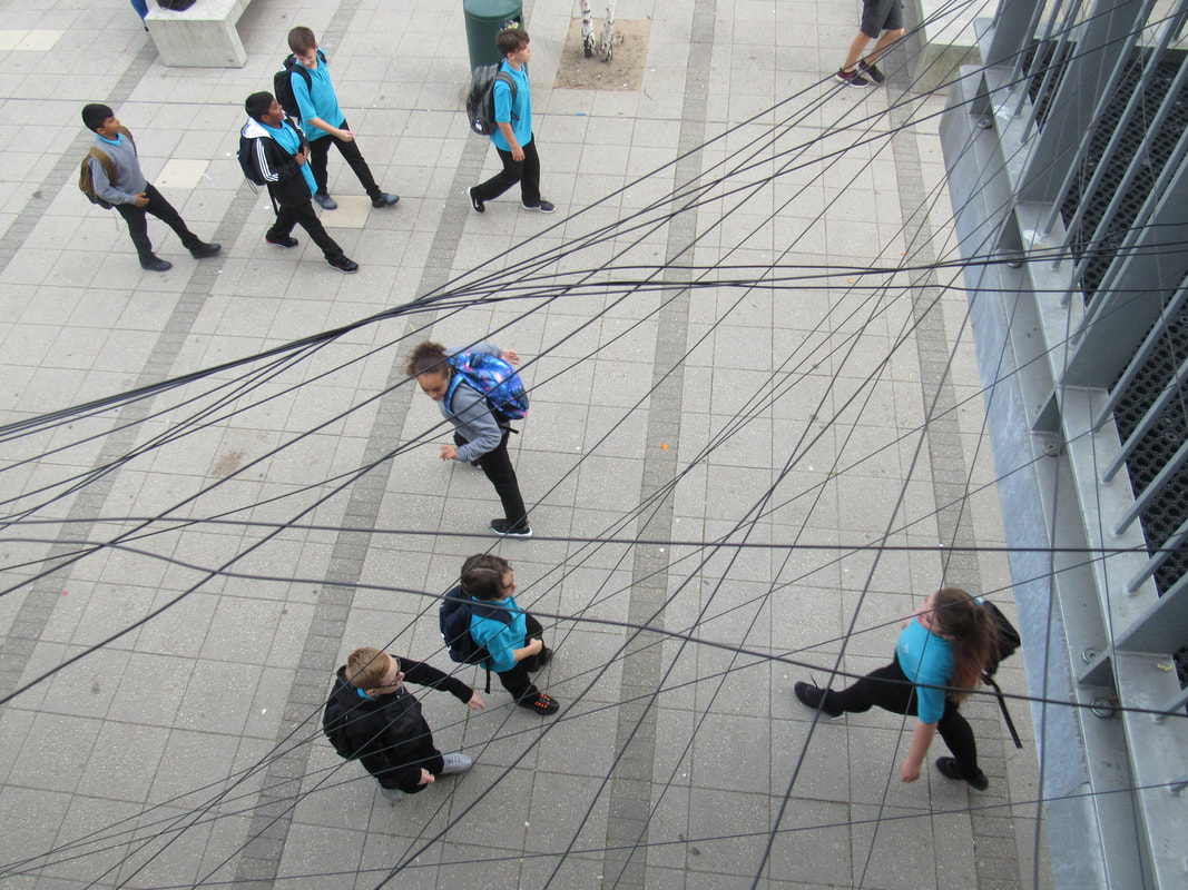
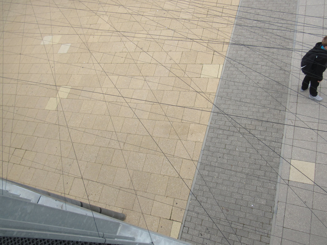
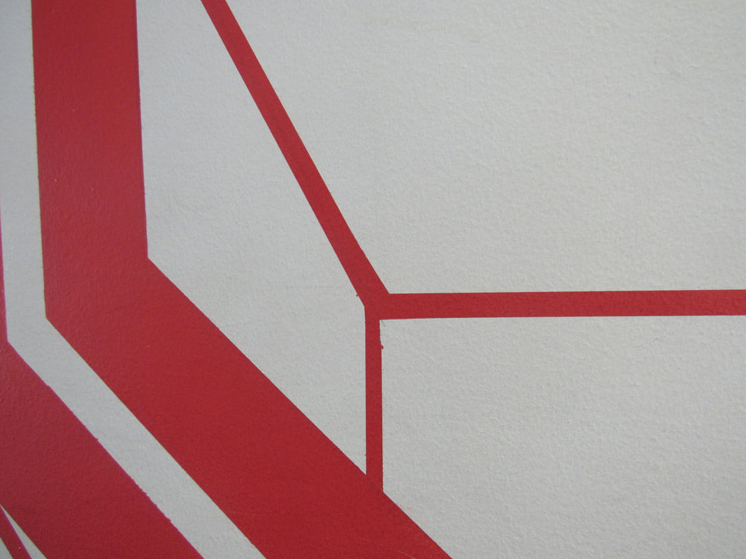
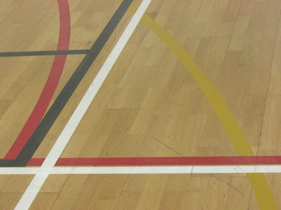
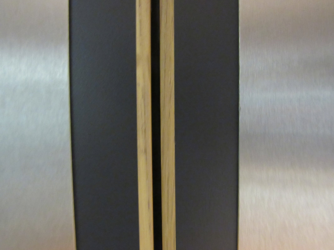
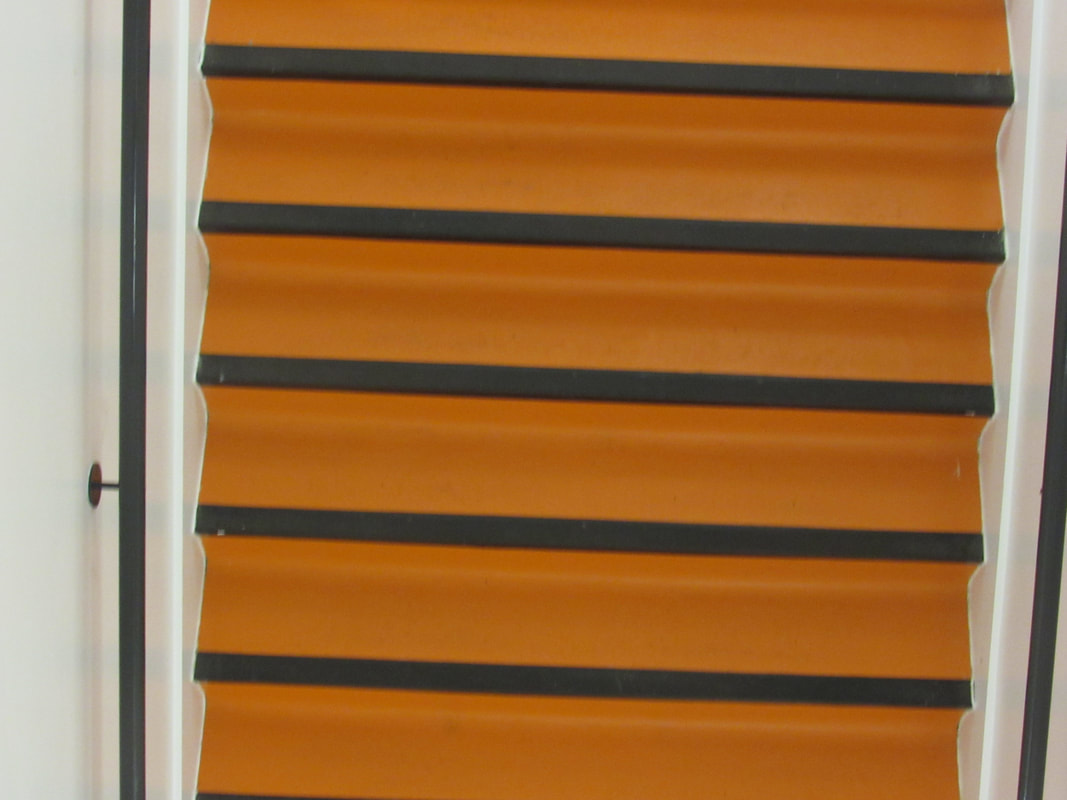
I think that some of the photos I took are abstract, but there are a few that aren't. I like the 2nd, 5th, 6th and 7th ones because they don't really look like anything and you can't describe them. There are some I would retake, like the 9th one, because I think you can tell what it is, and it is angled weirdly. Also, the 4th one is angled weirdly and I would have liked the focus to be more on the lines, rather than the bars on the side just so it doesn't ruin the abstraction and abnormality of it.
Although I chose the word 'line' to focus on, I do think that there were a few other word that inspired my photos. For example, space, focus, shape.
Although I chose the word 'line' to focus on, I do think that there were a few other word that inspired my photos. For example, space, focus, shape.
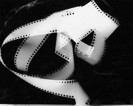
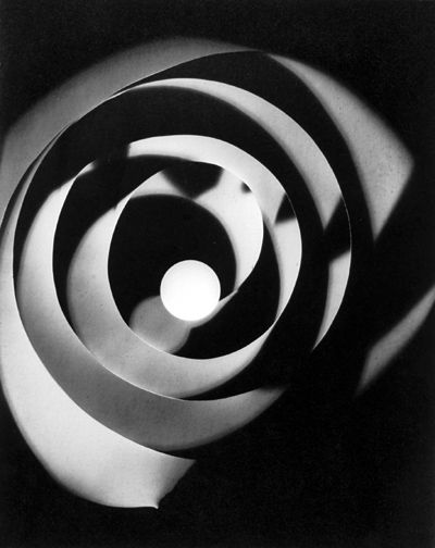
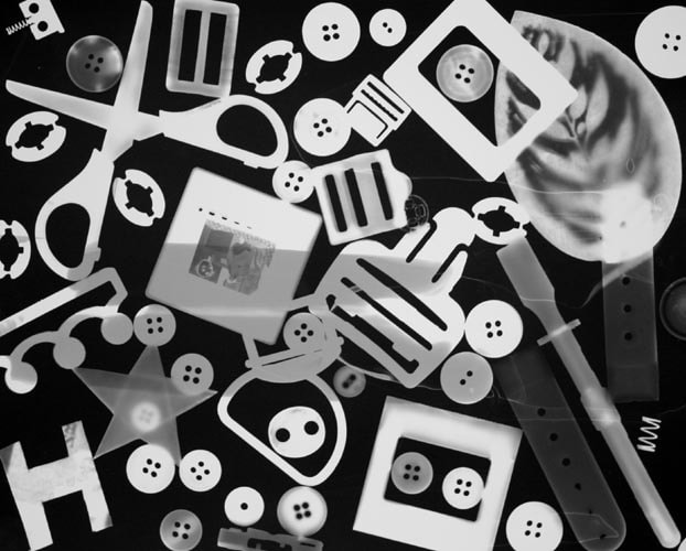
Photograms
Photograms are photos that you make yourself, with photo paper and any objects you want. You make one by placing the objects on the paper and placing light over it for a few seconds. You turn it off and place it in the acid in the dark room and eventually it will turn into a black and white picture.
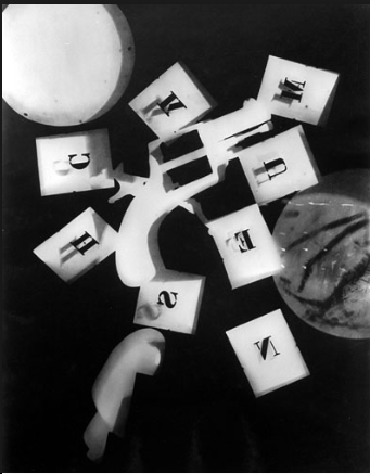
Many artists that focus their photography on photograms, like Man Ray, have very abstract pieces. We were inspired by artists like him to make our own photograms.
These are some photos that Man Ray has made that inspired my own ones.
Many artists that focus their photography on photograms, like Man Ray, have very abstract pieces. We were inspired by artists like him to make our own photograms.
These are some photos that Man Ray has made that inspired my own ones.
Photography research
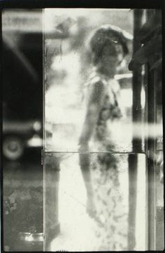
A few photographers and artists which inspired my photographs for my abstract photo book are Aaron Siskind, Alvin Langdon Coburn and Henry Holmes Smith. Here are some pictures from each artist I like the most:
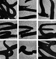
Aaron Siskind-
Aaron Siskind focuses on texture on walls and small details. His photographs are in black and white, maybe because he uses a black and white camera, or maybe because he does photograms.
Aaron Siskind focuses on texture on walls and small details. His photographs are in black and white, maybe because he uses a black and white camera, or maybe because he does photograms.
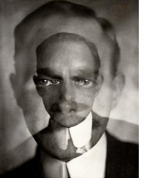
Alvin Langdon Coburn-
Alvin's photography is a lot of pictures layered on top of each other, and it isn't really in colour, but the third picture has a bit of a tint on it. His photos feature people, who don't really have any expression, like the first photo.
Alvin's photography is a lot of pictures layered on top of each other, and it isn't really in colour, but the third picture has a bit of a tint on it. His photos feature people, who don't really have any expression, like the first photo.
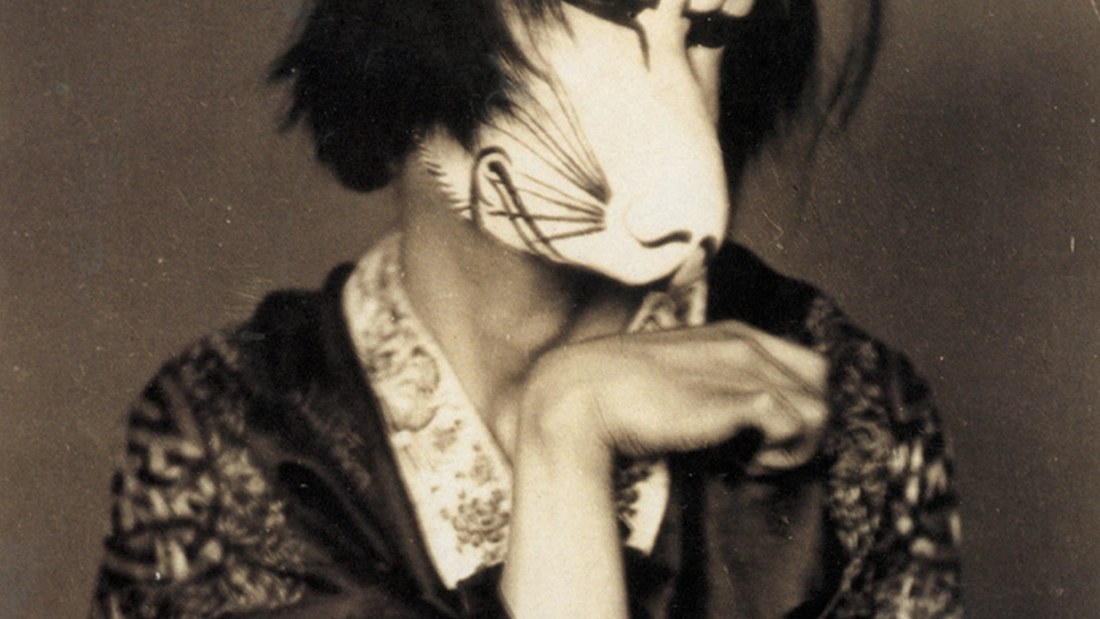
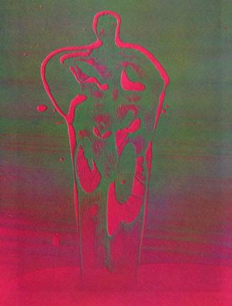
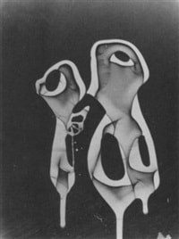
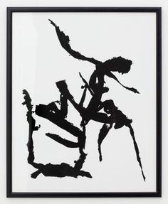
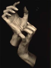
Henry Holmes Smith-
Henry's photographs are very abnormal and don't really feature any people. it's mostly just shapes and colour or dismorphed body parts, like the third and first pictures.
Henry's photographs are very abnormal and don't really feature any people. it's mostly just shapes and colour or dismorphed body parts, like the third and first pictures.
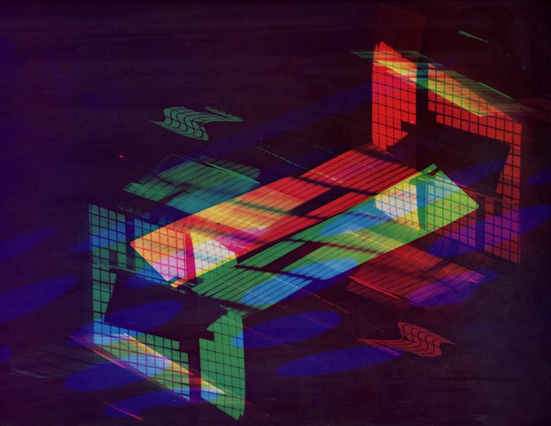
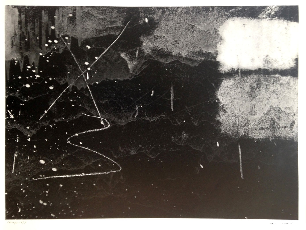
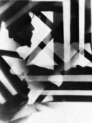
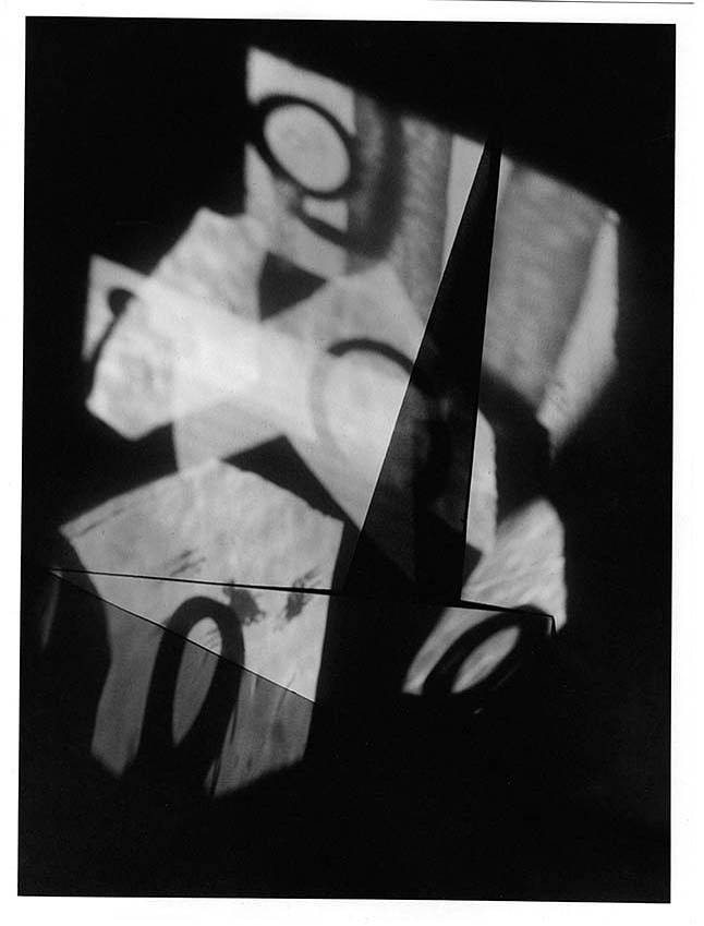
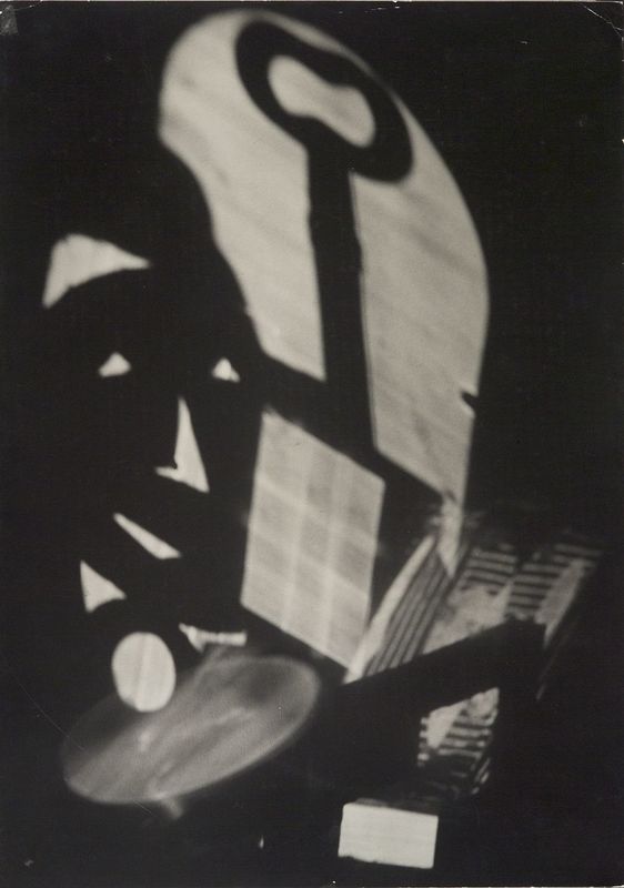
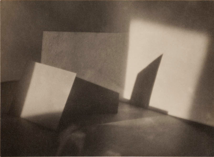
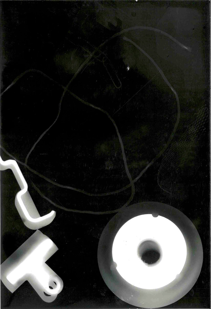
Jaromir Funke-
I like these photos because they mainly focus on light and shadows, and you can't really tell what each object is. Also, in the second image, there are lights which form together to look almost like a face, which was probably an accident but it adds to the picture and looks really good. There are lots of different shapes, patterns and lines in each picture.
I like these photos because they mainly focus on light and shadows, and you can't really tell what each object is. Also, in the second image, there are lights which form together to look almost like a face, which was probably an accident but it adds to the picture and looks really good. There are lots of different shapes, patterns and lines in each picture.
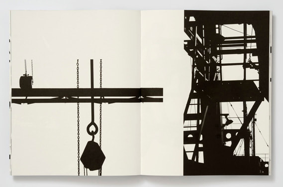
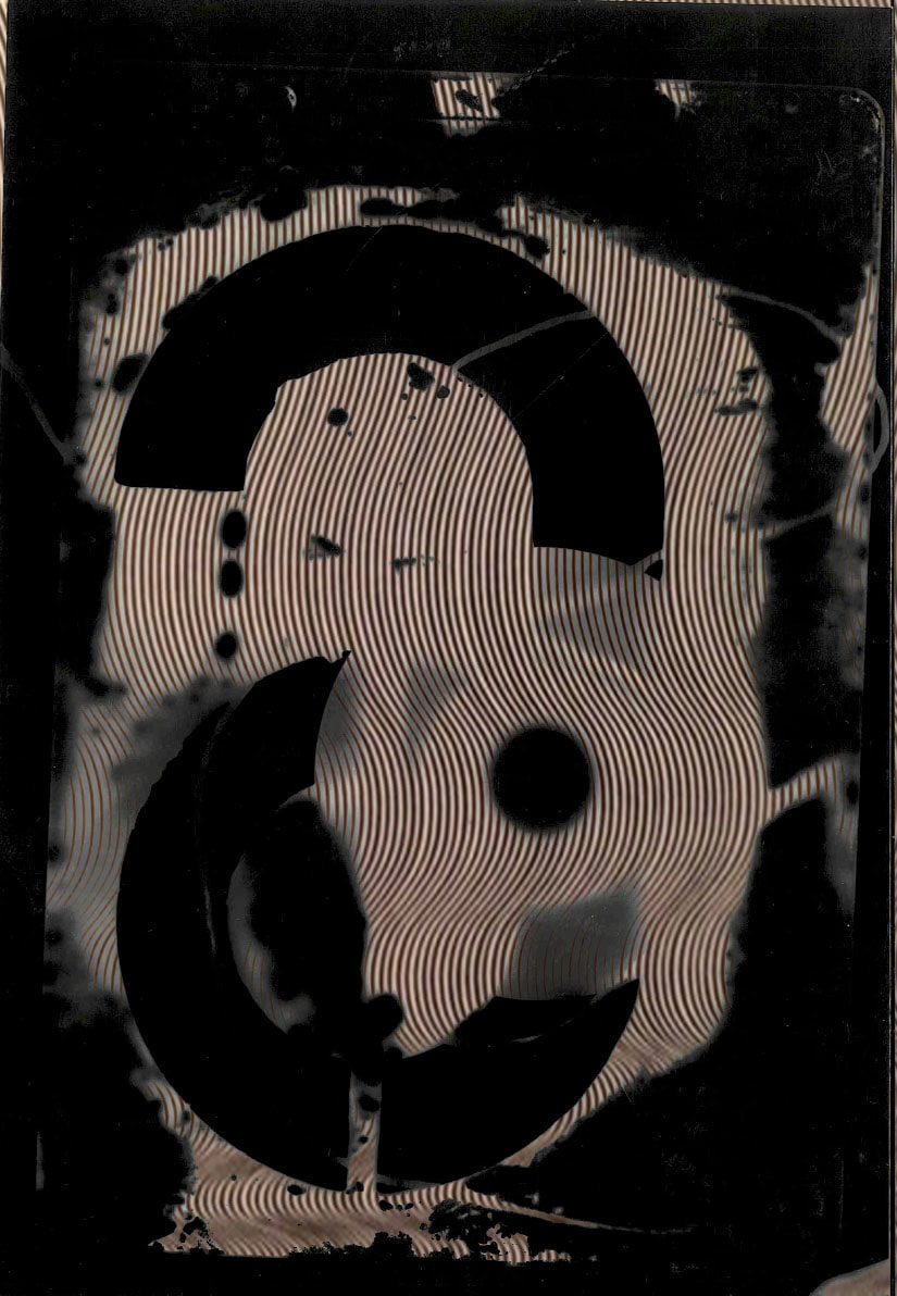
Keld Helmer Petersen-
I like Keld's photographs because each one is reversed, so it is just black and white lines and shapes. This way, you can't tell what any of the objects in the picture are, which makes it more abstract and abnormal since you don't really know what is happening in the picture. I like his style in abstract photography.
I like Keld's photographs because each one is reversed, so it is just black and white lines and shapes. This way, you can't tell what any of the objects in the picture are, which makes it more abstract and abnormal since you don't really know what is happening in the picture. I like his style in abstract photography.
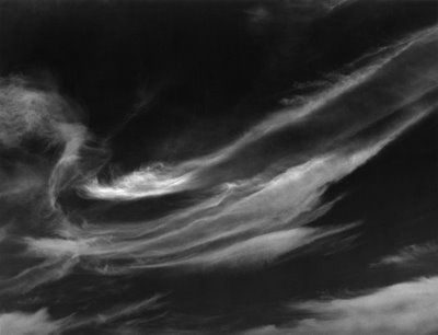
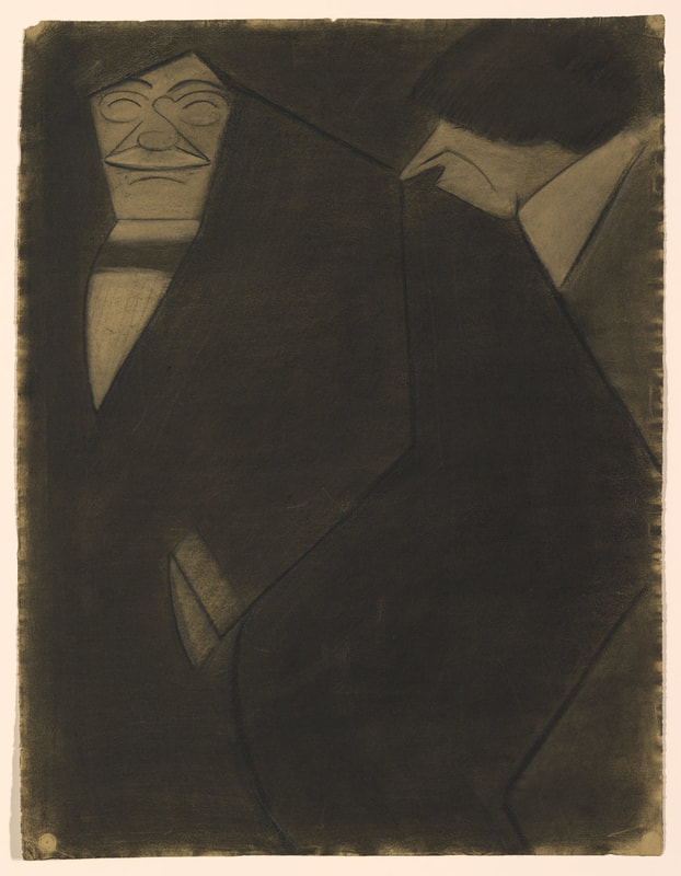
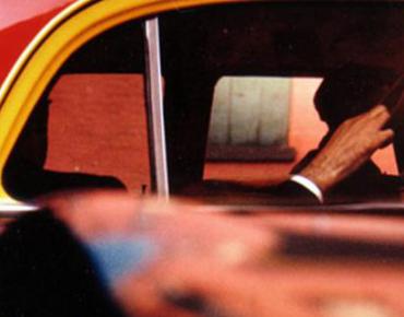
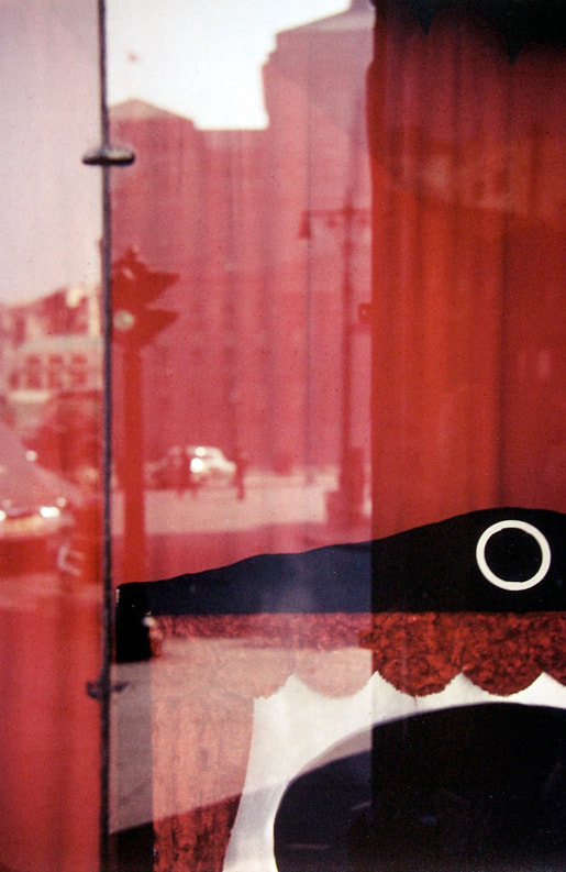
Alfred Stieglitz-
Alfred focuses a lot on clouds and the sky, like the first image. But there are also a lot of other abstract picture, like the third picture. Even though you can tell what it is, you don't really understand why it's happening and what the point of the picture is. Also, the second picture is really strange and we don't know who the men are and what they are doing.
Alfred focuses a lot on clouds and the sky, like the first image. But there are also a lot of other abstract picture, like the third picture. Even though you can tell what it is, you don't really understand why it's happening and what the point of the picture is. Also, the second picture is really strange and we don't know who the men are and what they are doing.
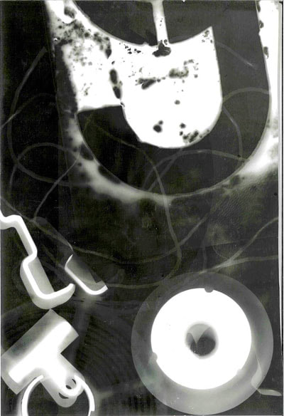
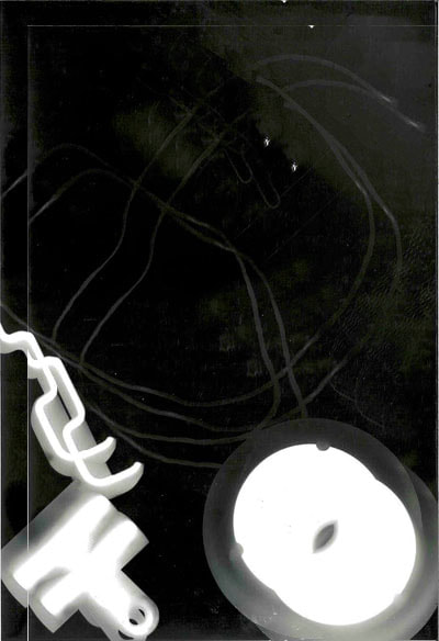
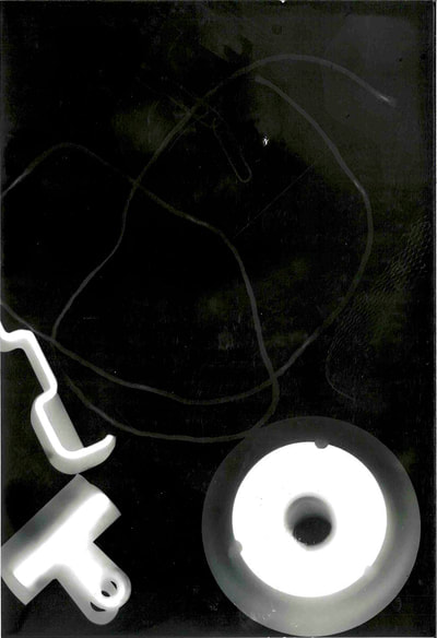
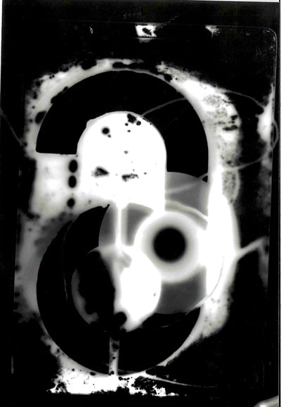
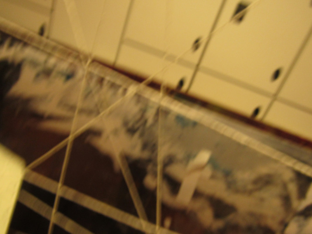
My photograms
In today's lesson, we went into the dark room to take our own abstract pictures. These are the ones that I made-
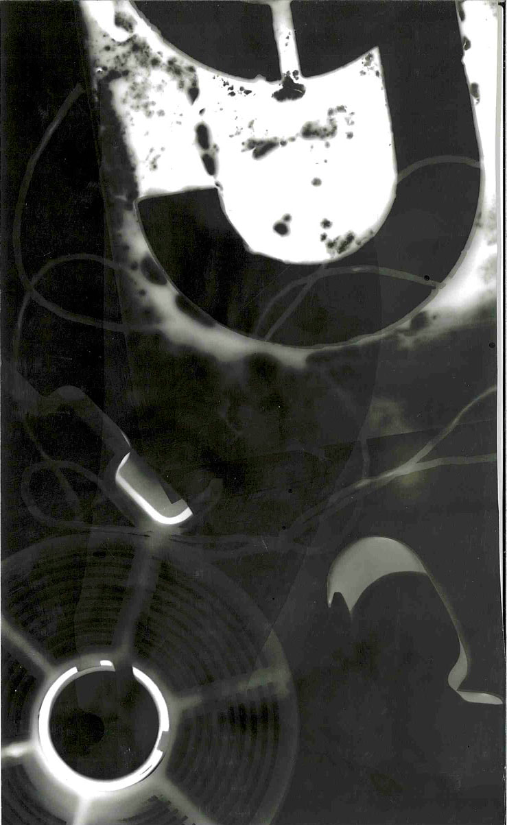
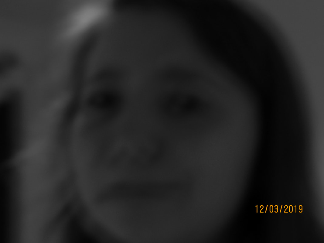
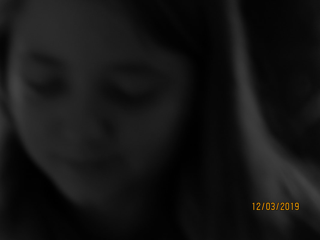
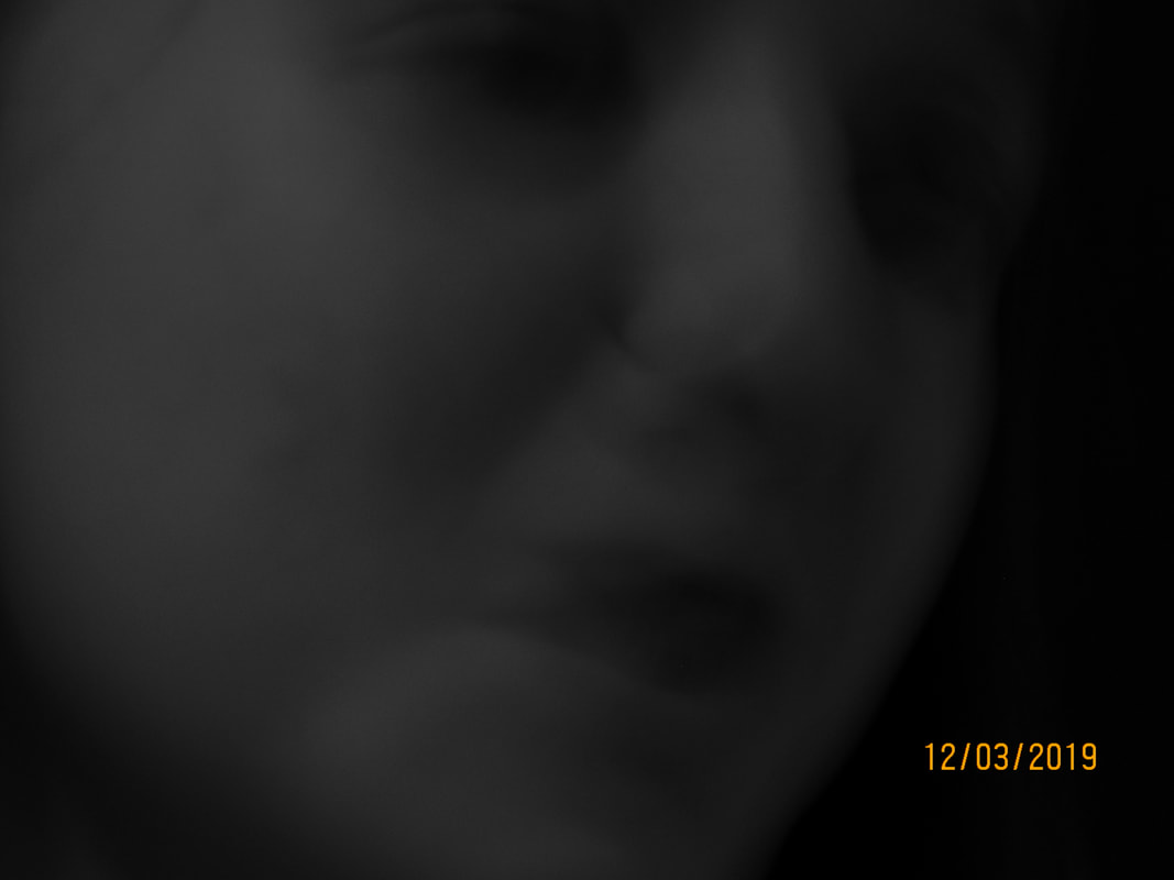
I am very happy with how my images turned out. I think that they are very abstract, as you can not tell what they are, and I really focused on the composition of all the objects I used for each photogram. I used things like signs, string, paper clips and clips. I also used the lens of a camera for one of them, which didn't really turn out how I wanted it to.
I do wish that the objects weren't as out of focus, and more of a harsh contrast instead of a faded blur sort of thing around the edges of each thing, but I am proud of how they all came out.
I don't really like the first photo as much as the other ones, because it's not as clear, and looks more black than I wanted it to look, and you can't really see the items in the picture.
If I were to redo this, I would maybe have the light on the paper longer, so that the objects are more clear.
Abstraction Homework
I really like these photos. Some of them are edited together as a double exposure, so I could play around with textures and colours, etc. I experimented with different techniques and photos, such as shadows, reflection, texture, etc. If I were to redo this, I would maybe edit more photos, try editing with different photos, and layering more than 2 pictures together to see what kind of effect this would give. I also want to try editing with different colours and change how the photo looks with filters and colours. I would take the photos into photoshop and start changing things like colours, exposures, contrast and see what looks best and upload them to my website so I can choose which would look good if I wanted to use it for a final piece to change up my work.
Final piece research
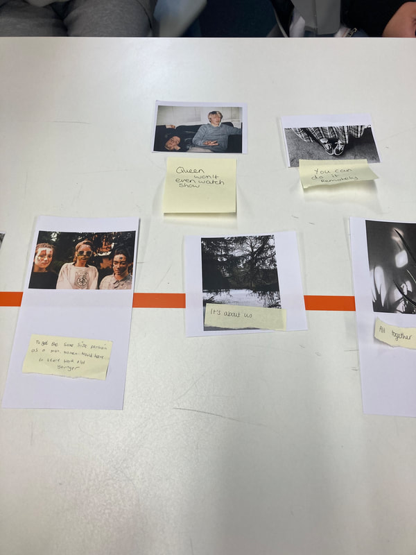
Board with river and leaves:
-Colours match with each other
-Theme is rivers and ripples in the water
-You can't really tell what some images are unless you are told
-I like the layout, and how they are all laid out the same
-Colours match with each other
-Theme is rivers and ripples in the water
-You can't really tell what some images are unless you are told
-I like the layout, and how they are all laid out the same
Photos with abstract words:
-All have the same black and white theme with a boarder
-Don't really understand how the words relate with the images
-I like the concept, and how it is presented
-Very different and haven't seen anything like it before
-All have the same black and white theme with a boarder
-Don't really understand how the words relate with the images
-I like the concept, and how it is presented
-Very different and haven't seen anything like it before
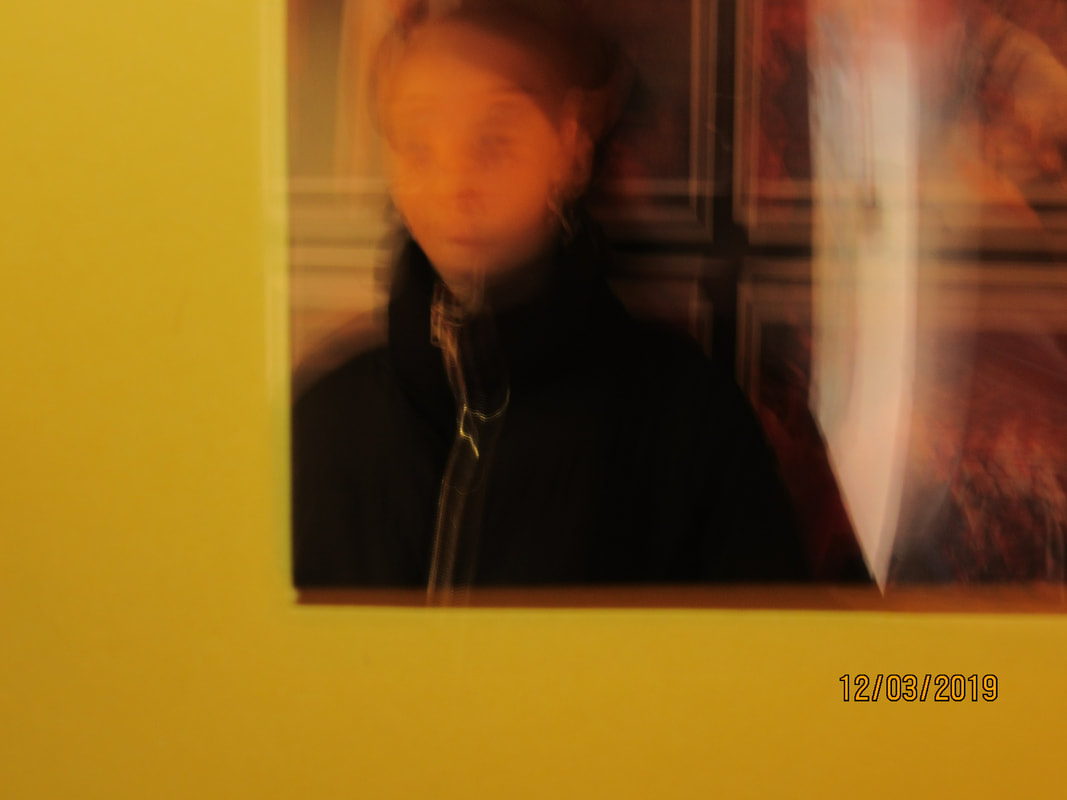
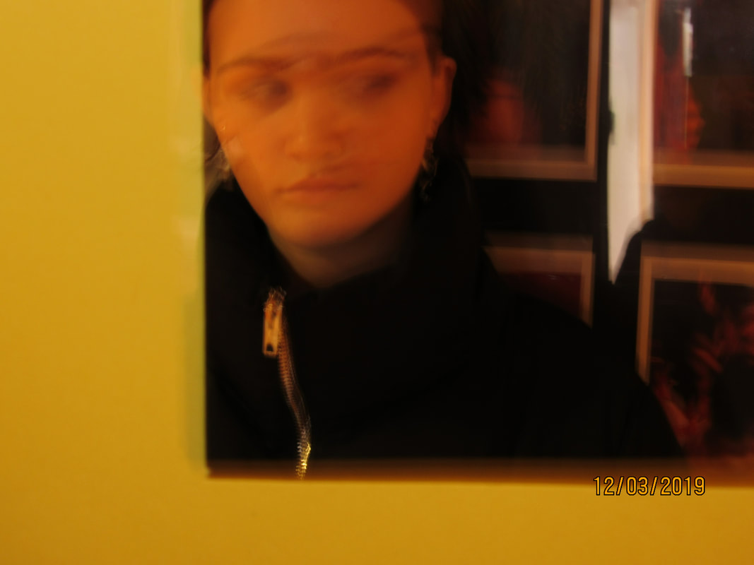
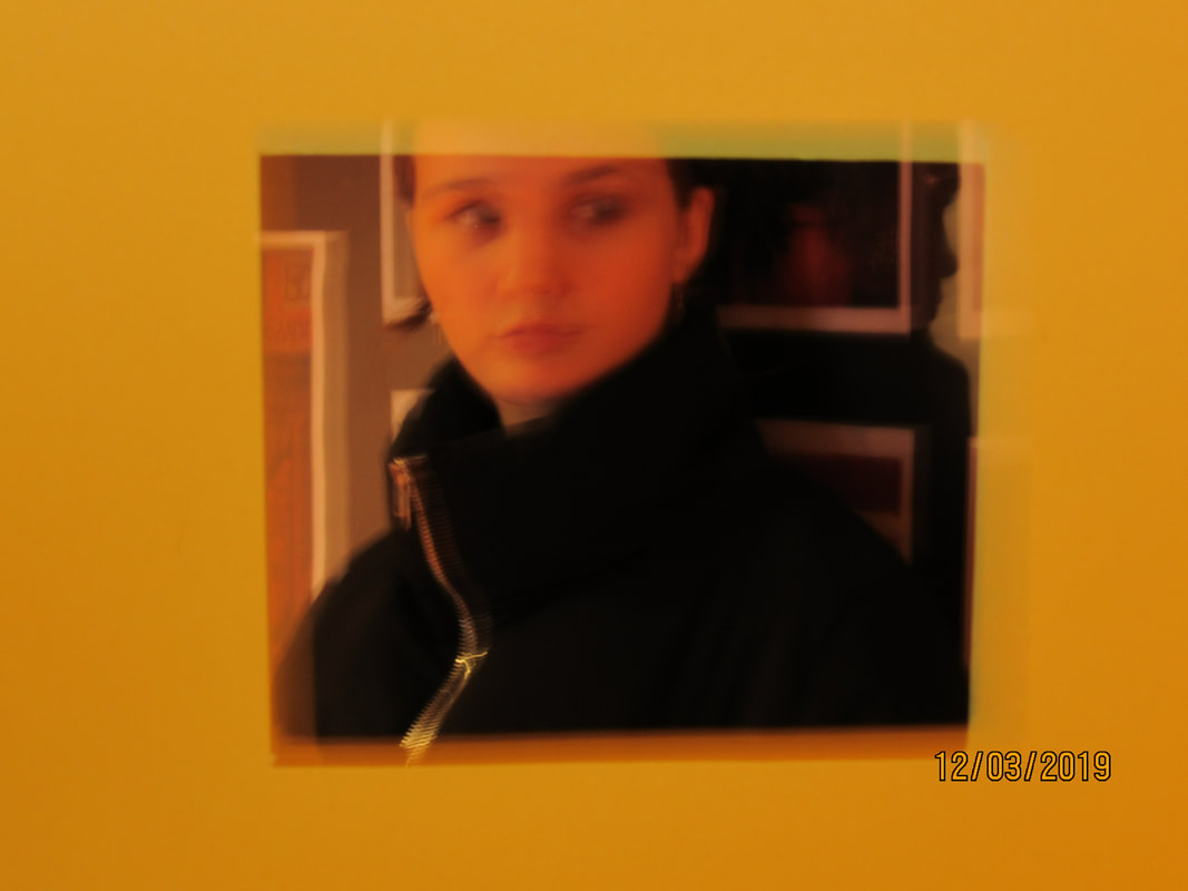
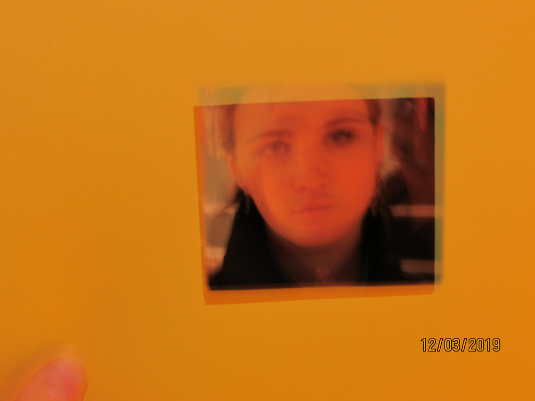
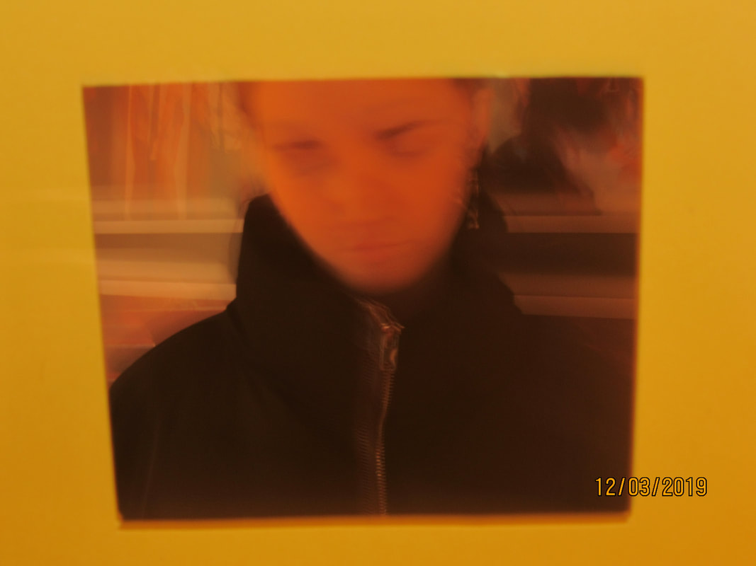
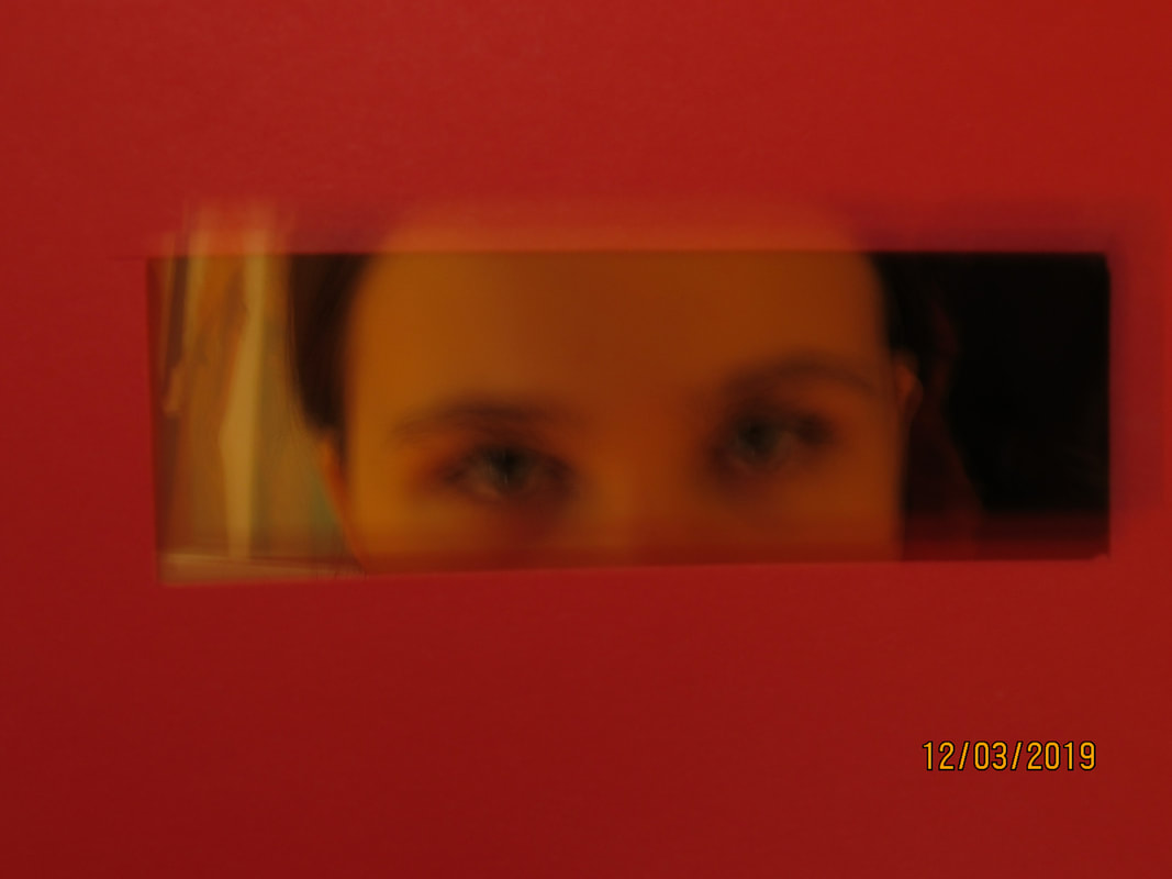
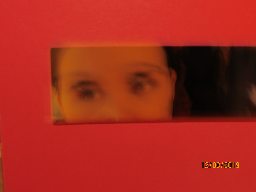
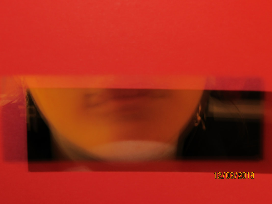
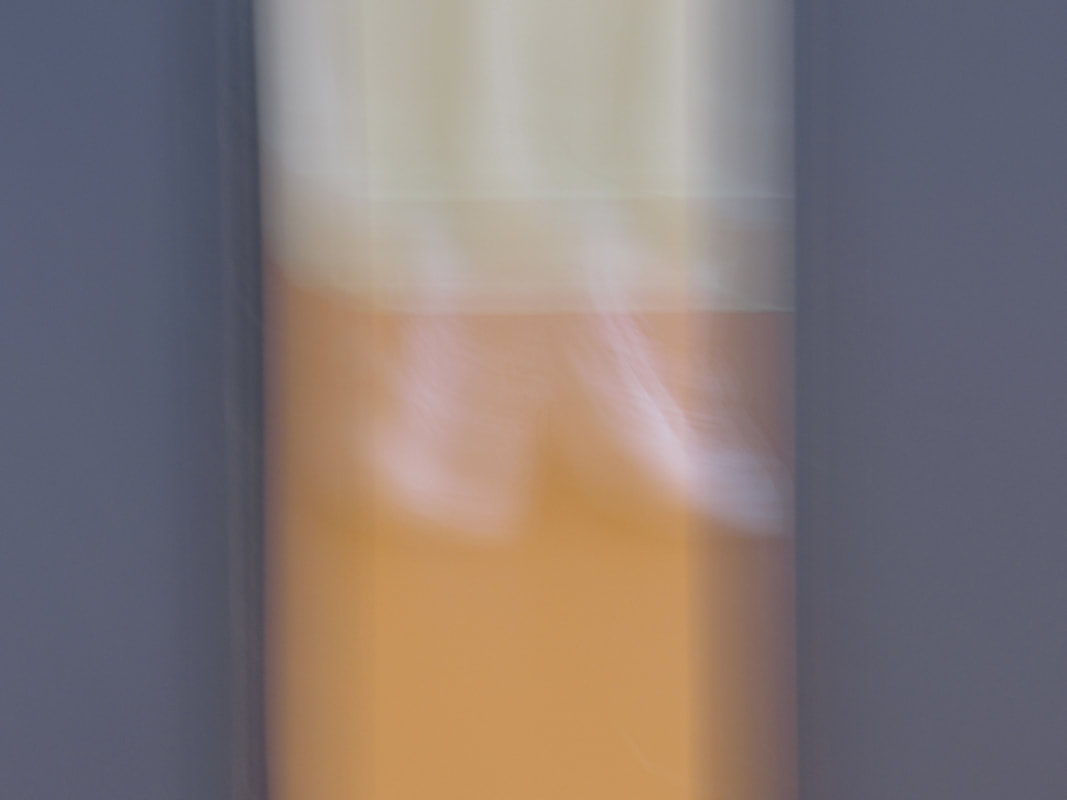
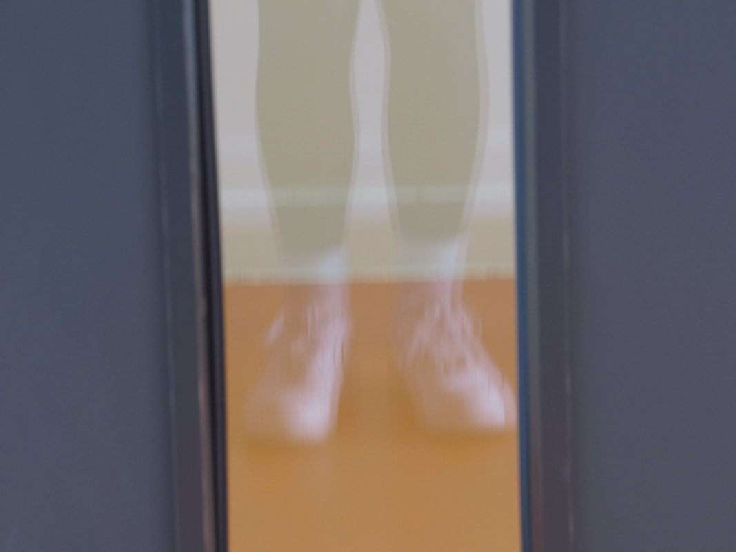
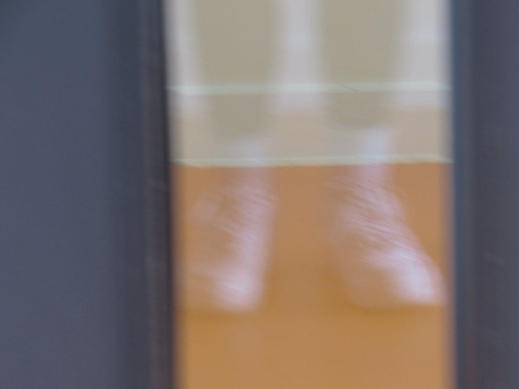
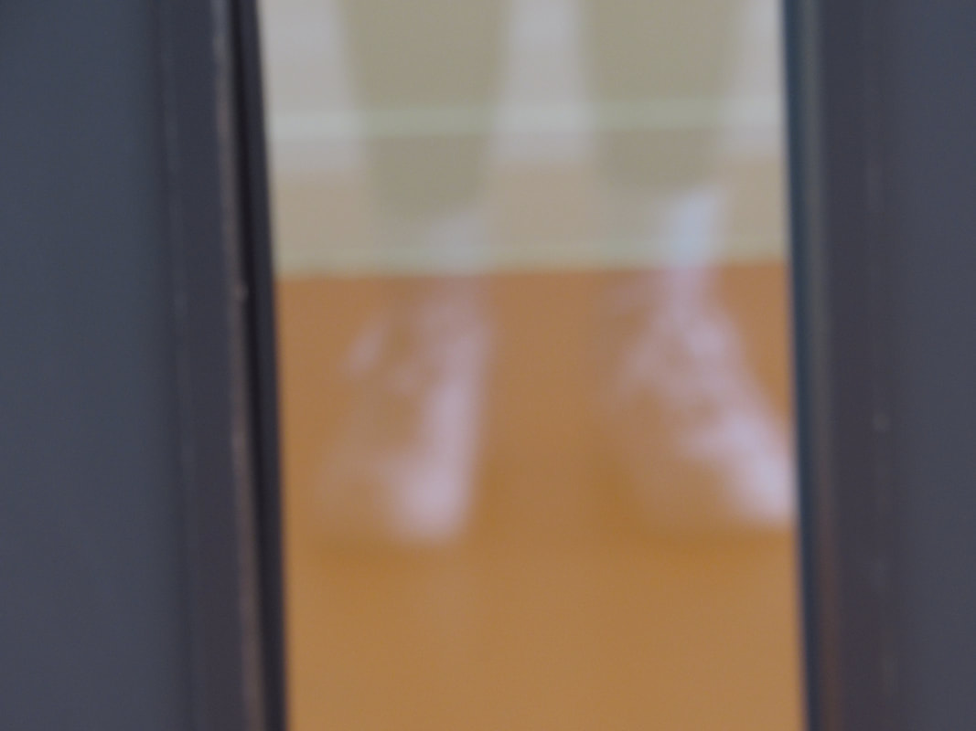
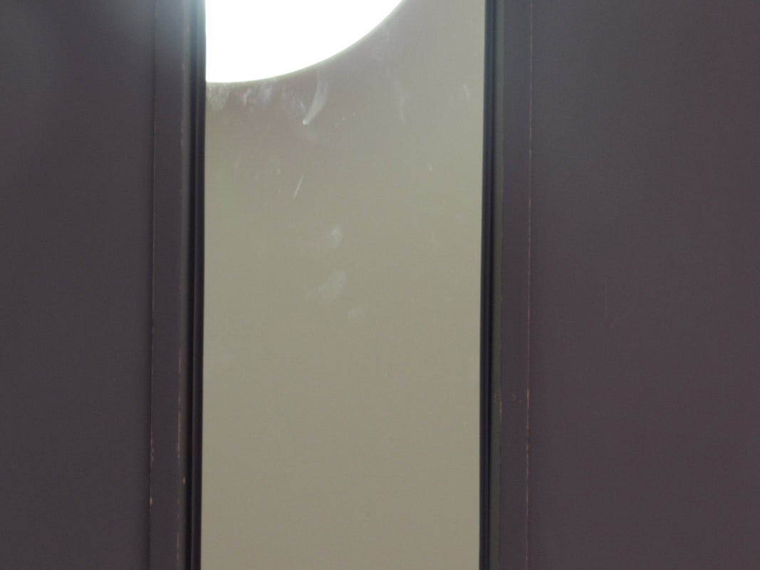
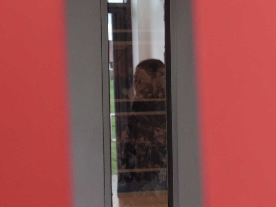
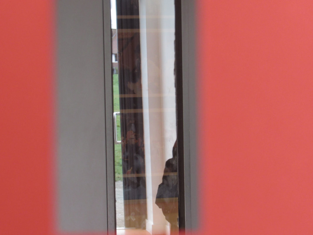
Ripped paper with image behind:
-Simple colour theme, only about 2 or 3 colours
-I like the idea of the picture, I've never really seen anything like it before
-I like the idea of how it's mostly black and the only exposed part is really bright and colourful
-The person ripped a hole in paper and put the camera lens through the rip and photographed what they could see through it
Folded school building:
-I really like the concept of this, and the idea of folding it and it looking really smooth
-The editing that the person did is very good and clean
-It doesn't really look like the school, which adds to the abstract idea
-They put it on a board and folded it at each angle, so it looks 3D
-I really like the concept of this, and the idea of folding it and it looking really smooth
-The editing that the person did is very good and clean
-It doesn't really look like the school, which adds to the abstract idea
-They put it on a board and folded it at each angle, so it looks 3D
Photogram board:
-All of the images are made up of abstract photograms that the person made
-They cut some photograms up and stuck them in different places to change the image up
-I like it because there are some positives and some negatives mixed together
- The person used different objects for each photogram to create this peace, and stuck them all on a board
Sky and clouds board:
-The person only focused on the sky and clouds with their piece
-There is a poem that matches with the theme about clouds, and the layout of the poem is very abstract itself
-Some of the photos are edited and are blue, some aren't edited and are black and white
-I like this piece because the person really thought about the layout, and sticking them in a strange composition, and not just spread around everywhere
Photograms and photographs board:
-I like this piece because there is a big variety of colour and black and white pictures
-I really like the layout of it, there are some circles cut out, and some just regular images
-There is pink and red paint splattered across some pictures which adds colour to the darker photos
-This piece is abstract because there are lots of different shapes added together
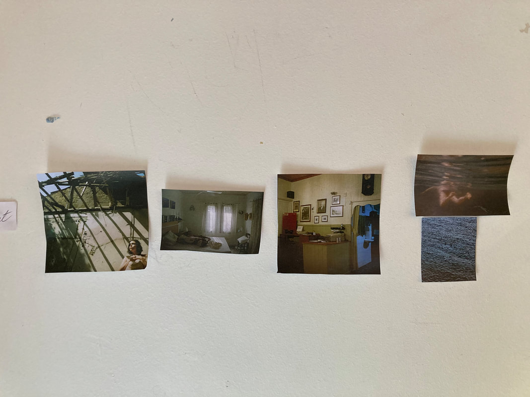
Photobook research
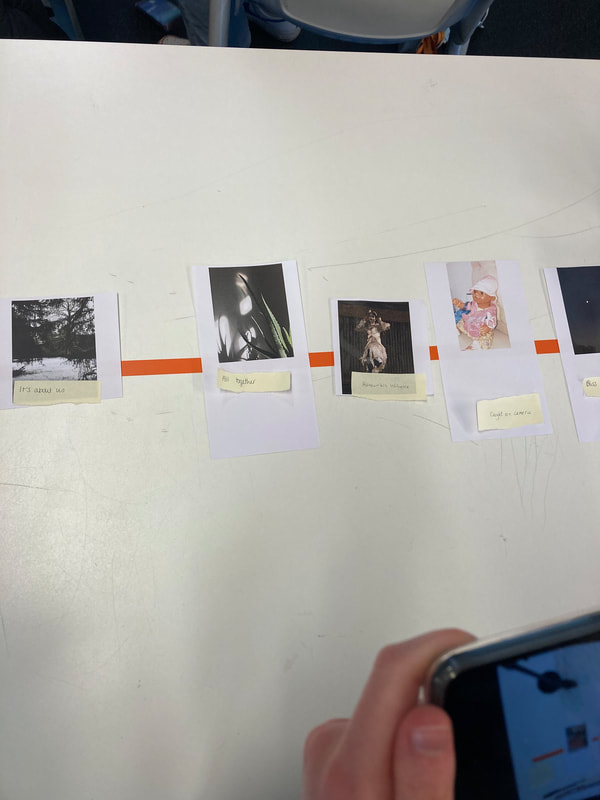
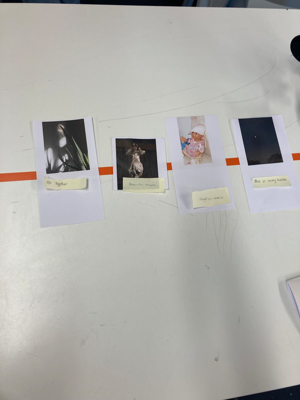
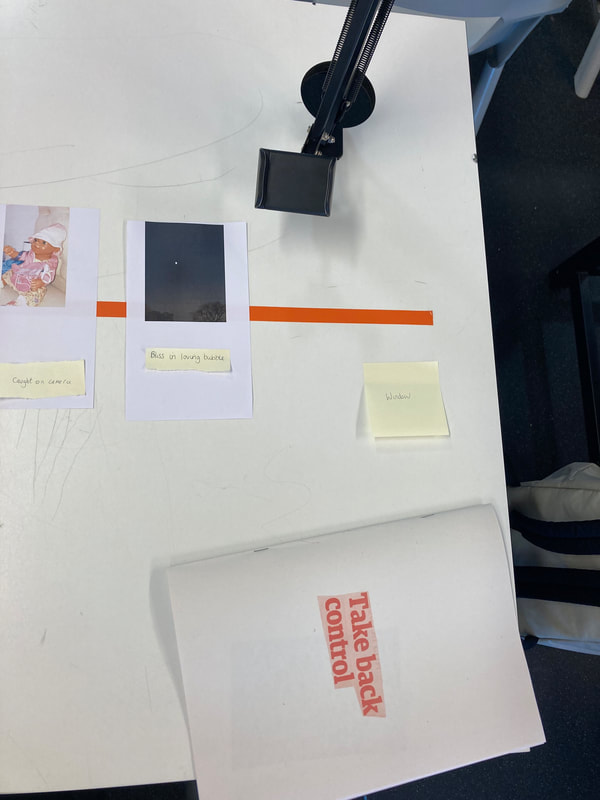
There are a few ways that I could present my piece; I could make a book, I could put my favourite pictures on a board. There is an endless list of things I could do to show my work. Here are some images that have inspired me to show my research.
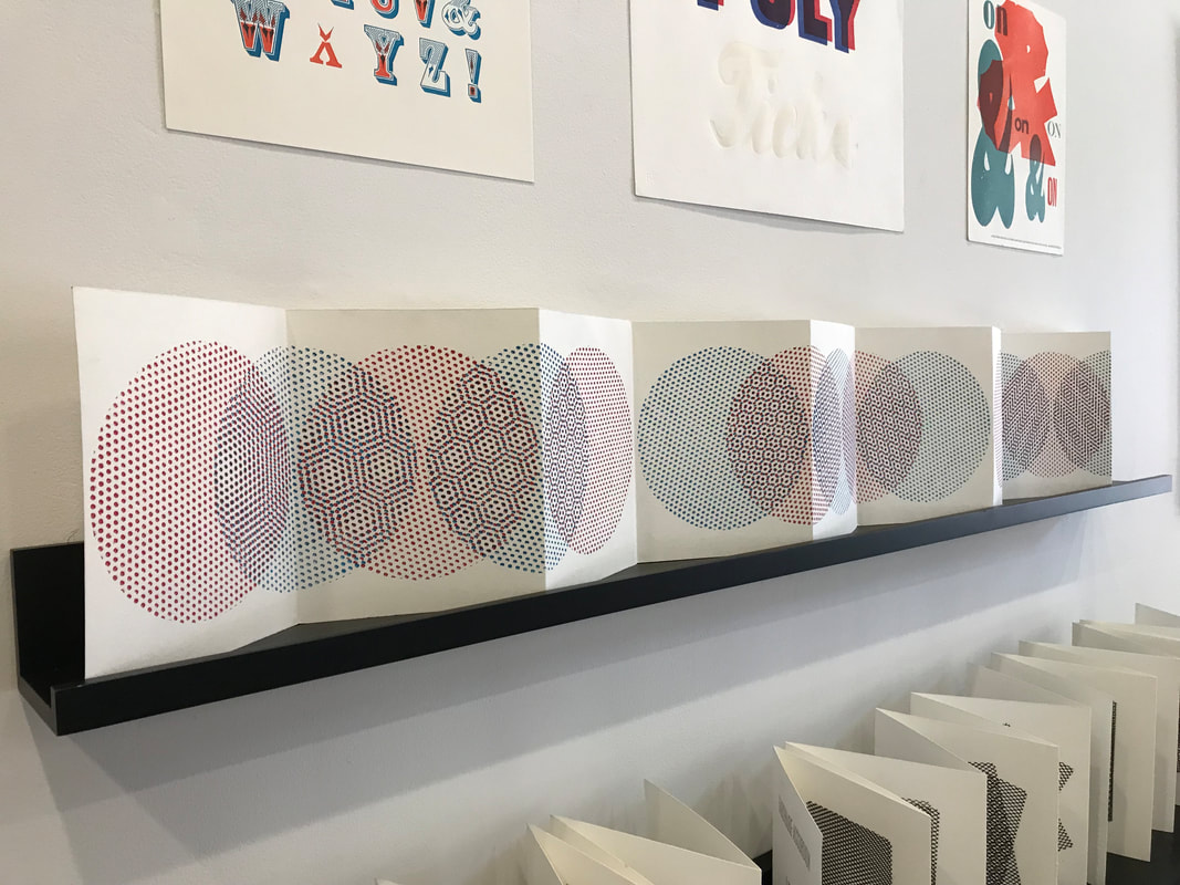
I think the layout of my photobook will be quite simple, so that the focus is more on the photograms/photographs, but I want to have one of my photos on the whole of the front page, like the fourth picture. I also want to stitch the perimeter of the book, like the second picture. I will lay my photos out like the third picture, but I might have it like the first picture, where it's all just folded together and will come out almost like a popup book.
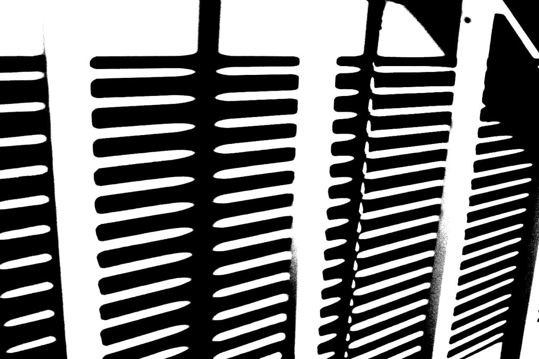
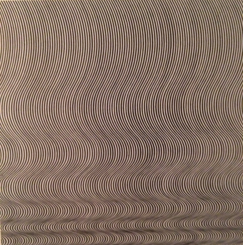
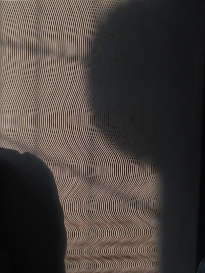
How to take pictures like Keld Helmer Petersen
- Black and white outline
- Think about the formal elements space, shape, light, value/tone and line
- Take pictures mainly of lines and building sites
- Make sure there is a lot negative space around the main part of the image
- Think about the composition of the lines
- Make sure the photo is in focus, can't be blurry
- No people in the photos, only outside and buildings
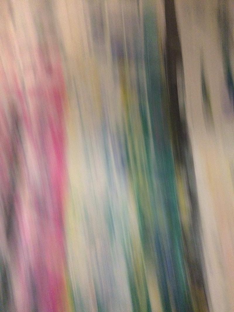
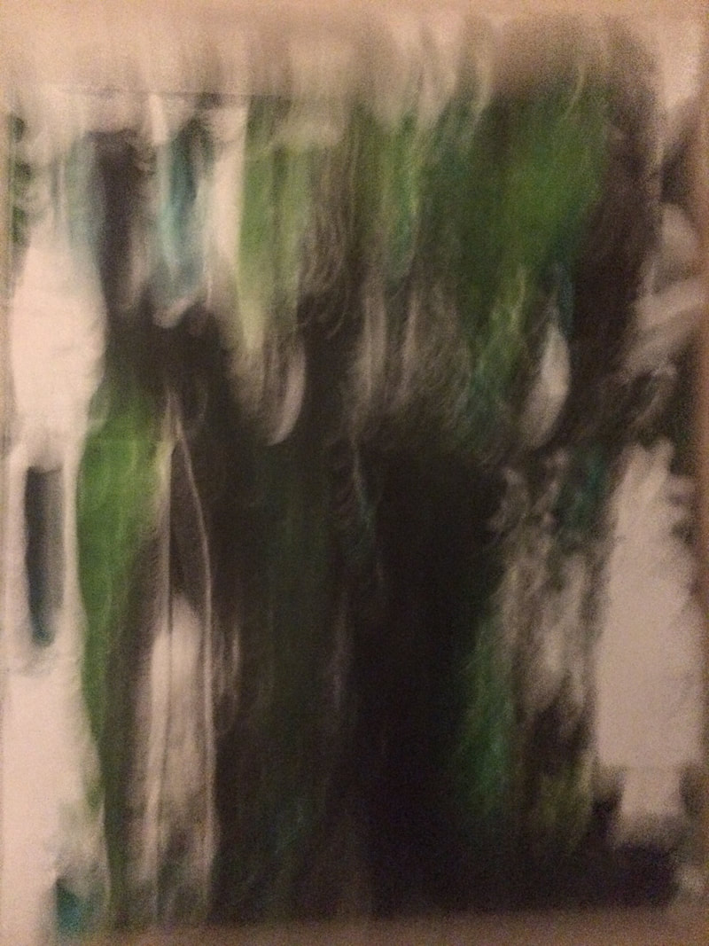
Edited abstract photos
To make these photos, I got one of my photo (in the first one I used a photogram, and in the second one I used a photo) and another picture on top of it in photoshop and changed the transparency of the photo so that you could see both the photogram and the photo. I like them because the lines make the photo look really different and it adds the formal element 'line' to it. If I were going to redo this I would try adding new photographs instead of the lines, to see how it looks different.
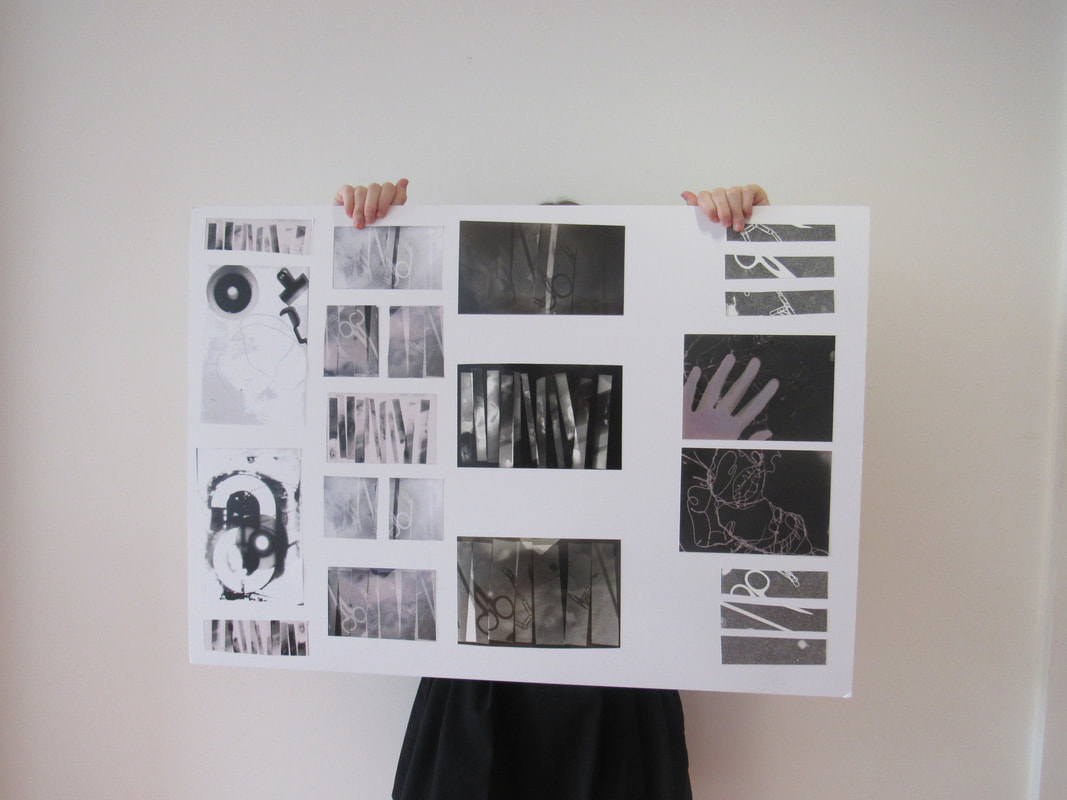
Abstraction photo book
Our homework for the half term was to take 30 abstract pictures.
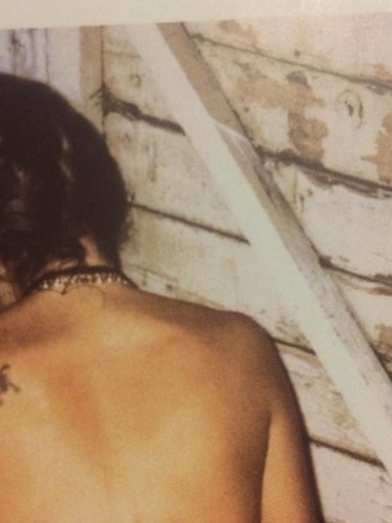
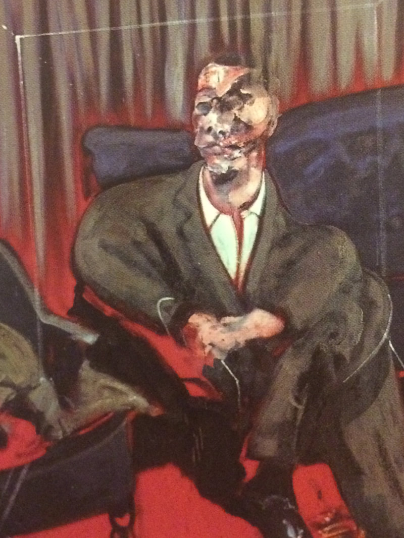
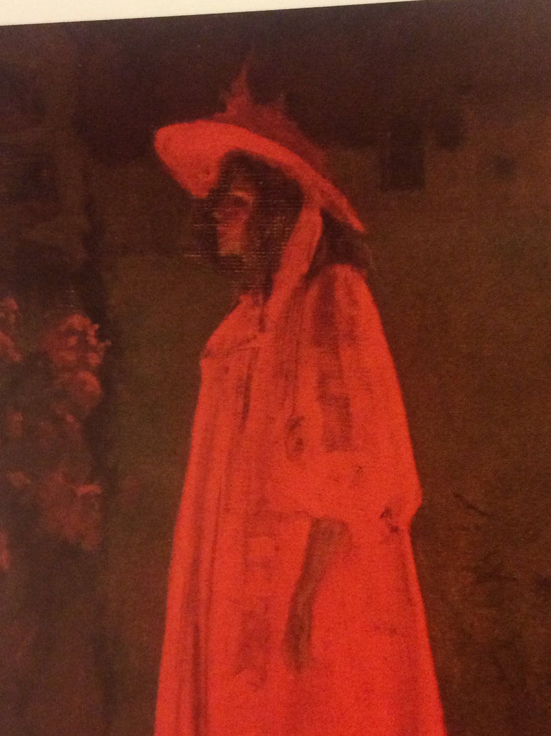
I'm really proud of these photos. I took photos at different angles so you could see different perspectives of the object, and used flash on some of them so that the lighting is different. I also made sure that some lights were on so that there were shadows on the objects. However, there are some photos I don't like, such as the photos of the art, because it's not my photography. I think if I were to redo this, I would not take photos of other photos/art, and find something else to photograph, or maybe edit photos together so I get different variations of my work.
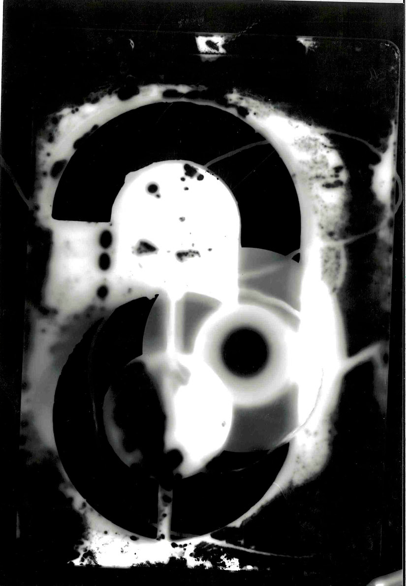
Abstract photograms + duotones
Our task today was to cut up old photograms and lay them out in a different order. We then had to expose them on the enlarger and put them in the acids. The dyes go onto the new photo paper and create a new photogram.
Then, we had to invert the image on Photoshop so that the colours went the other way around. These are my photograms before inverting and after inverting on Photoshop.
Then, we had to invert the image on Photoshop so that the colours went the other way around. These are my photograms before inverting and after inverting on Photoshop.
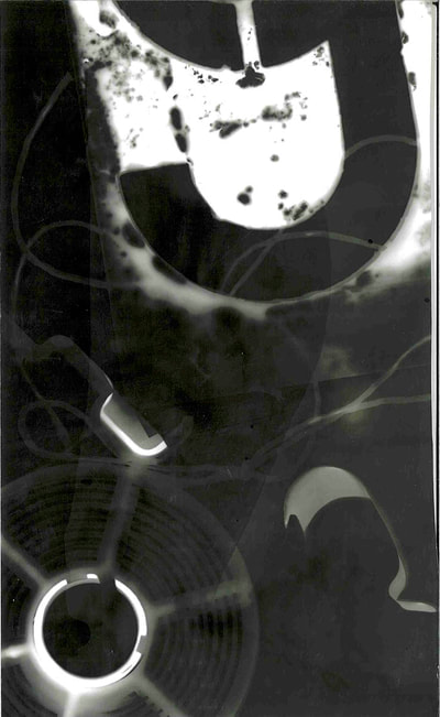
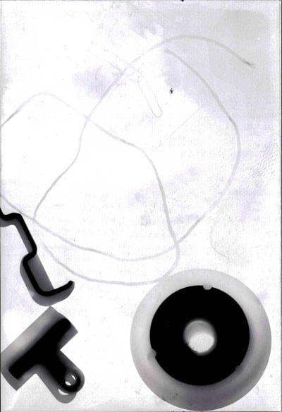
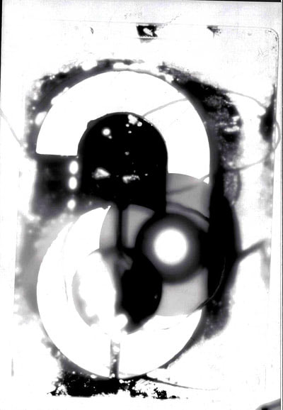
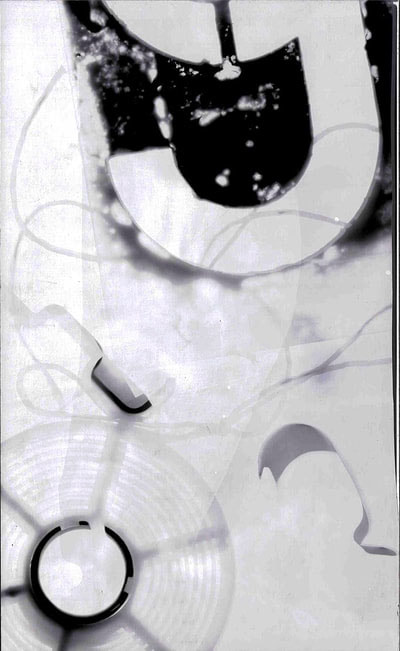
Before I made my photograms, I wasn't sure if they would work, considering it is just putting paper on paper and putting it in acid. But, I was really surprised with how they all turned out. I like the idea of mixing all the different cards around, and even adding more pictures to the strips. The duotones look even better, in my opinion. But, I prefer the first photogram more than the duotone/inverted version of it, just because I think you can tell what it is a bit more, and it is much clearer. I will definitely try more variations of this technique for my work, and try editing more things on photoshop to get better variations of my work.
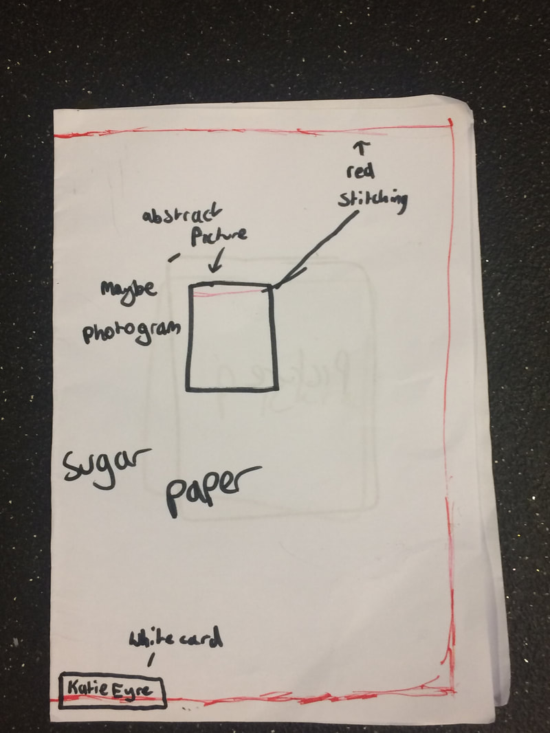
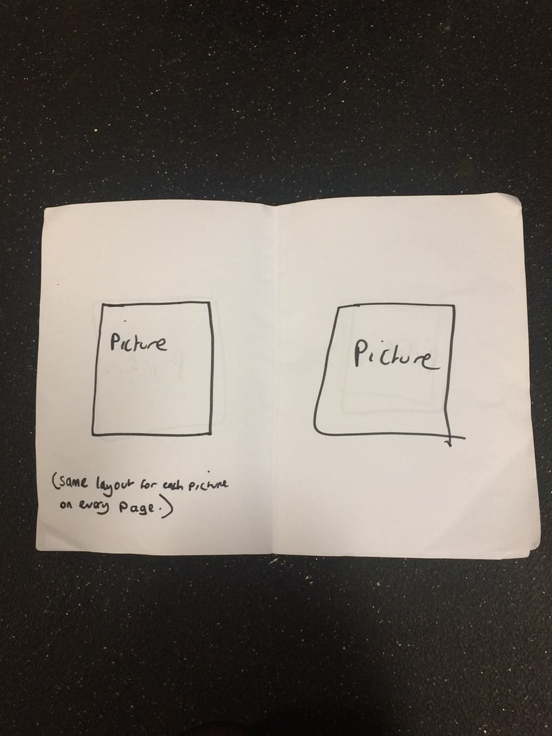
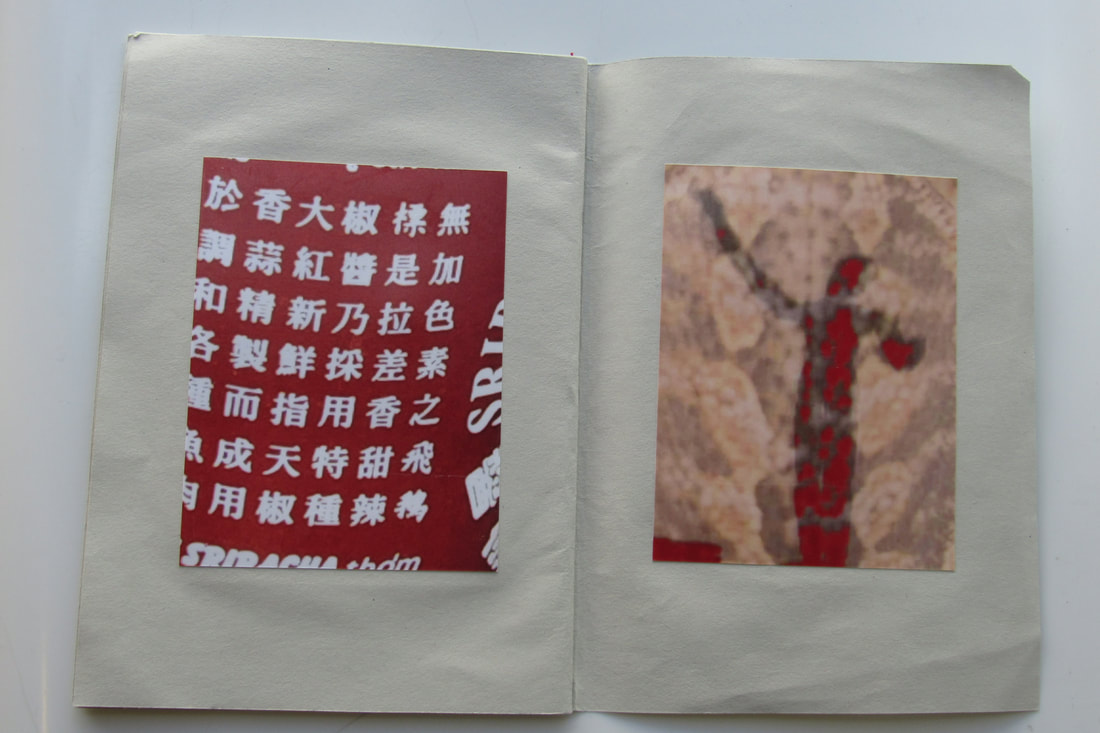
Dummy photo book
Our homework was to create a dummy version of the photo book ideas we have. Here is what mine looks like.
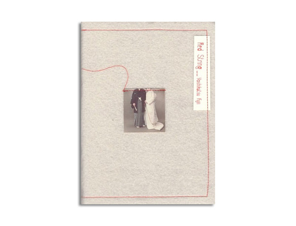
Finished photo book
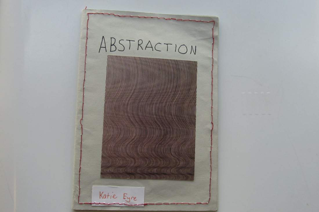
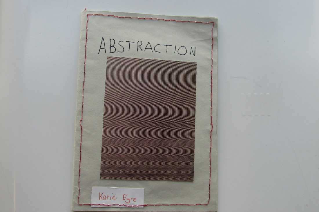
I am very happy with how my photobook turned out. I like the red stitching around the edges, which is exactly how I pictured it looking. What I would do to improve it if I did it again would be to print out the title on the front page so it looks neater.
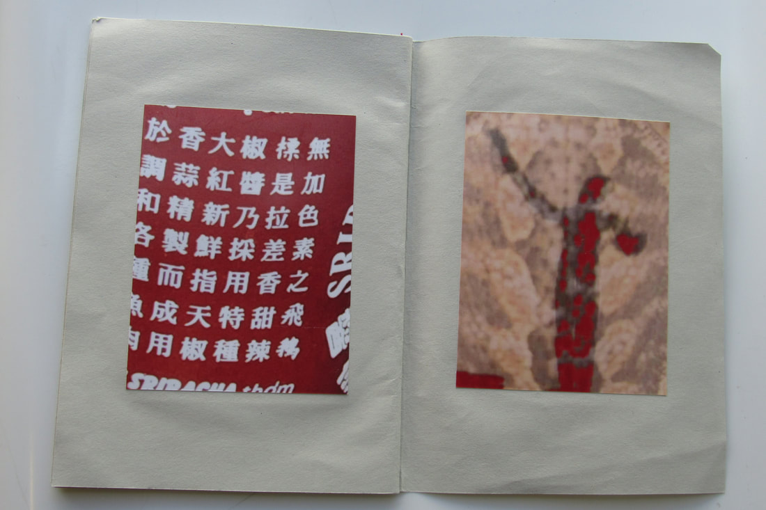
WWW- I completed my photobook, and it looks exactly like I pictured it to be. The photos in it are the ones I picked out to put in my book.
EBI- I made it look a bit neater and more professional, by making the font on the front cover neater by printing it out, or by making the stitching straighter.
WWW- I completed my photobook, and it looks exactly like I pictured it to be. The photos in it are the ones I picked out to put in my book.
EBI- I made it look a bit neater and more professional, by making the font on the front cover neater by printing it out, or by making the stitching straighter.
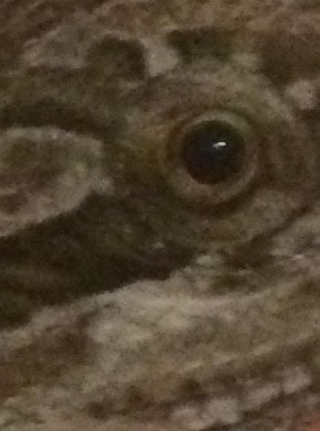
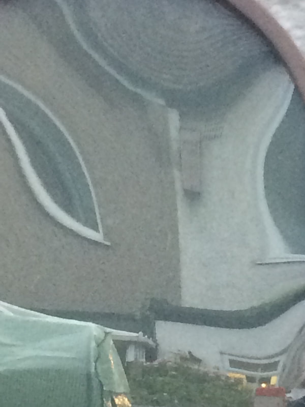
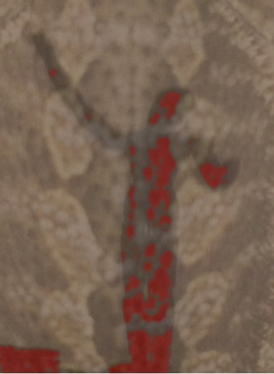
Photos in the style of a photographer
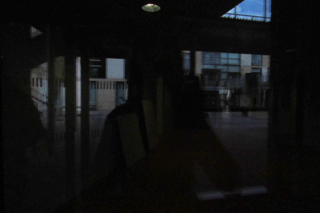
In this lesson, our task was to go out and take photos in the style of an abstract photographer. I chose to do mine in the style of Alvin Langdon Coburn, and because he uses double exposure, I wanted to edit them on Photoshop.
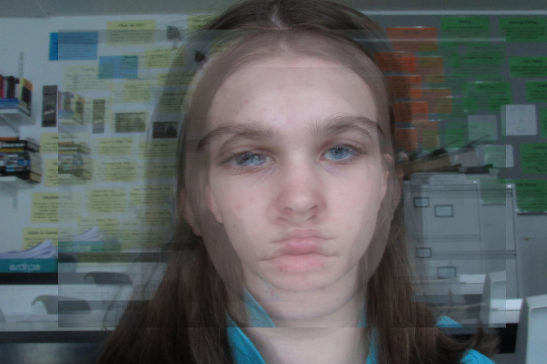
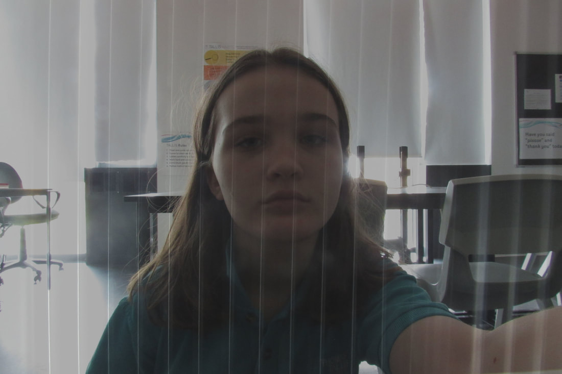
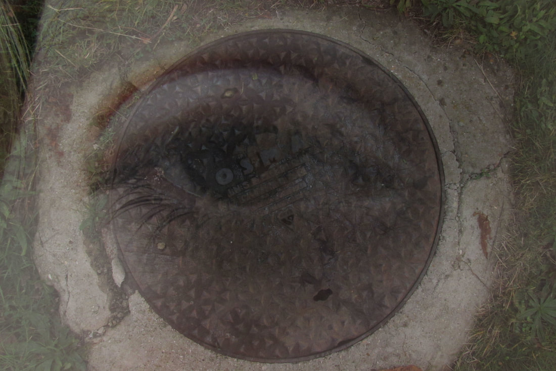
I think my favourite photo is the first photo, because it is really interesting, and I based the editing from one of his pictures, which is just someone sitting and it has the same picture pasted over it, but it is zoomed out and faded out. I like the last one too because the eye lines up with the sewer grate, and it is still double exposure which is still in the style of his photography.
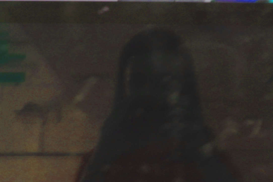
One thing I would change is that the second and fourth pictures are too dark, so I would either lighten them with editing, or retake them and make them visible.
One thing I would change is that the second and fourth pictures are too dark, so I would either lighten them with editing, or retake them and make them visible.
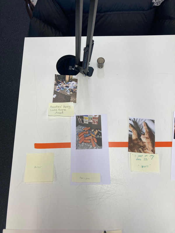
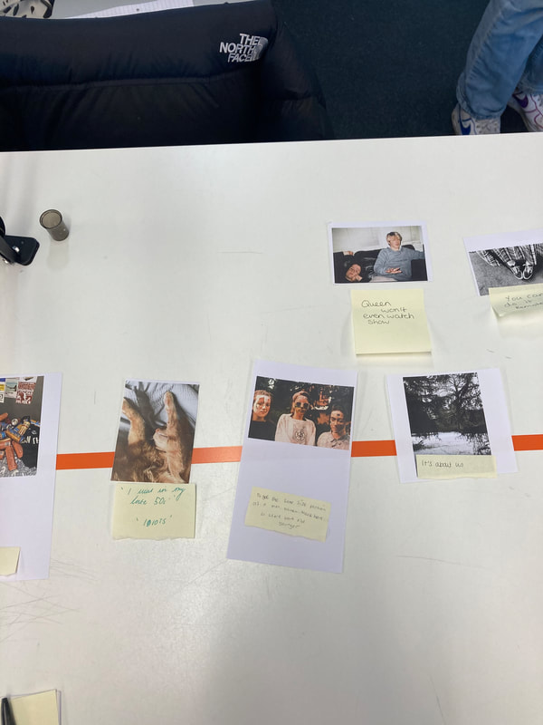
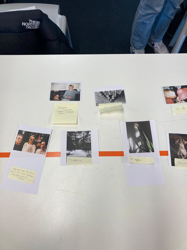
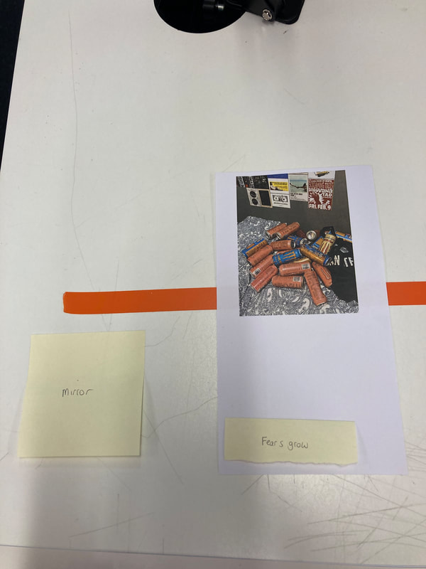
Finished photo board
For the past few lessons, we have been collecting photos to put on a board as a final piece for abstraction. I am really happy with how mine turned out. On the right hand side is all my abstract photograms, and on the left hand side is the inverted ones, which I edited on Photoshop.
The only thing I would change is that because the photogram side is very subtle and not crowded, but the inverted side is, I would maybe add more photograms, or cut up ones, or I would remove some inverted photos, just to balance it out. I may also change that the photos on both sides are different, so I would maybe have done an invert for each photogram, and laid it out exactly the same on both sides, just different techniques for each.
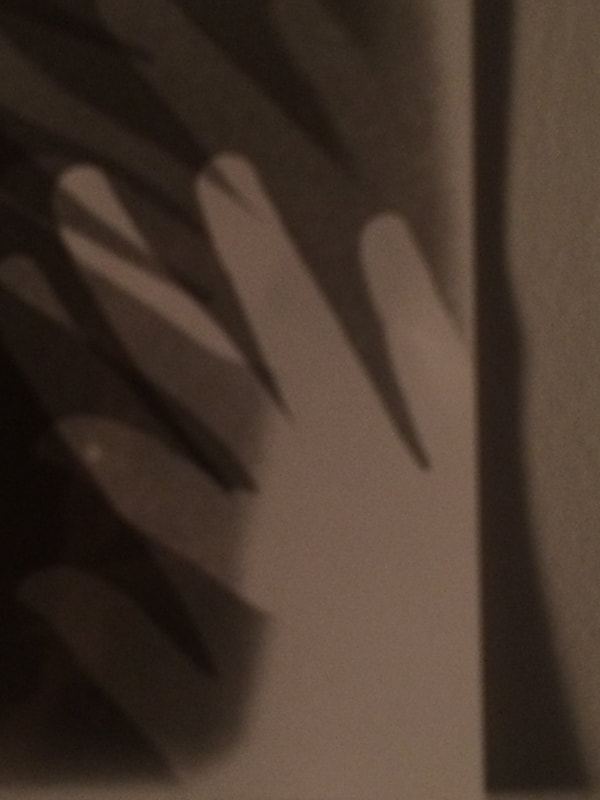
I think that my favourite photograms are the hand and the line model underneath it. I like them because the acid and the time I had them in the acid kind of changed the colour of the subject to a more pink/purple, which adds a bit of colour to the board, considering all of the pictures are black and white.
The only thing I would change is that because the photogram side is very subtle and not crowded, but the inverted side is, I would maybe add more photograms, or cut up ones, or I would remove some inverted photos, just to balance it out. I may also change that the photos on both sides are different, so I would maybe have done an invert for each photogram, and laid it out exactly the same on both sides, just different techniques for each.
I think that my favourite photograms are the hand and the line model underneath it. I like them because the acid and the time I had them in the acid kind of changed the colour of the subject to a more pink/purple, which adds a bit of colour to the board, considering all of the pictures are black and white.
Abstract Photoshop
Out task in todays lesson was to go over some tabs on our website and find a few pictures that weren't abstract, and we put them into photoshop and edited them into abstract photographs. These were the photos I edited.
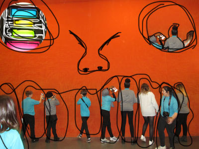
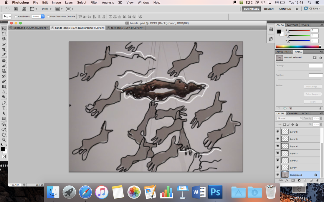
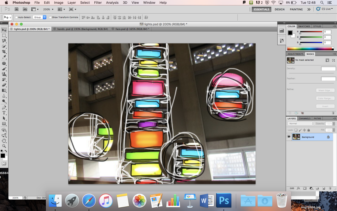
To create these, I took the clone stamp tool and selected which area of the picture I wanted to clone, and placed a few prints around my images. I also got the paintbrush tool and circled around the images and harsh lines so they stood out. The second and third were abstract, but the first image is more humorous, and one of our challenge tasks was to create a humorous photo. It looks like a face, because all the people are the teeth in the mouth, the clone stamps are the eyes and I drew a nose in the middle.
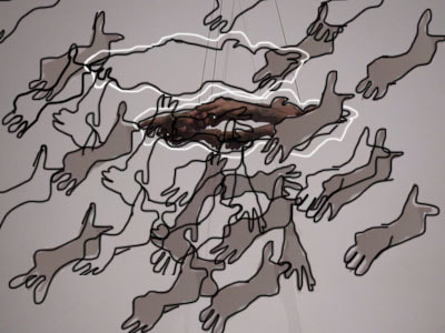
Also, to get the shadows from the hands in the second image, I used the magnetic lasso tool and cut out one hand that was on the shadow in the original photo and pasted it around the photo so that it was more spread around. I then took the clone stamp and copied some of the lines that were on the hands, and spread them around the photo.
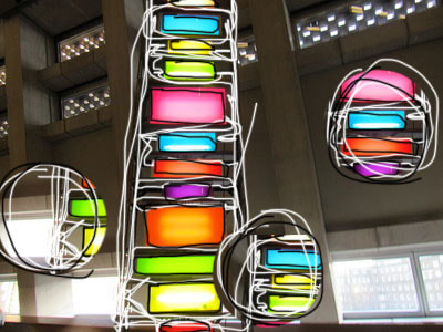
WWW- I created 3 abstract photos on photoshop, and used different tools to make them look more abstract, which I am very happy with how they turned out. I also took one part of the light image and put it into another photo.
EBI- Next time, I would experiment with more photos, and maybe used more tools to give them each a different look, since they all have clone stamps and paint circled around each one.
EBI- I wish I had experimented with more photos, and different editing techniques to make each of my images more different from each other.
Also, to get the shadows from the hands in the second image, I used the magnetic lasso tool and cut out one hand that was on the shadow in the original photo and pasted it around the photo so that it was more spread around. I then took the clone stamp and copied some of the lines that were on the hands, and spread them around the photo.
WWW- I created 3 abstract photos on photoshop, and used different tools to make them look more abstract, which I am very happy with how they turned out. I also took one part of the light image and put it into another photo.
EBI- Next time, I would experiment with more photos, and maybe used more tools to give them each a different look, since they all have clone stamps and paint circled around each one.
EBI- I wish I had experimented with more photos, and different editing techniques to make each of my images more different from each other.
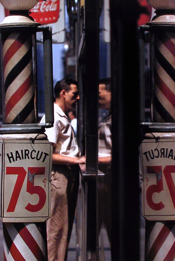
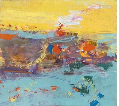
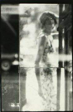
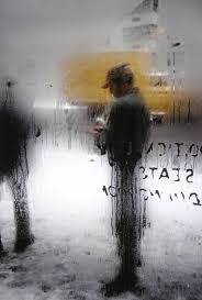
Saul Leiter
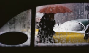
Saul Leiter was an American photographer and painter, and decided to start painting at the age of 23, after he left theology school. By the 1950s, he began to work in colour. His distinctively subdued color often has a painterly quality that stood out among other pieces of work. Leiter is now very well known for his early color photography.
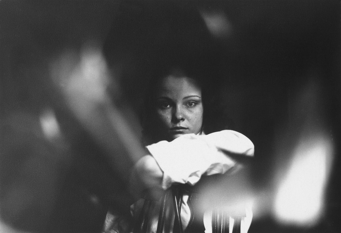

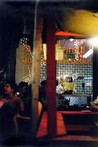
This image is my favourite Saul Leiter photograph. I like it because you can't really tell what is happening, and it is very abstract. Leiter's approach to photography is very different, since I haven't seen many photos like his before, and his style is very unique. I think the formal element that matches this photo the most is line, since it is a bunch of lines put together to make a photo.
Saul Leiter paintings
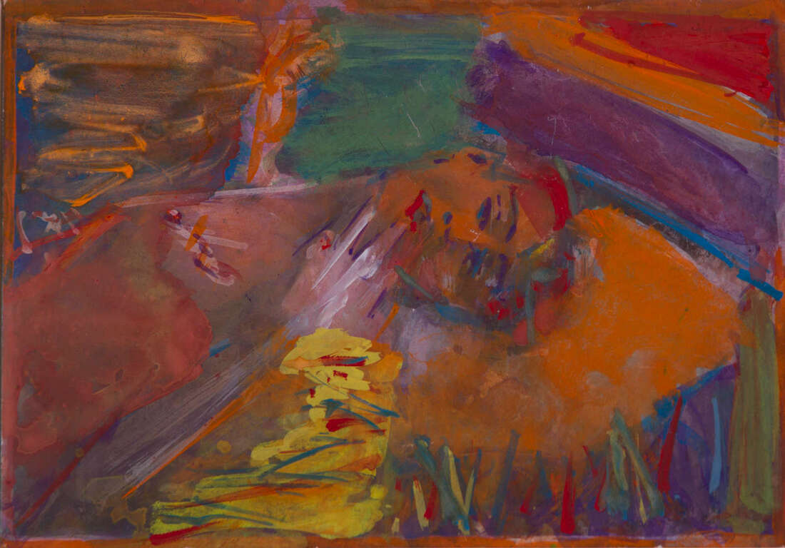
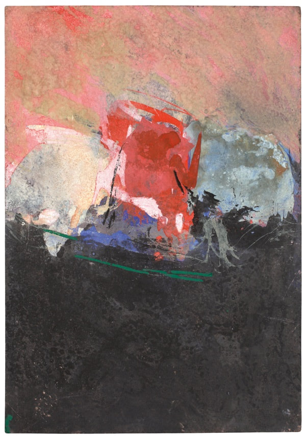
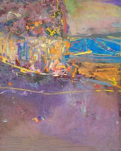

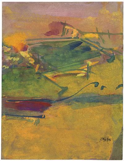
Saul Leiter's paintings are very colourful, which correlate with his photographs. His photographs are known for being taken in colour, so the fact that his paintings are also very colourful isn't surprising. You can't really tell what is in each painting, which is what makes them all so unique and abstract, because we each have our own interpretation of what could be the subject.
In a way, I think that these images are very identical. This is because there is a person in the middle of the photo and a background around them. The composition of the model in the photo is in a similar place as the painting. The colours are different, though, since the photograph has dull colours and is in black and white, but the painting is vibrant and colourful.
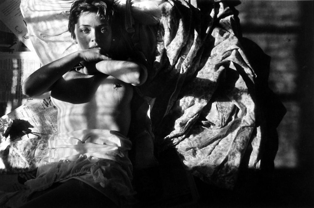
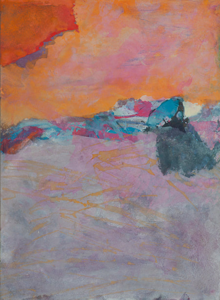
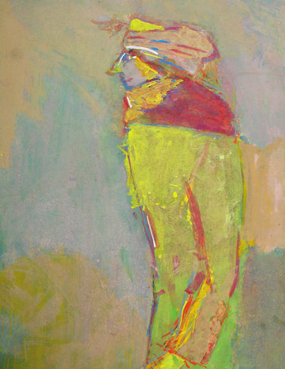
Painting a Saul Leiter photograph
Our task was to paint our own version of one of Saul Leiters photographs. The photo on the right is the original photo that I was painting, and the photo on the left is my painting.
I think the proportions on my painting are very different to the original photo, but I would not be able to get them to match up perfectly. The colour matches are quite similar though, but I wish that the lighting was darker so it looked the same. However, you can definitely tell that this is the photograph I was painting.
Photographs inspired by Saul Leiter
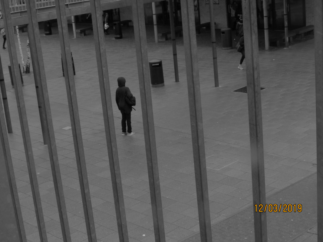
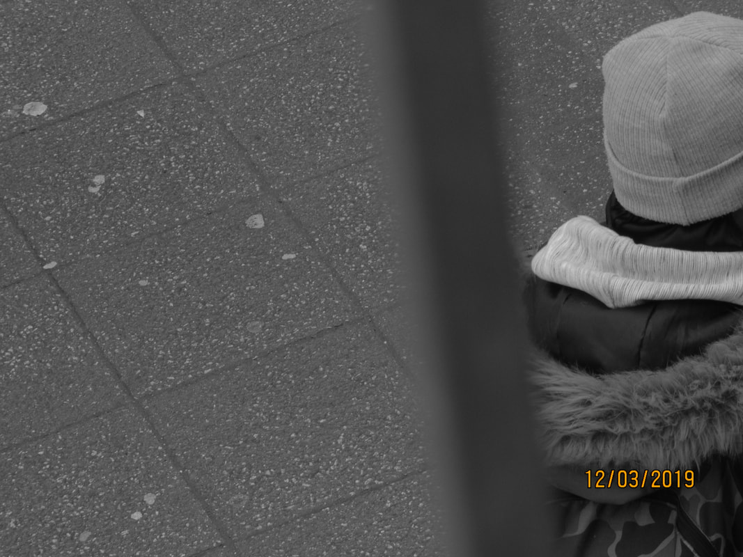
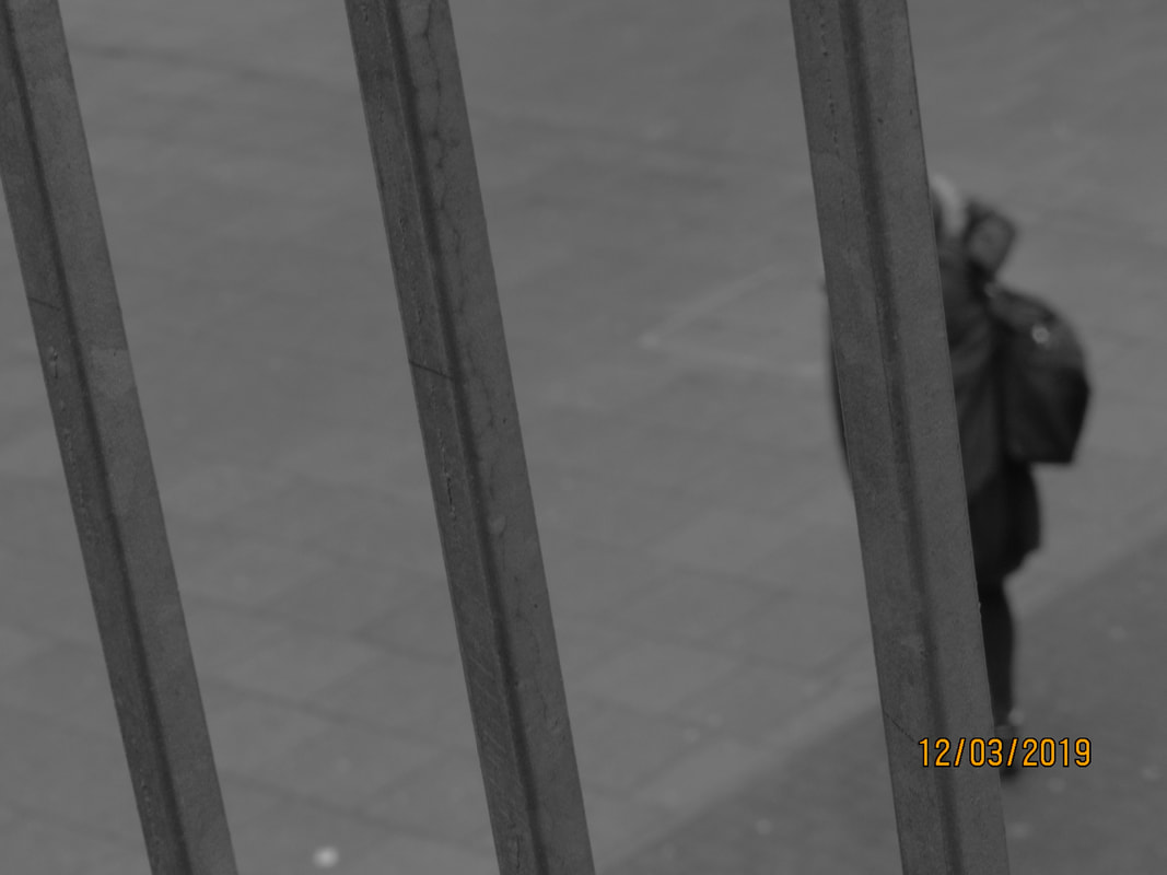
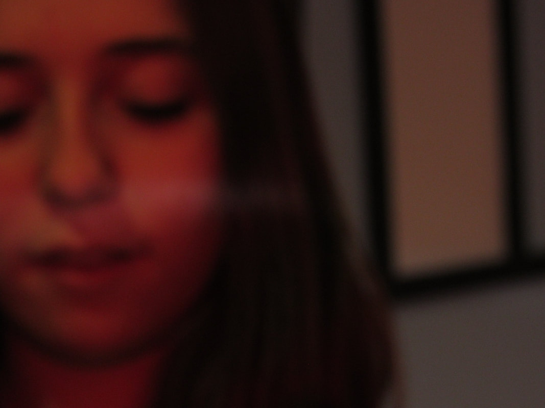
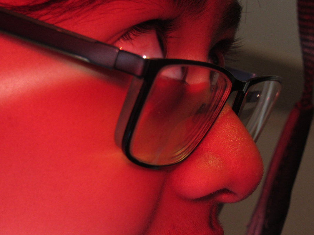
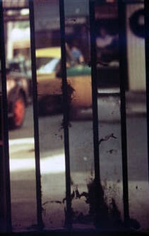
These photos were inspired by Saul Leiter. In the first set of grey photos, I thought about composition of the gate, to try and get the fence to be out of focus, and the background to be in focus. I used a variety of different items to make the photos different, for example, for the last 4 photos, I covered the flash with my finger to get the red filter. I also used coloured acetate over the lens to colour it. Next time, I would like to experiment with different camera settings to make my images different.
Finished board
|
|
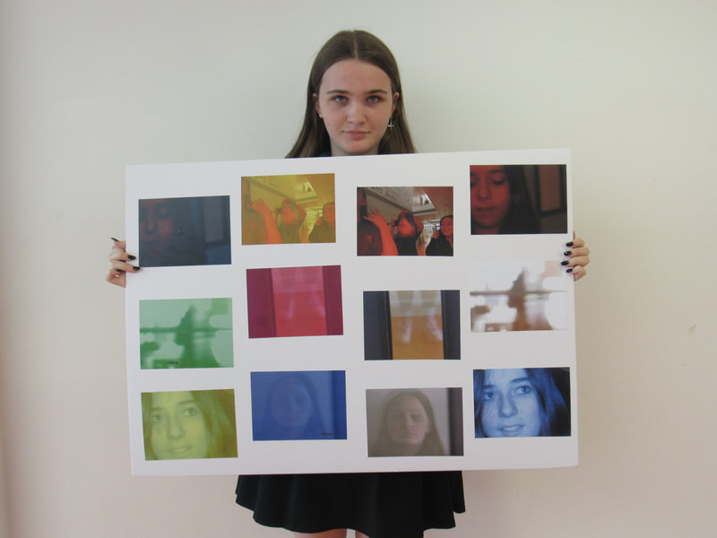
|
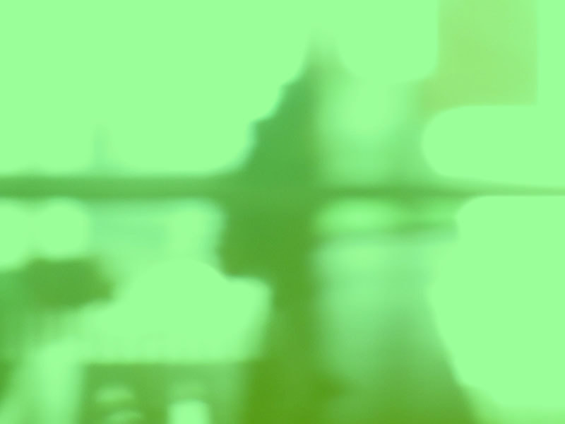
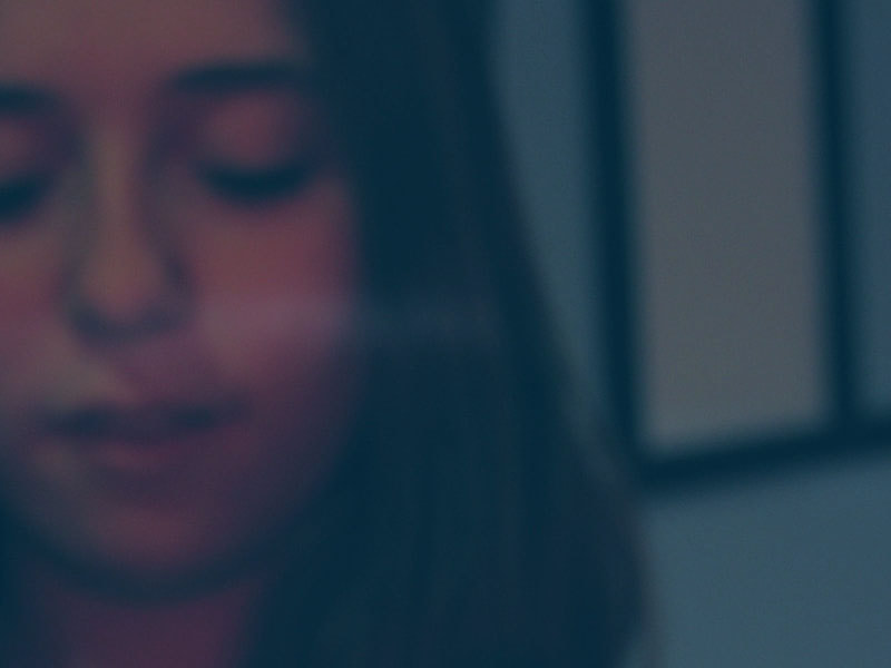
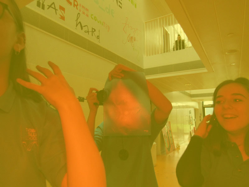
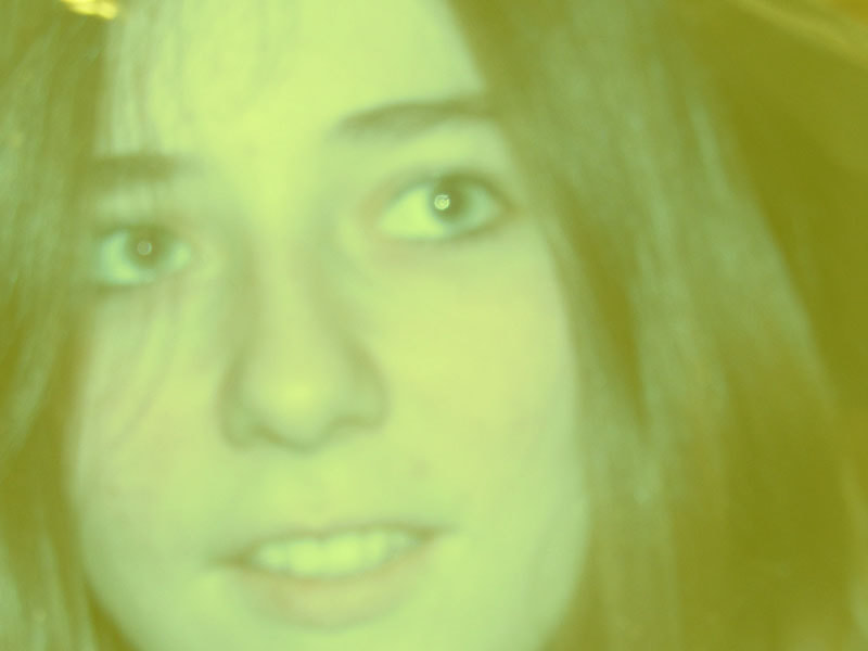
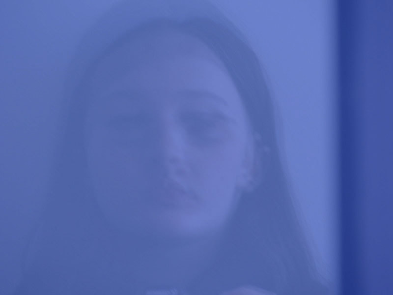
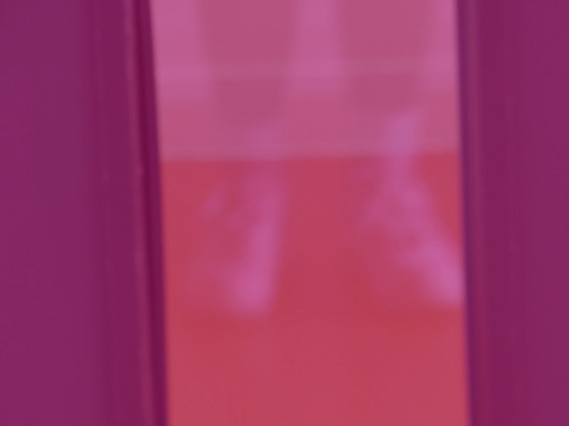
These are the photos I chose for my board. I edited them on photoshop, by changing the colour. I did this because I wanted to change how the image looked and experiment with different colours. If I were to do this again and change anything, I would try and take more photos that are in focus, since a lot of images are blurry and not in focus,
