Edges
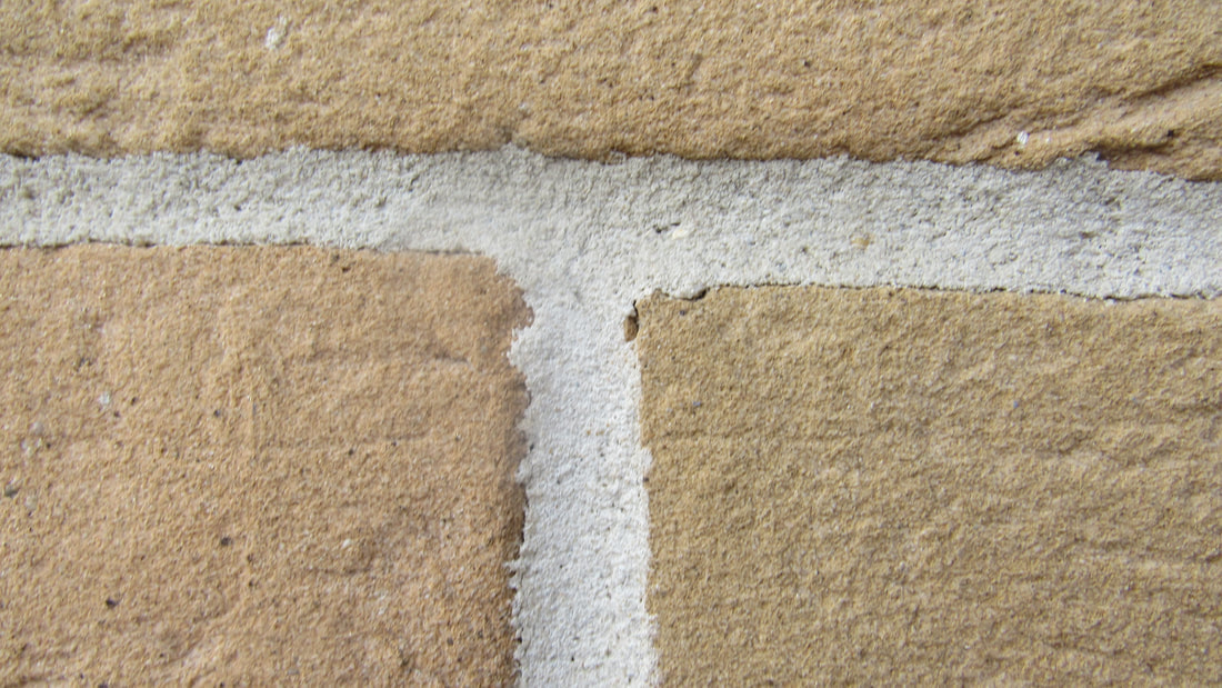
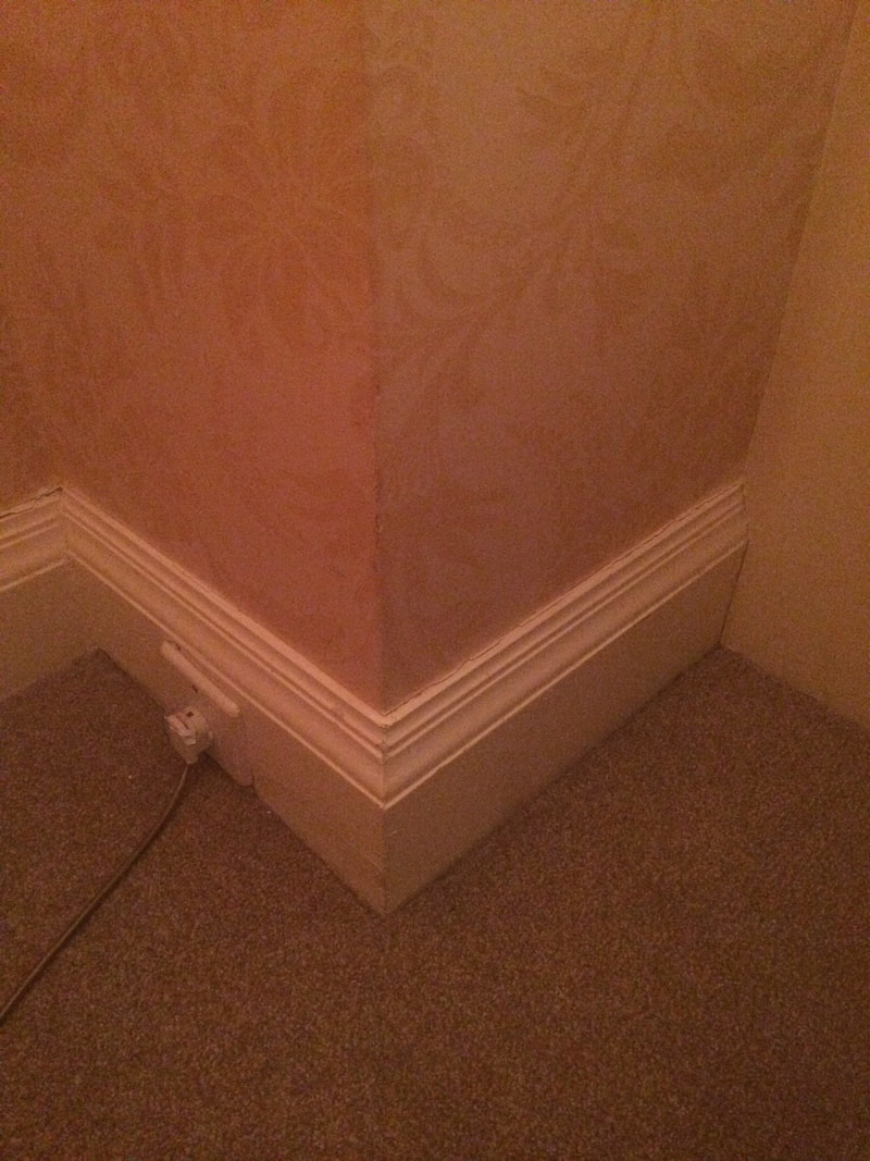
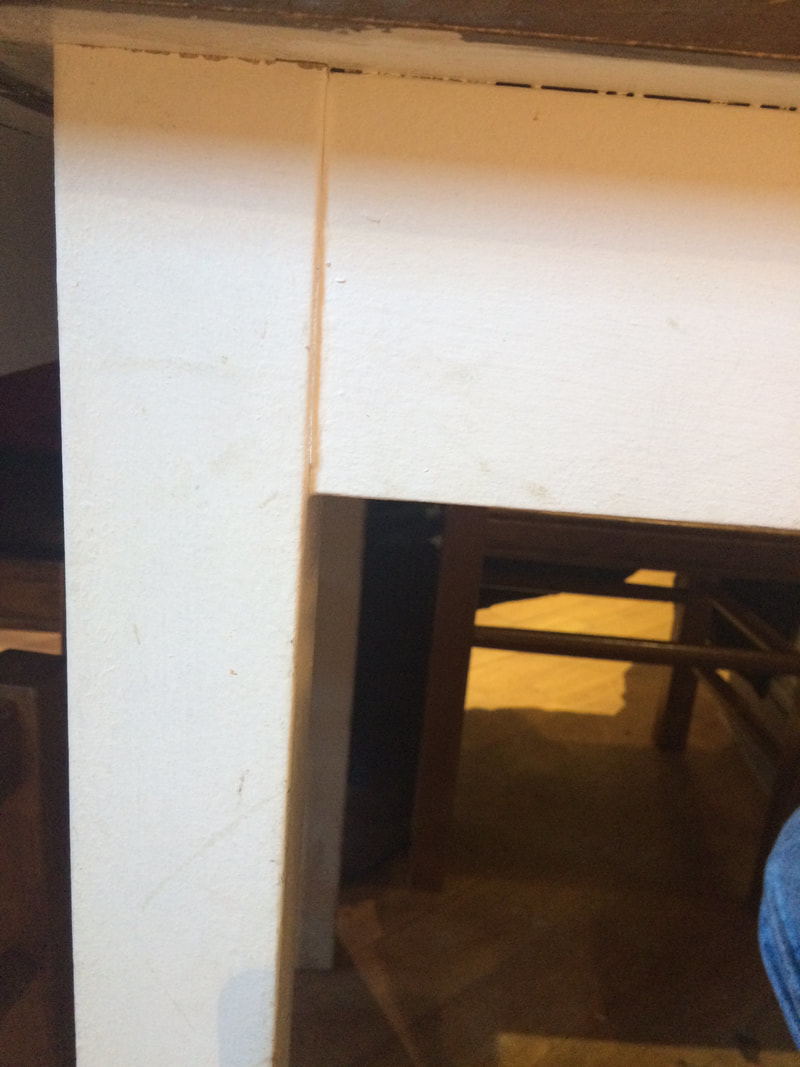
This lesson, our task was to go out and take pictures of edges. Me and my partner found that wherever we went, there were thousands of edges around us, so we took a lot of pictures. Edges are quite important in pictures, as it frames the image, or frames the focus point/main part in the picture.
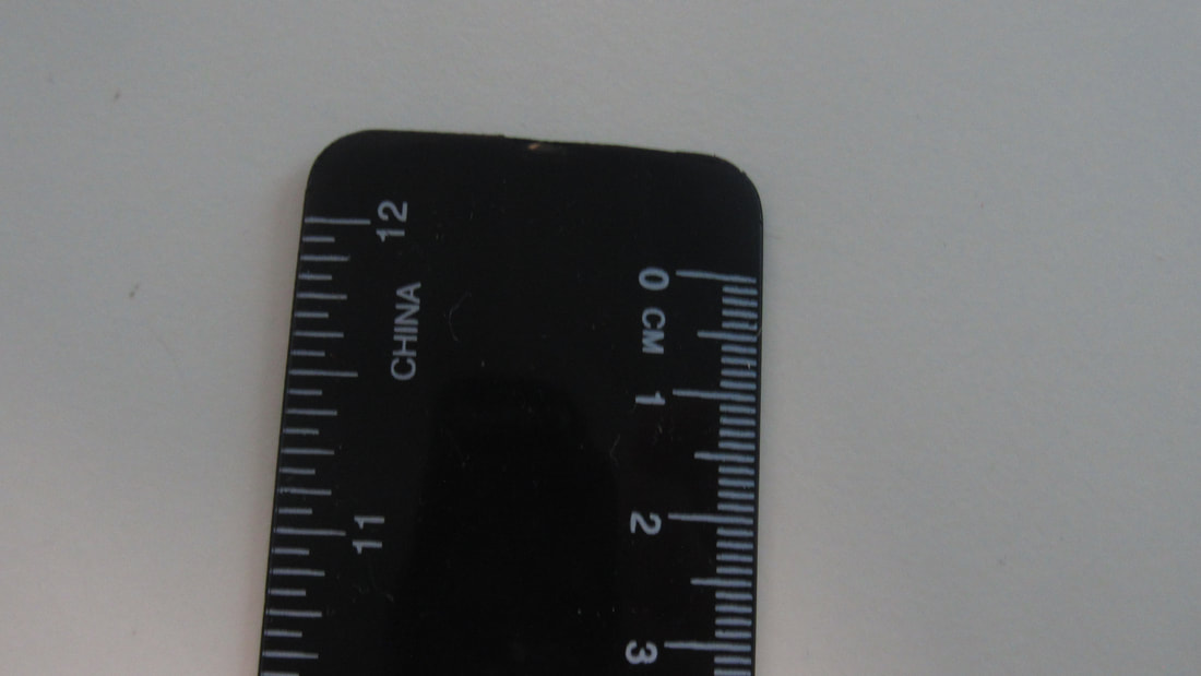
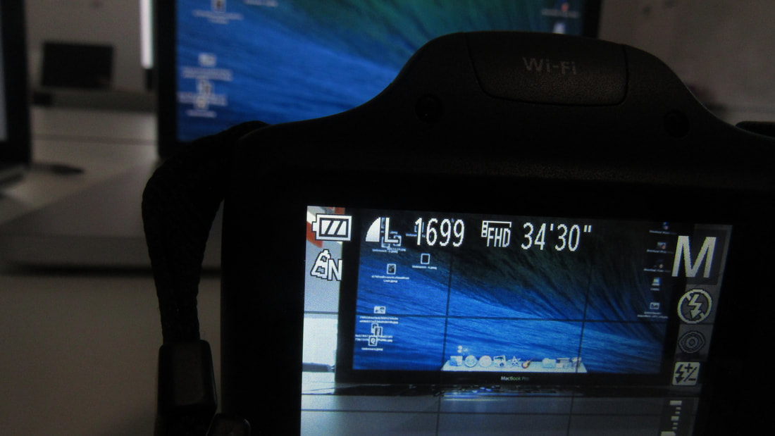
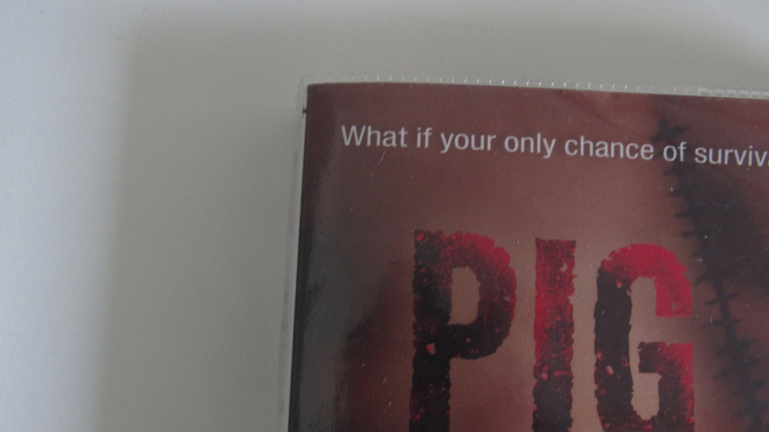
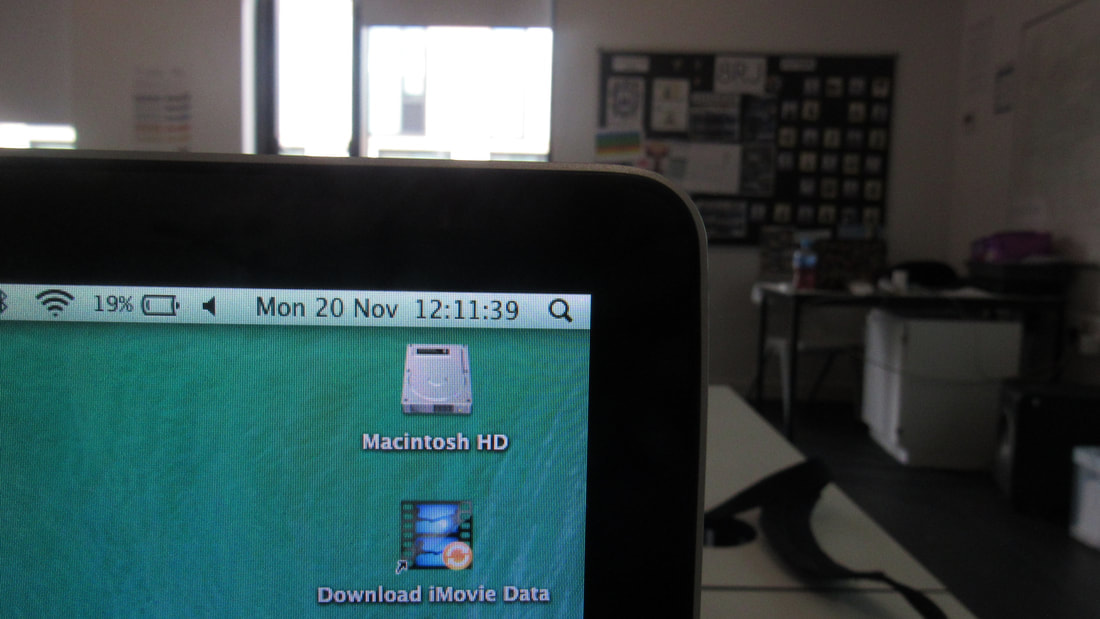
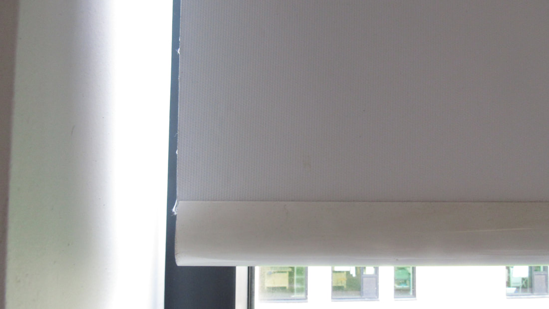


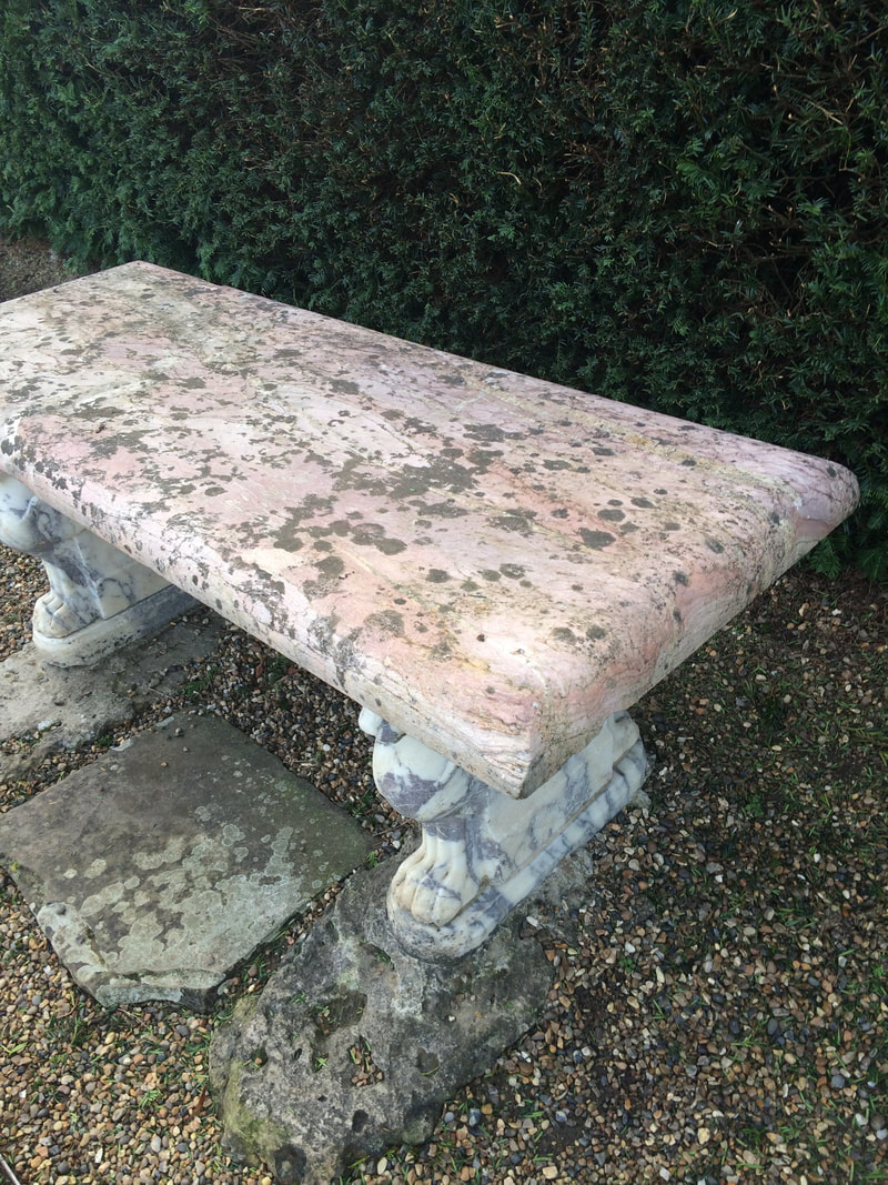
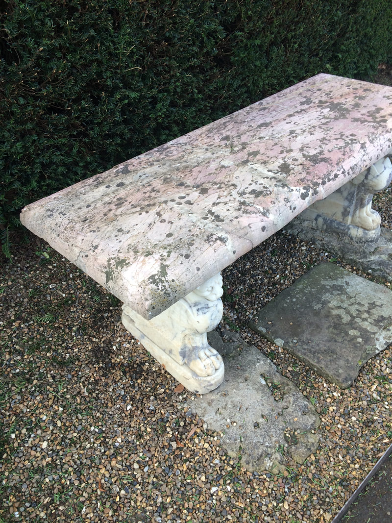
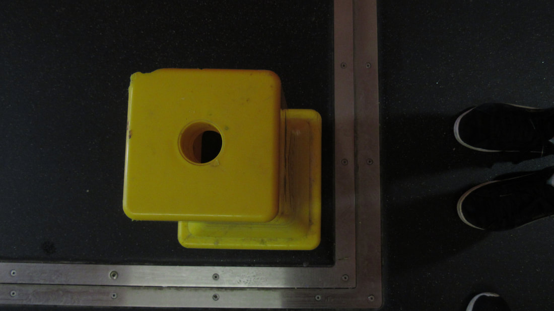
While taking these pictures, we found more corners around the school. I took a total of around 30 images, but the slideshow below shows some of my favourite pictures.
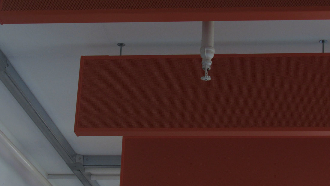
Out of all the pictures, I think my favourite one is the orange soundboards on the ceiling. This is because it's completely in focus, and the background is blurred a bit. Also, in the background, there are more soundboards on the ceiling so there are more edges in the picture. I also like the image of the corner of the MacBook. I like it because the background is also blurred out, making it look neat and crisp. Another reason I like the camera is because the background is dull and plain, but the screen of the MacBook makes it bright and colourful.
Out of all the pictures, I think my favourite one is the orange soundboards on the ceiling. This is because it's completely in focus, and the background is blurred a bit. Also, in the background, there are more soundboards on the ceiling so there are more edges in the picture. I also like the image of the corner of the MacBook. I like it because the background is also blurred out, making it look neat and crisp. Another reason I like the camera is because the background is dull and plain, but the screen of the MacBook makes it bright and colourful.
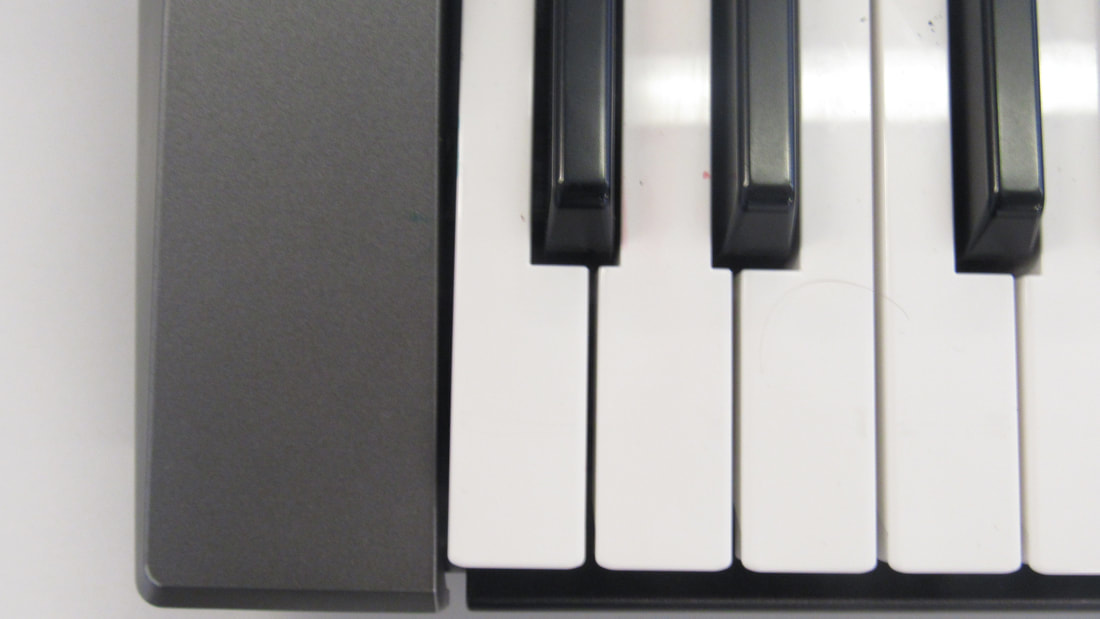
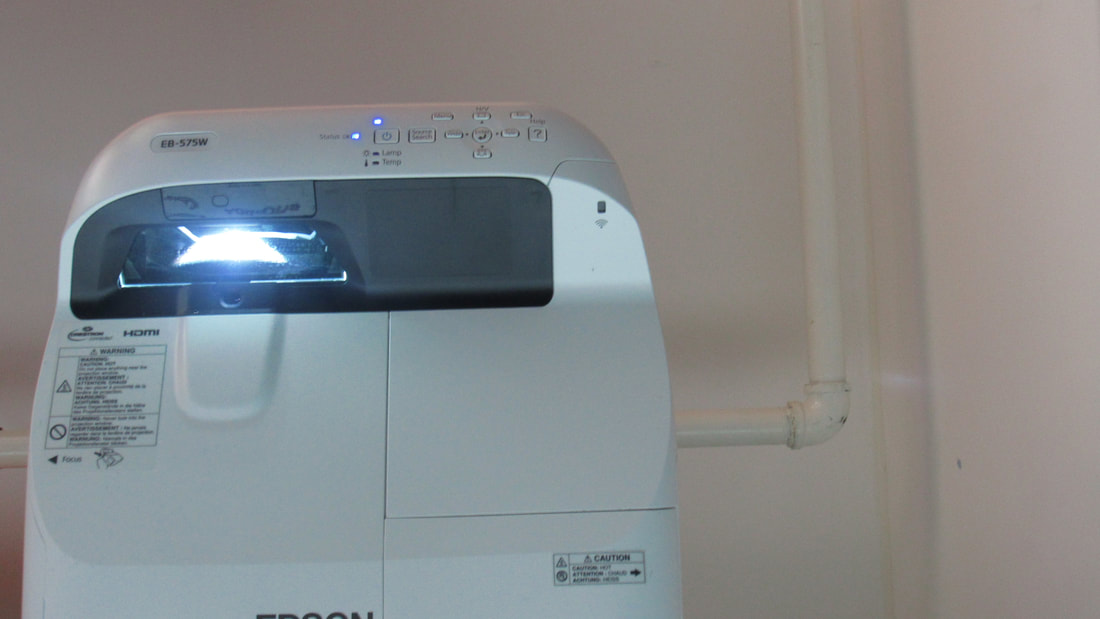
WWW: I think the pictures I took looked very high quality, and ended up turning out really bright, and interesting. I also like the creativity of my pictures, for example the corner of a piano, and the corner of the projector.
EBI: I think I could have been more adventurous and found more images, such as the corner of a building, or the corner of someone's face. I also think that in some images, there could have been more colour. Some photos are quite dull and boring, so if there was more colour, I think it would look better.
EBI: I think I could have been more adventurous and found more images, such as the corner of a building, or the corner of someone's face. I also think that in some images, there could have been more colour. Some photos are quite dull and boring, so if there was more colour, I think it would look better.
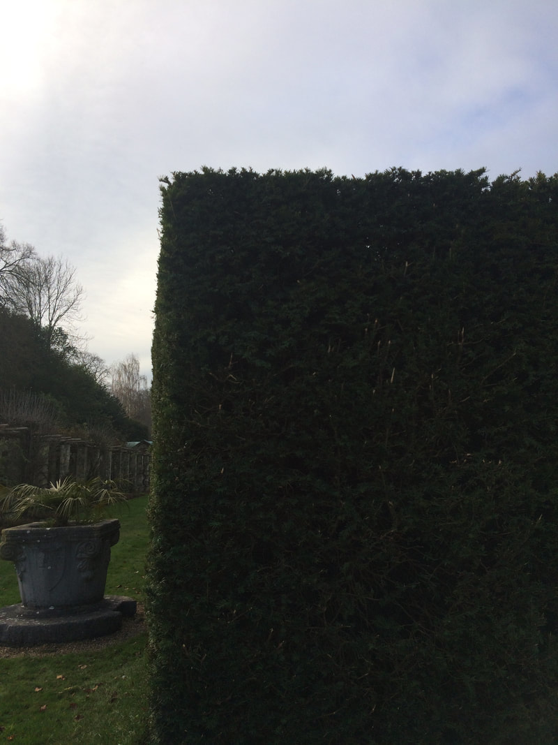
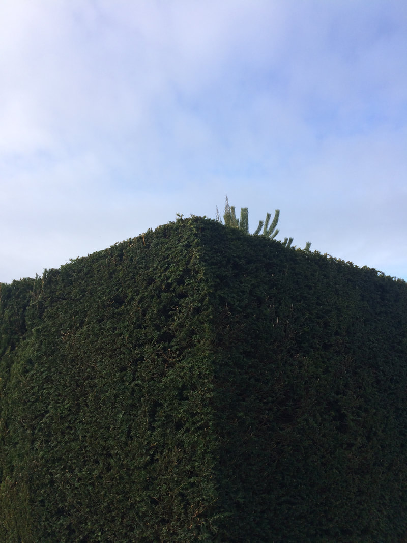
Edges lesson 2
In the next lesson, we went back outside to correct out mistakes from last lesson.
In the slideshow, I took a picture of the following;
In the slideshow, I took a picture of the following;
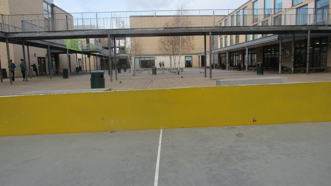
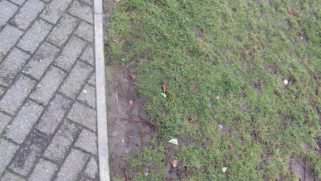

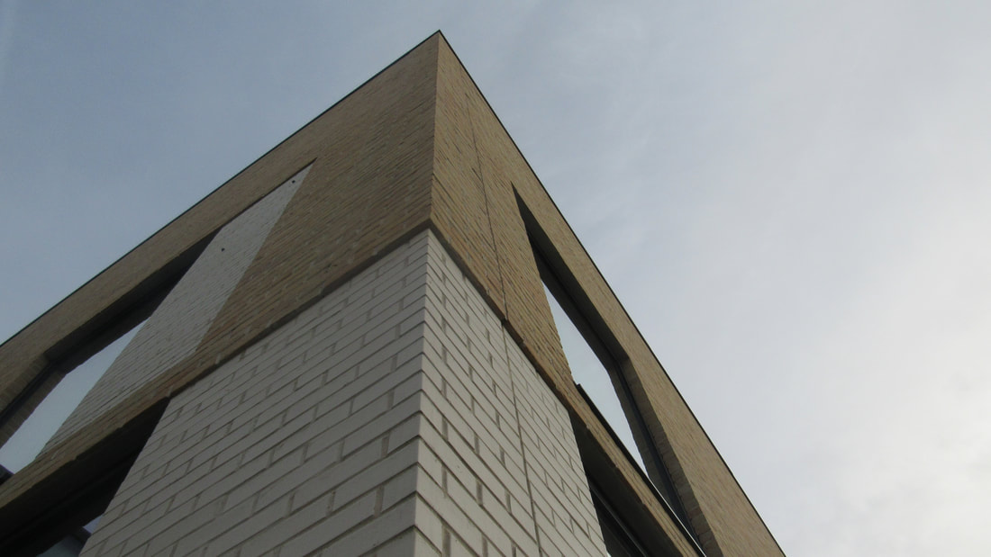
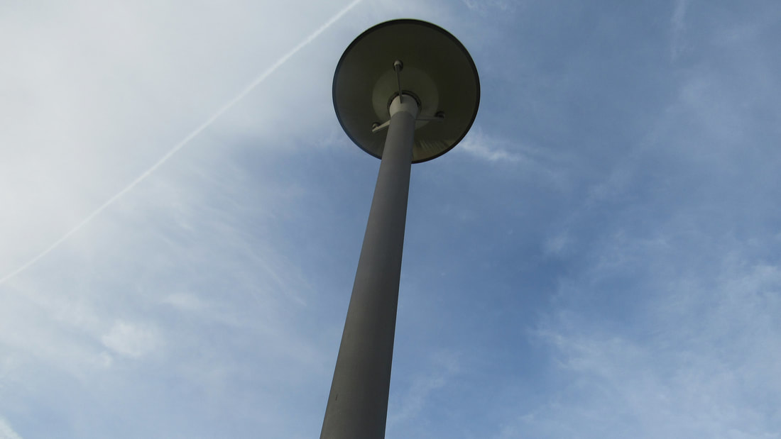


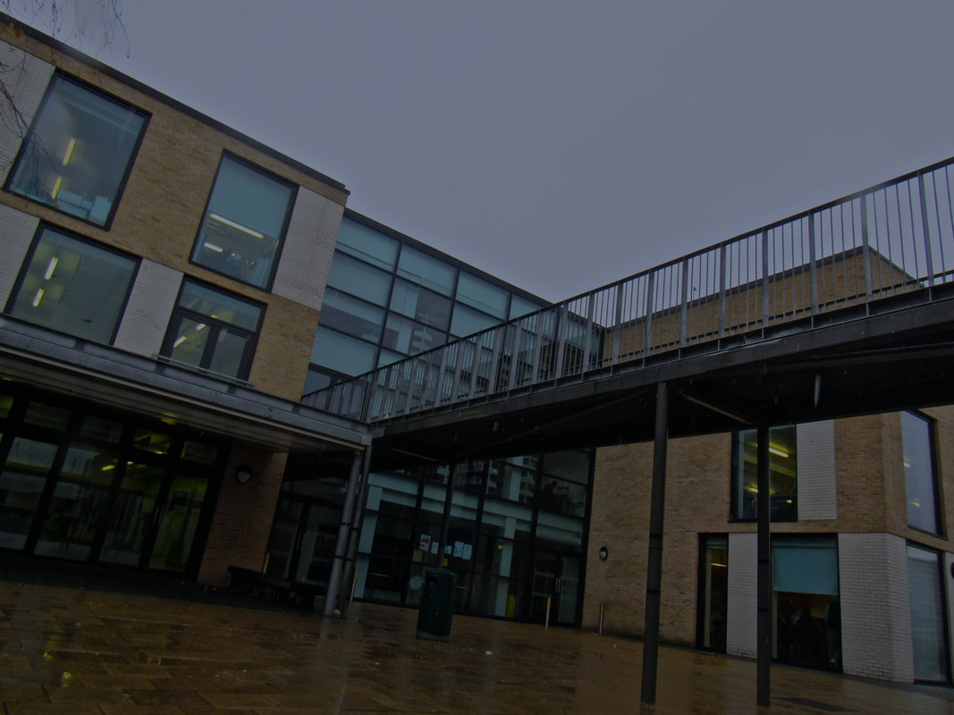
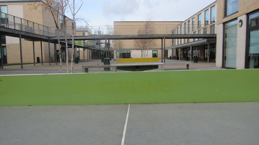
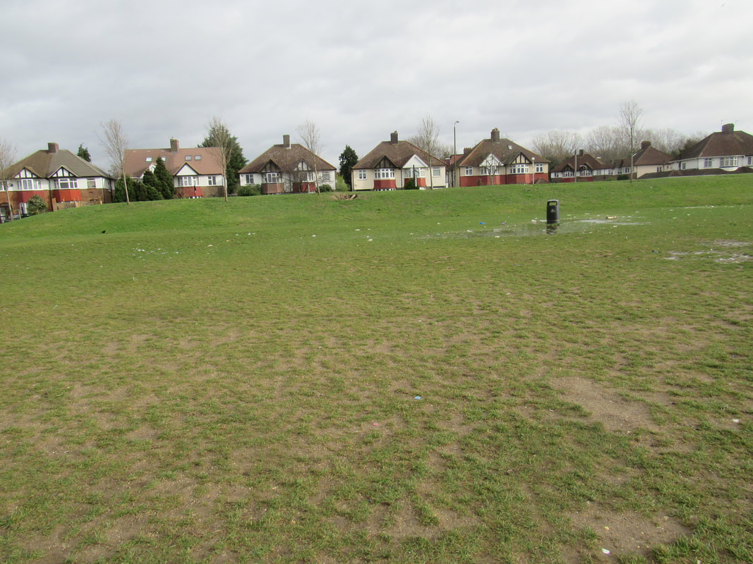
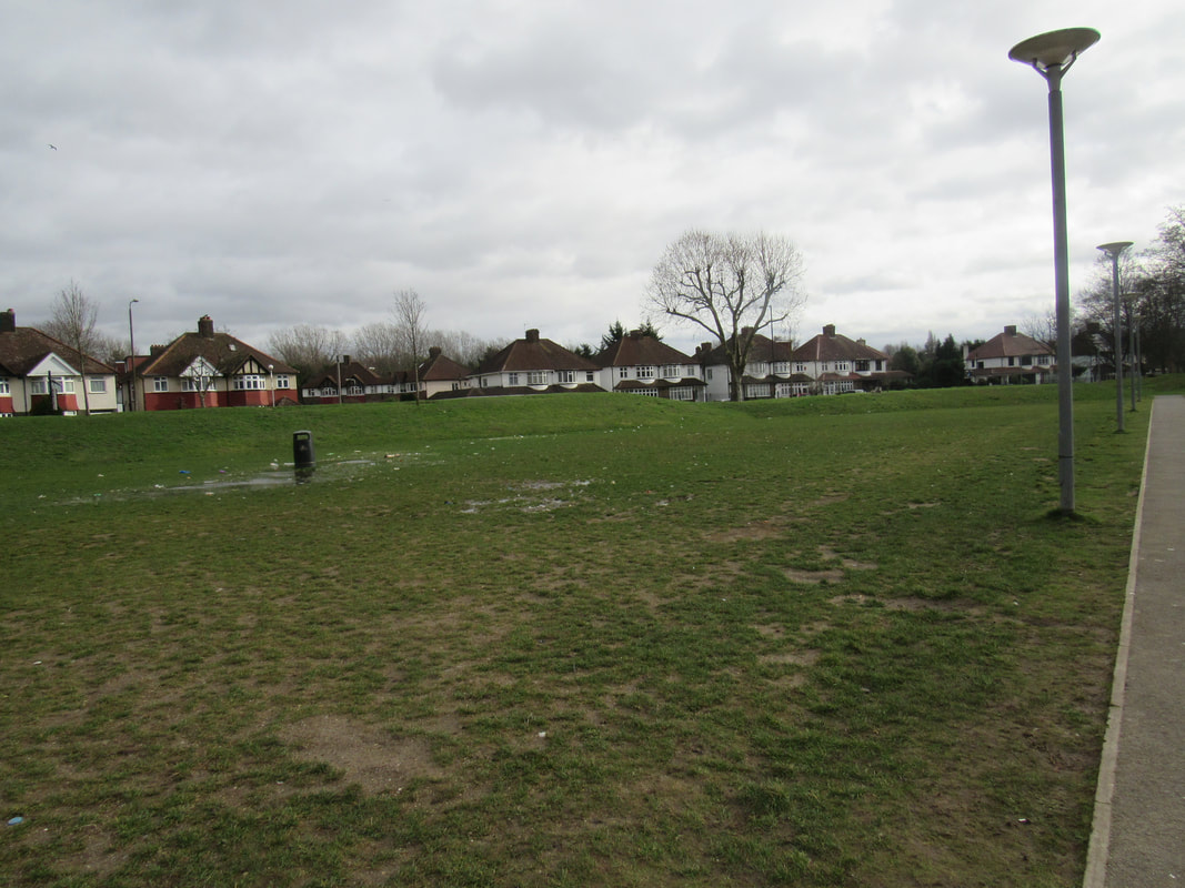
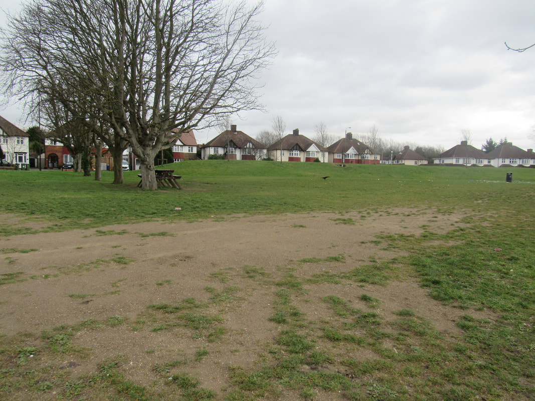
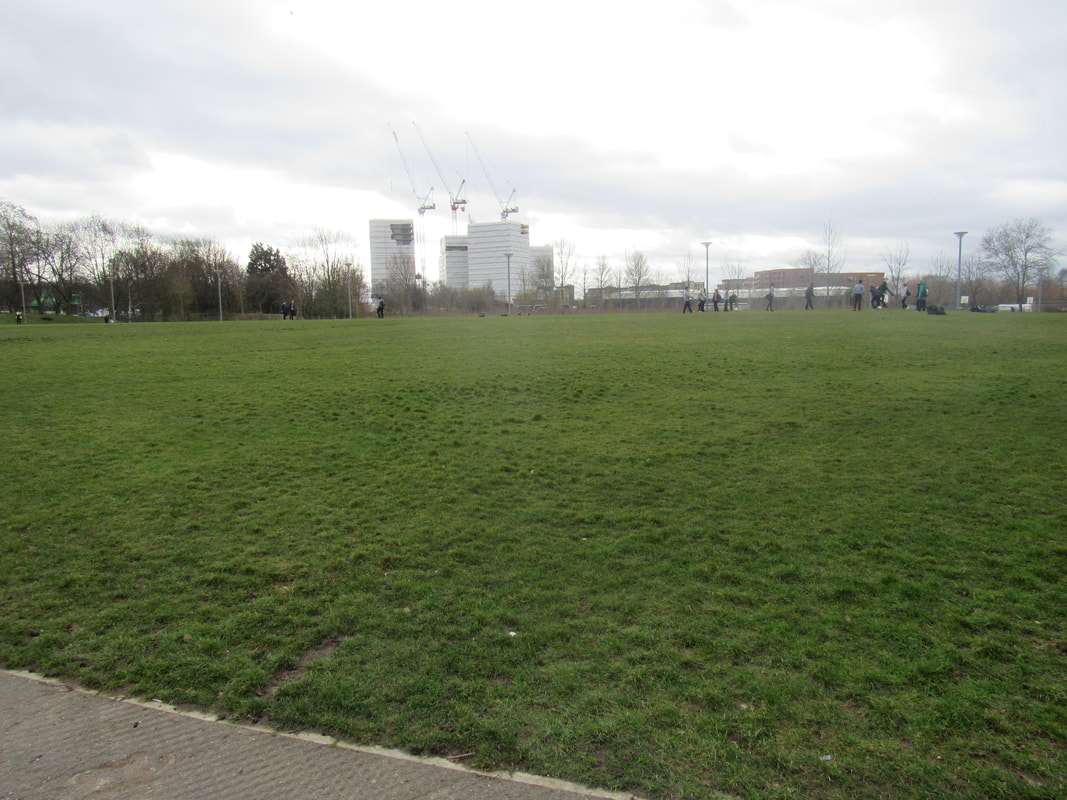
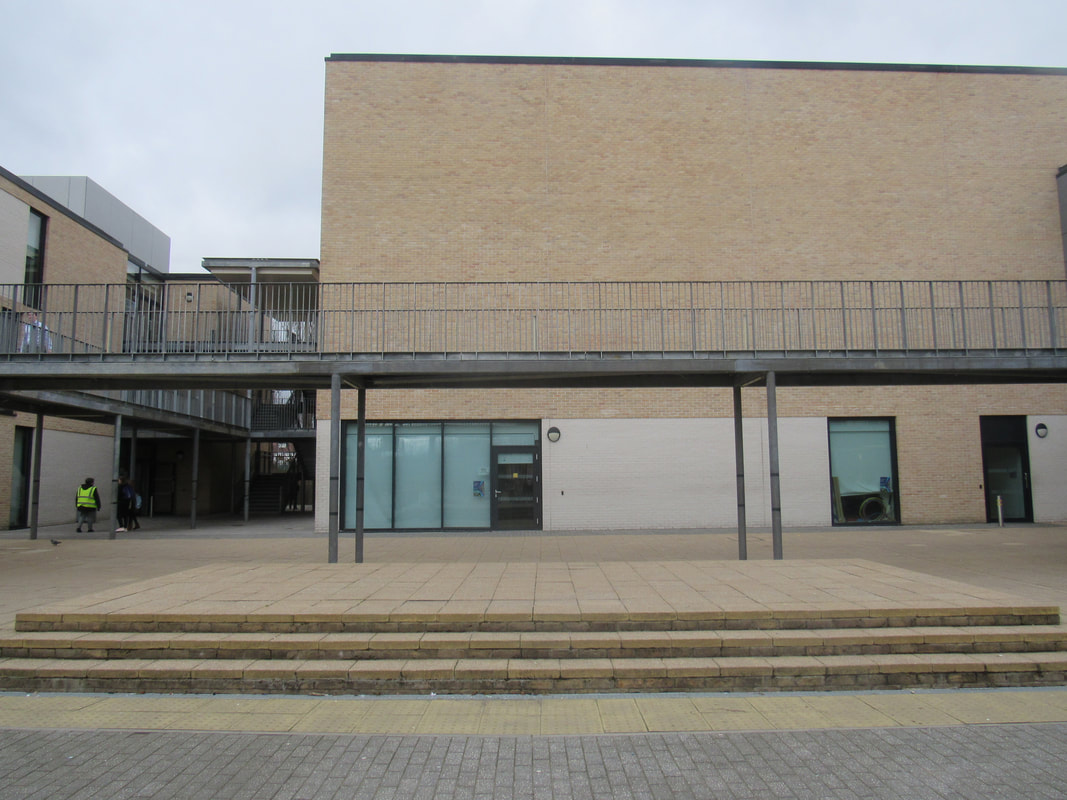
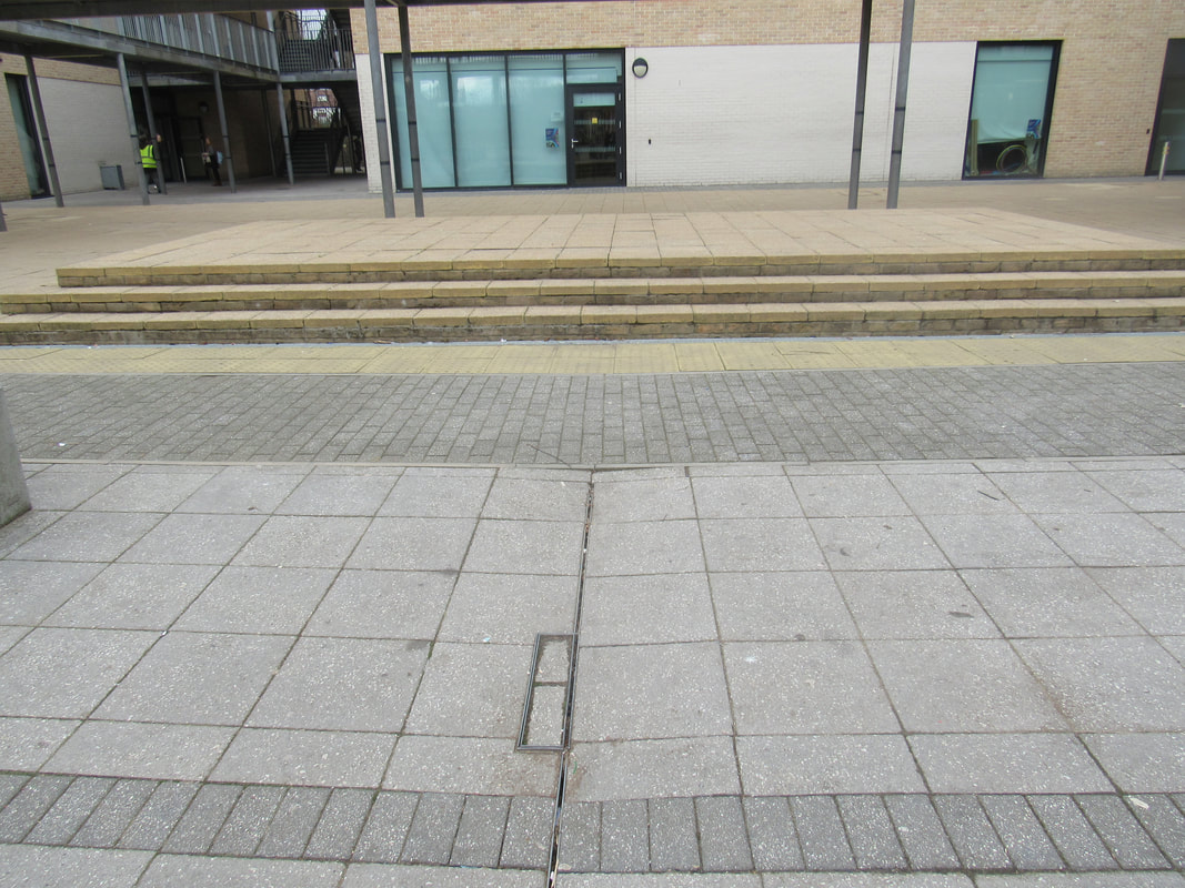
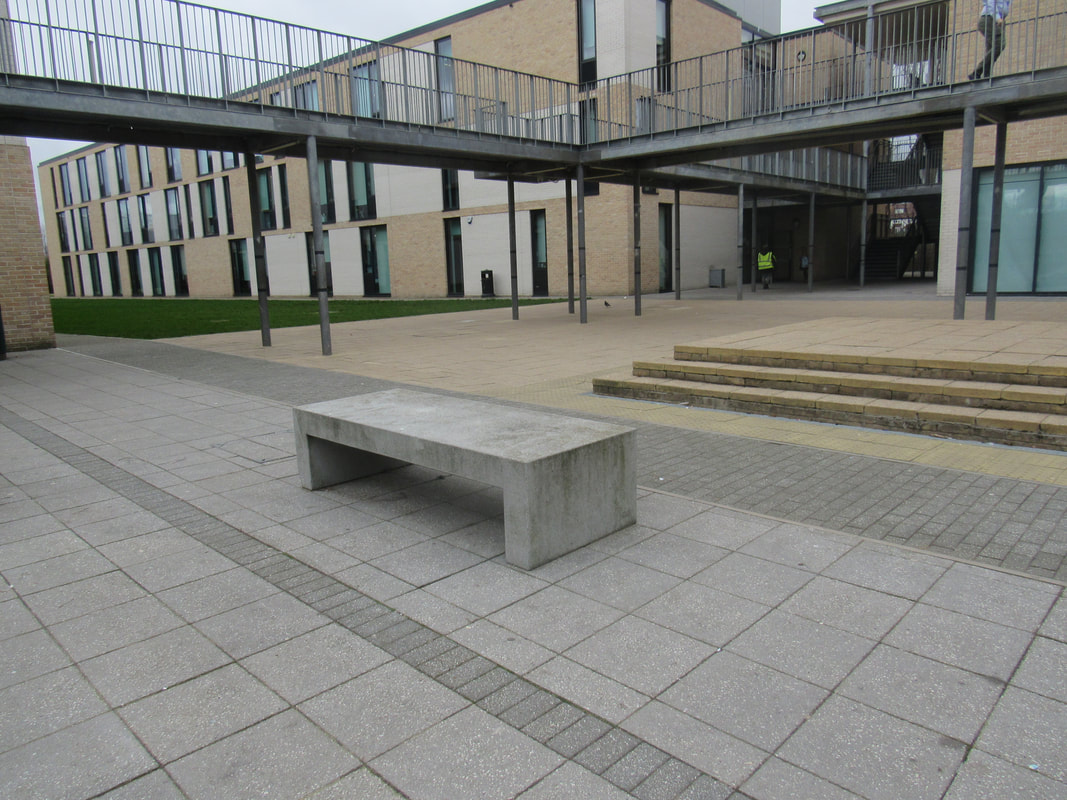
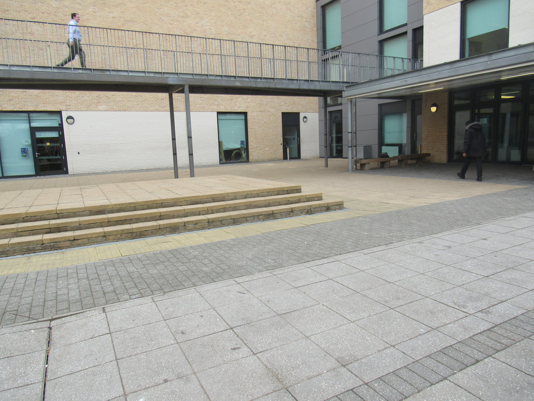
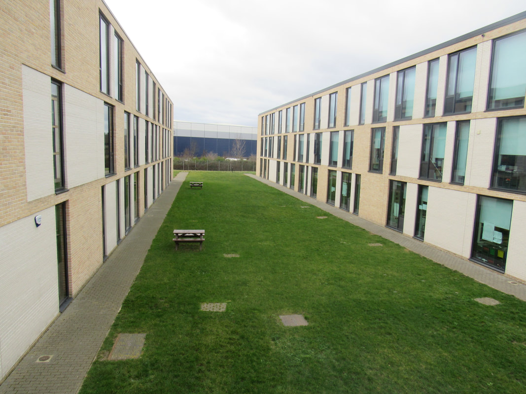
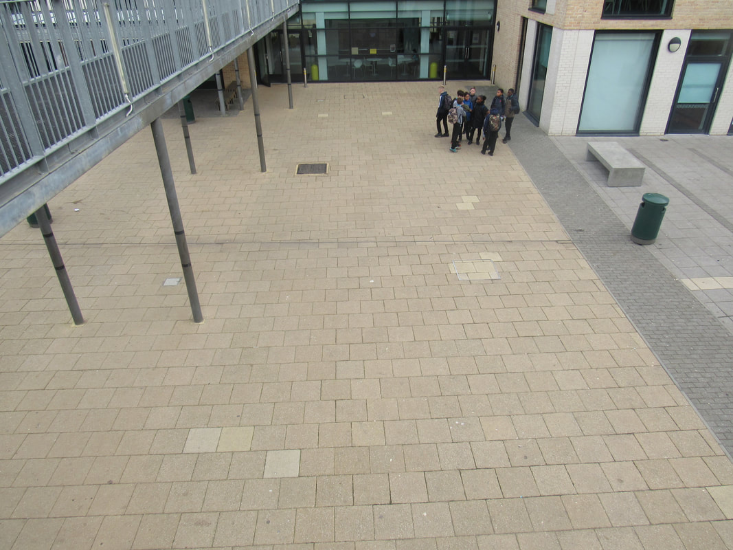
Out of all the pictures, I think my favourite one is the side of the building, picture four. This is because the sky in the picture is a nice shade of blue, and it fades to yellow. Also, the building itself is very in focus and the lines are very sharp. The shadows on one side of the building are different colours to the colours on the other side, which makes the picture look interesting and makes the colours pop. I like the angle of the building because it's in the centre of the image. The image I don't like is the picture of the grass and path. This is because the image doesn't look very neat and the angle isn't in the centre, which is what I would have wanted it to be, and the grass is very patchy and dirty looking.
I found todays task quite hard, as my goal in the lesson was to take perfect pictures. This is hard because there will always be imperfections in any image, so trying to make any image 'perfect' was a challenge. But there were a lot of pictures I liked and that in my opinion looked as close to perfect as I could take them.
I found todays task quite hard, as my goal in the lesson was to take perfect pictures. This is hard because there will always be imperfections in any image, so trying to make any image 'perfect' was a challenge. But there were a lot of pictures I liked and that in my opinion looked as close to perfect as I could take them.
Homework
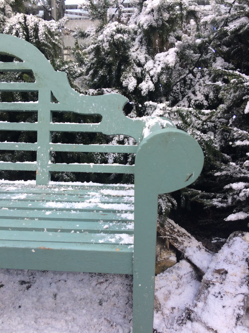
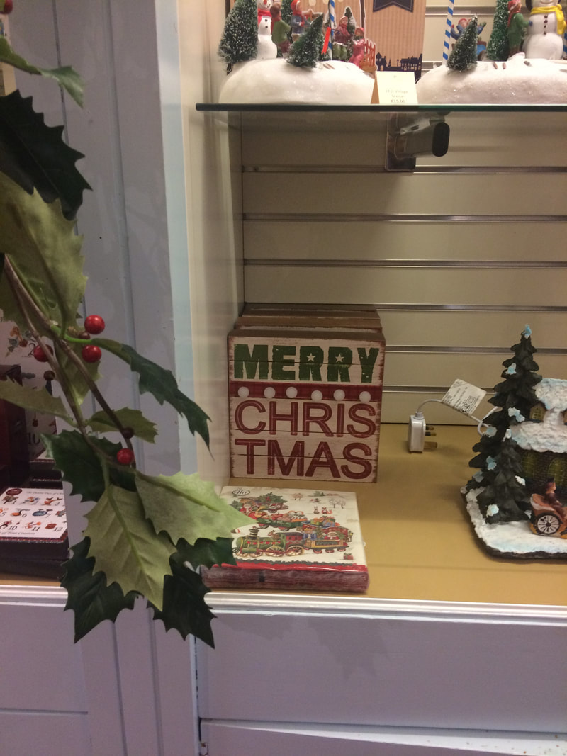
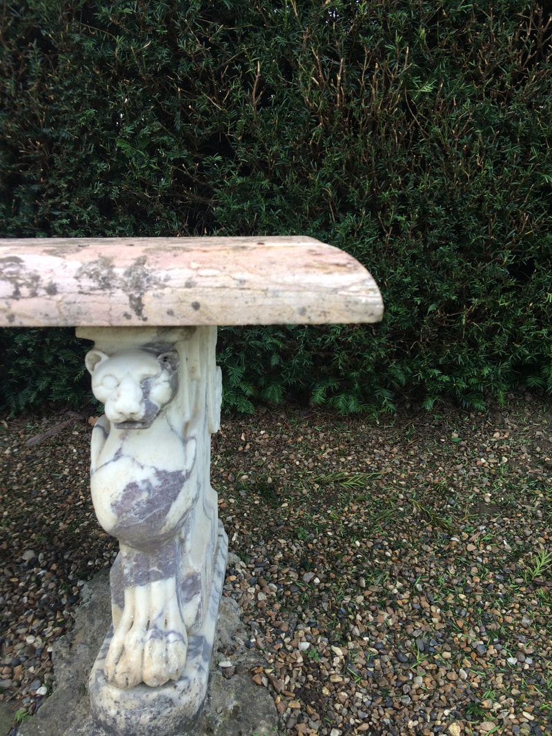
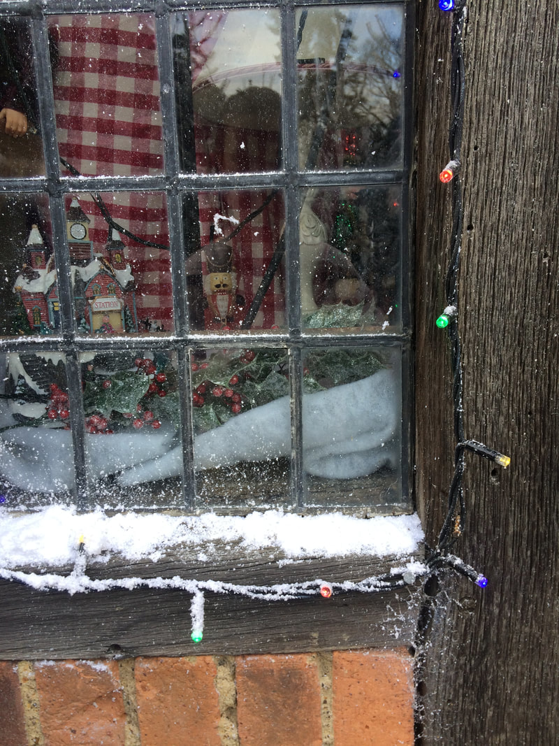
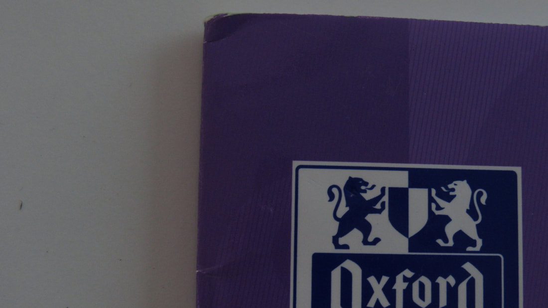
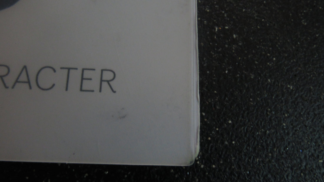
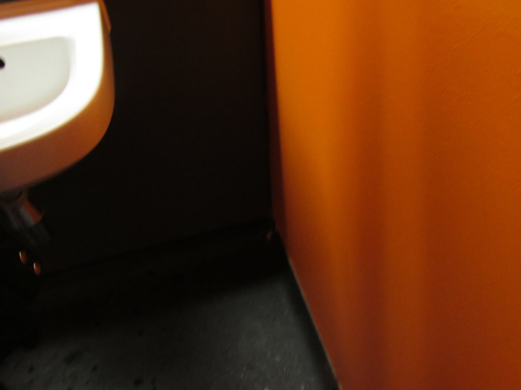
Our task was to go outside and take around 10 pictures of edges we could find. These are what I took:
I found this task a little bit hard, but it was also easy. This is because it was quite hard to find edges with the key words in the image.
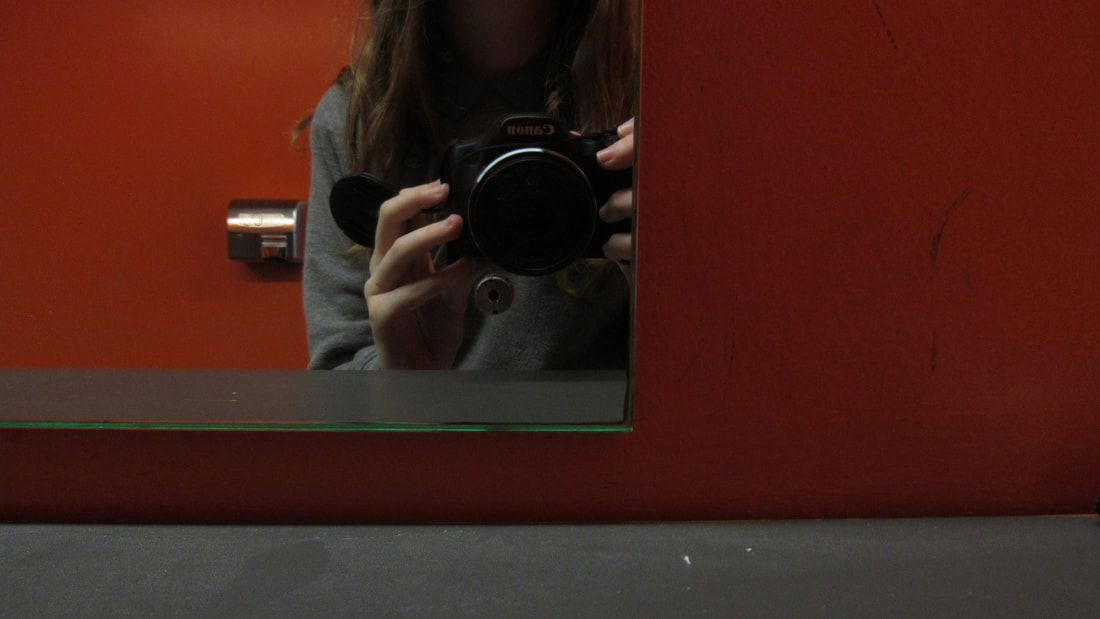
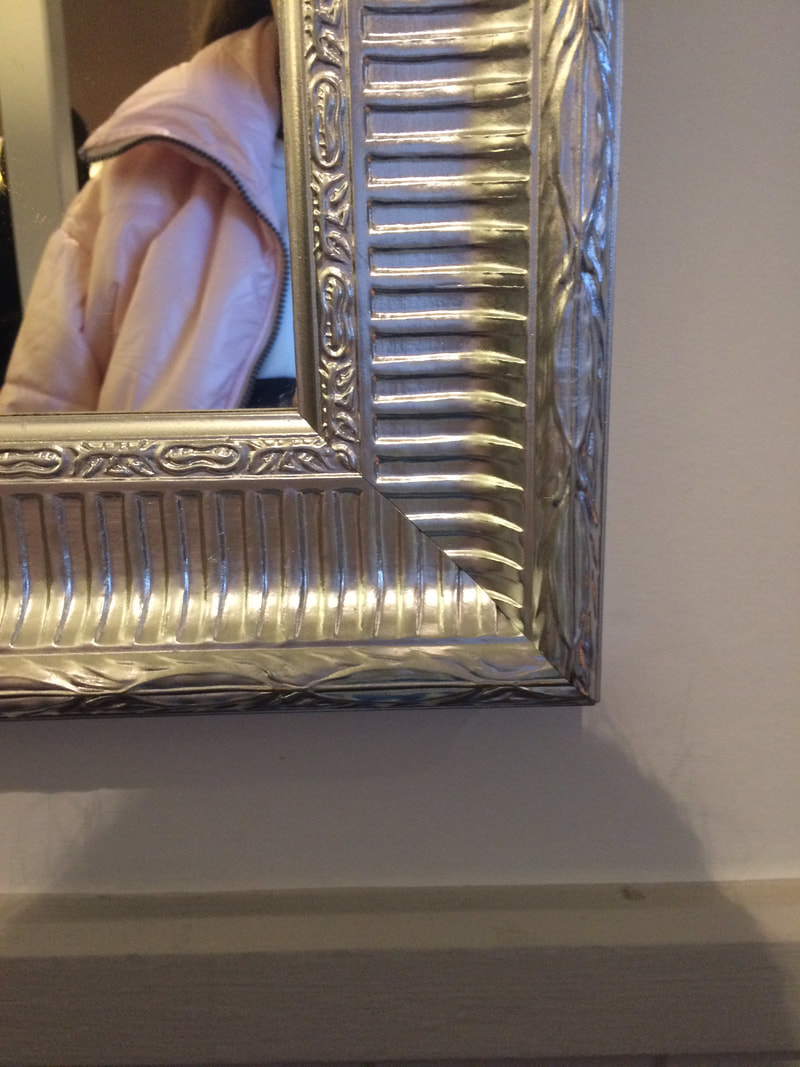
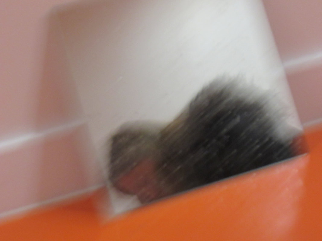
The images I enjoyed photographing the most were the pictures of the window sill & the edge of the mirror. I liked the picture of the window sill because it matched my theme, which was winter/christmas, and it matched one of the keywords on the list, which is texture from the snow. I liked the picture of the mirror because, to me, it was quite interesting and unique, and the mirror had interesting patterns around the edge. Also, you can see my shadow, which adds another interesting edge to the image. For me, I didnt really find any edges I had taken a picture of.
WWW: I think I considered the following keywords; angle, colour, pattern, shape, texture.
EBI: I think I could have considered the keywords space and composition.
Dolores Marat
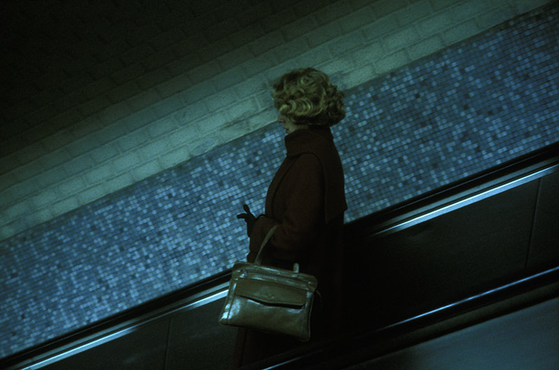
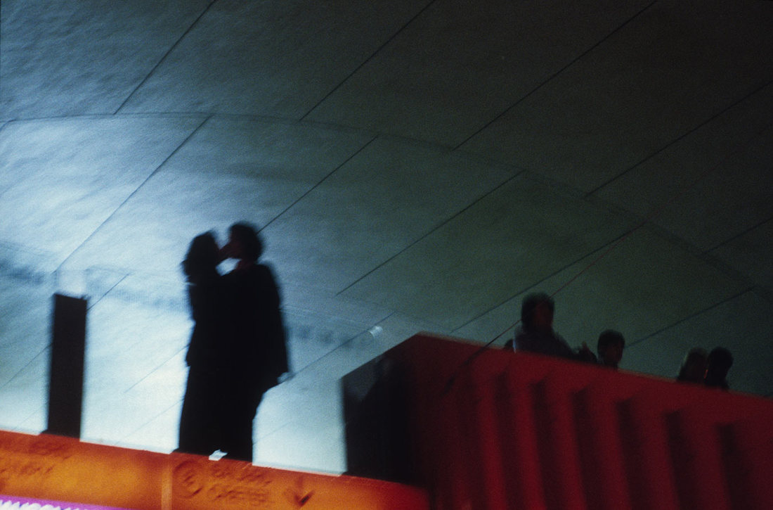
Dolores Marat's images usually consist of the following:
people
nature
space
colour (usually dark)
light
shadows
lines
direction
decisive moment
focus
patterns
shape
contrast
A lot of her images are dark, and dull. Also, in her pictures are people, which is quite different to other photographers we have reviewed.
people
nature
space
colour (usually dark)
light
shadows
lines
direction
decisive moment
focus
patterns
shape
contrast
A lot of her images are dark, and dull. Also, in her pictures are people, which is quite different to other photographers we have reviewed.
Edited Photos


Unedited Photos
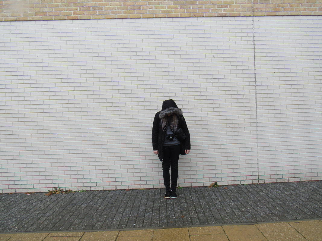
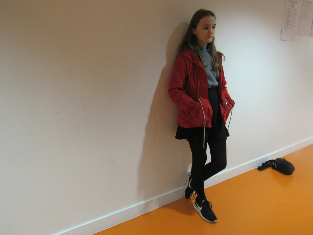
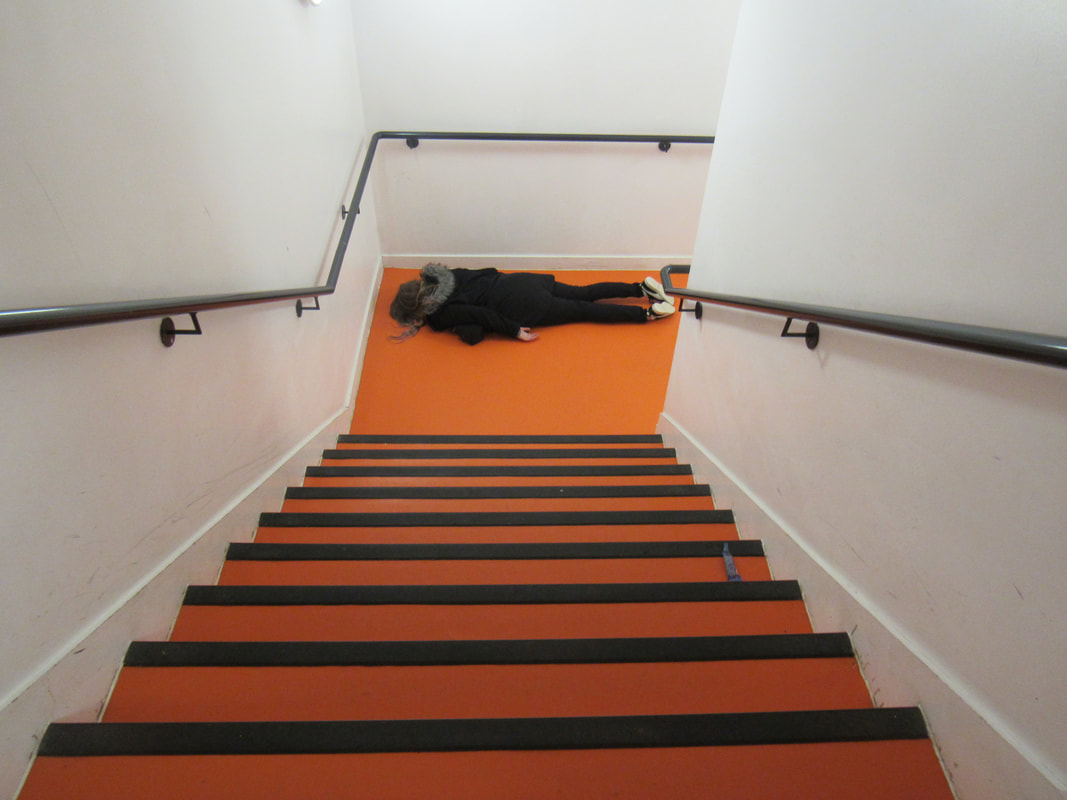
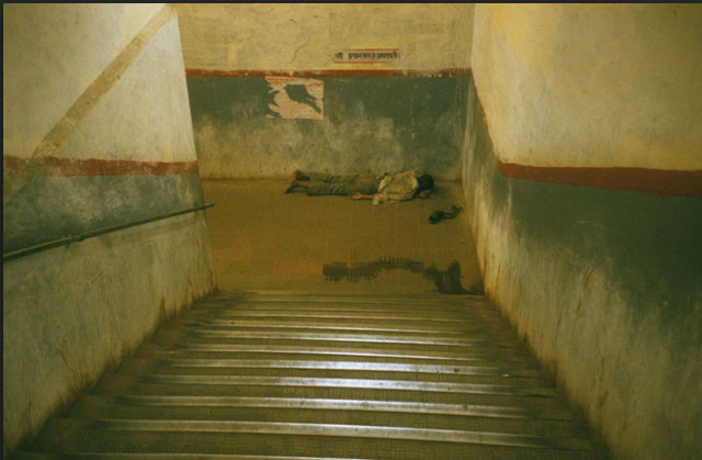
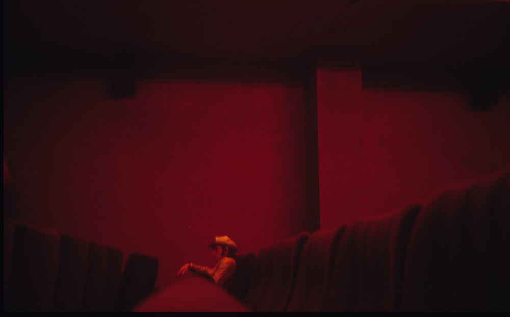
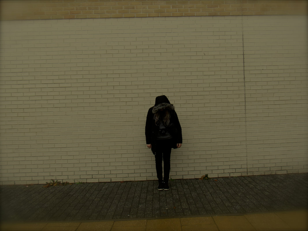
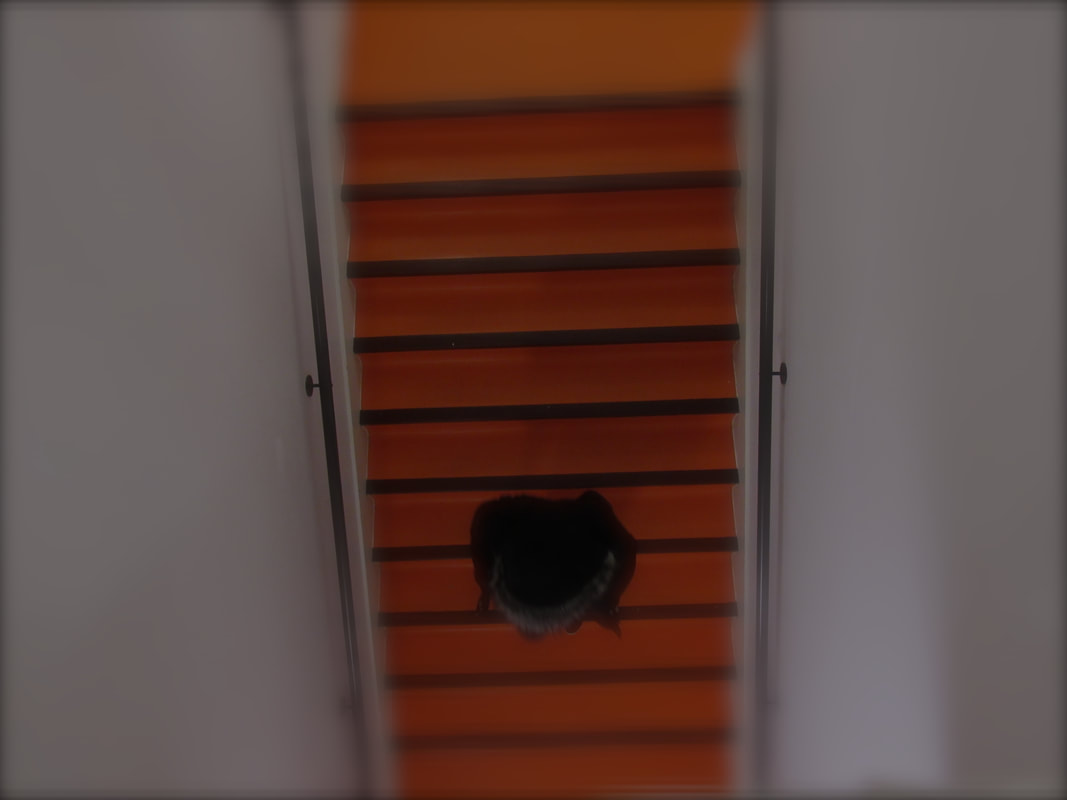
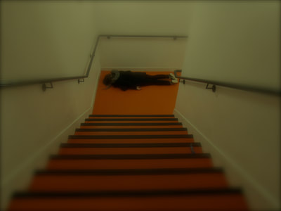
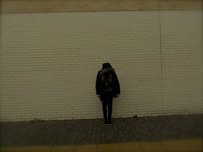
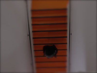
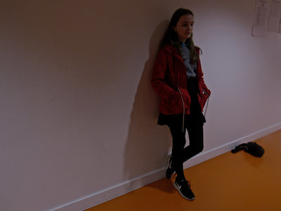
Our task was to go outside and take pictures inspired by Dolores Marat and William Eggleston. We had to keep in mind some of their pictures in mind, so they looked as close as possible. My inspiration for the pictures I took and edited was Dolores Marat, because I really like her style of photos, as they aren't too vibrant. I like dark, dull pictures because they stand out to me. My main focus during this task was to create pictures which looked similar to Marat's photos, but also quite different. I am very proud of the pictures, especially how they looked after I edited them because they looked exactly how I wanted them to look in my head. This is because I think the colour wasn't too bright, it was very dull and dark and the images seemed quite decisive. In the image of the person standing against the wall, the composition of the person is in the middle of the brick wall. Also, in the photo of the buildings, the angle of the camera is to a slant, because it makes the image look different and unique and the perspective of that image was facing up to the buildings because it made the buildings look disproportionate. The photo of the person walking on the stairs uses different varieties of lines, as the white wall is an obvious edge to the orange stairs, and so are the black lines on the stairs. I would improve the images by making them a bit more colourful, but duller. For example, Marat's photograph of the person sitting from the side in a red room, the colour seems very dulled out which is the kind of picture I wanted for my work. When I was taking my pictures, I didn't think about framing, but in the one of the person on the stairs, the white walls frame the edges of the photo because it's a completely different colour to the orange of the staircase.
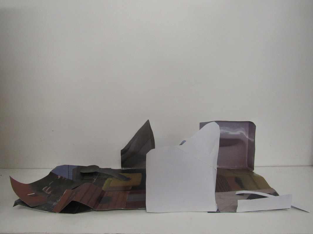
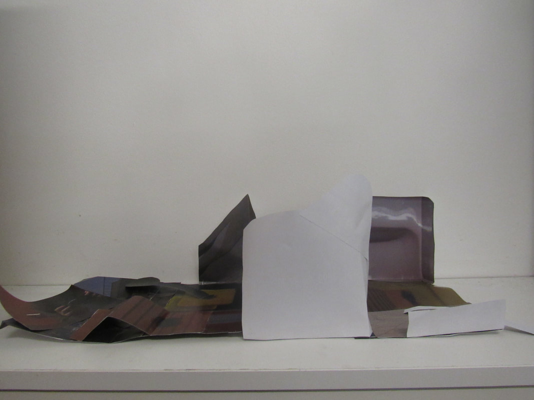
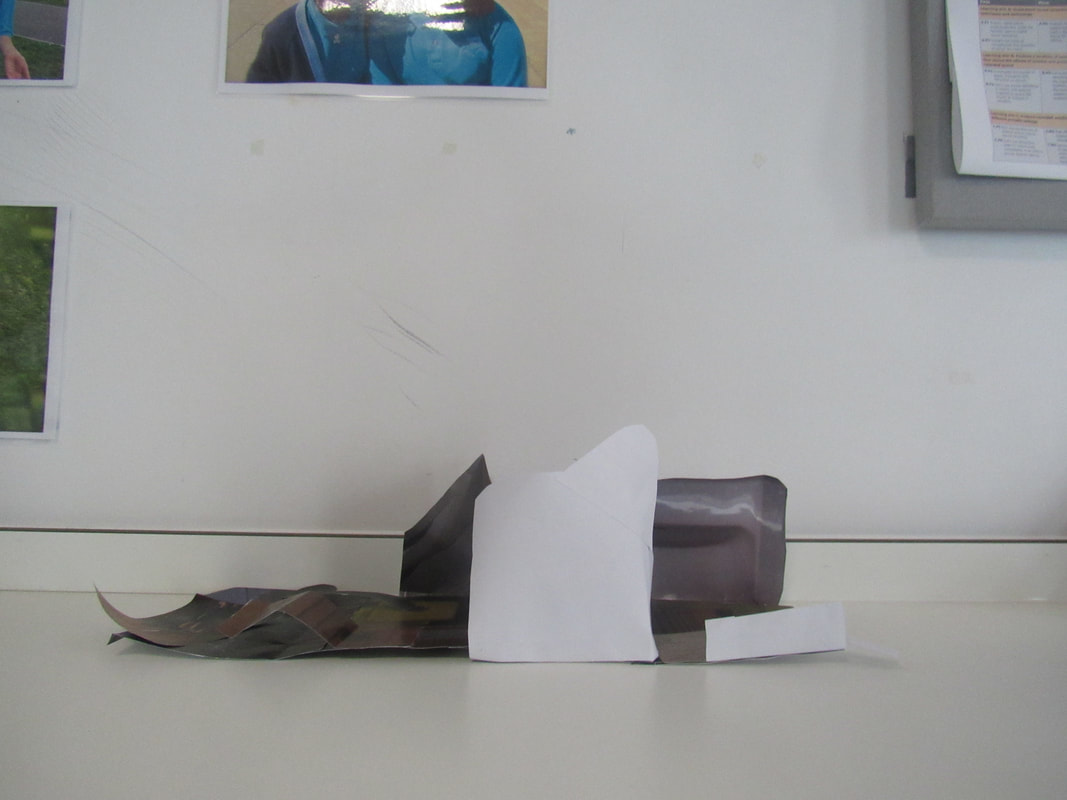
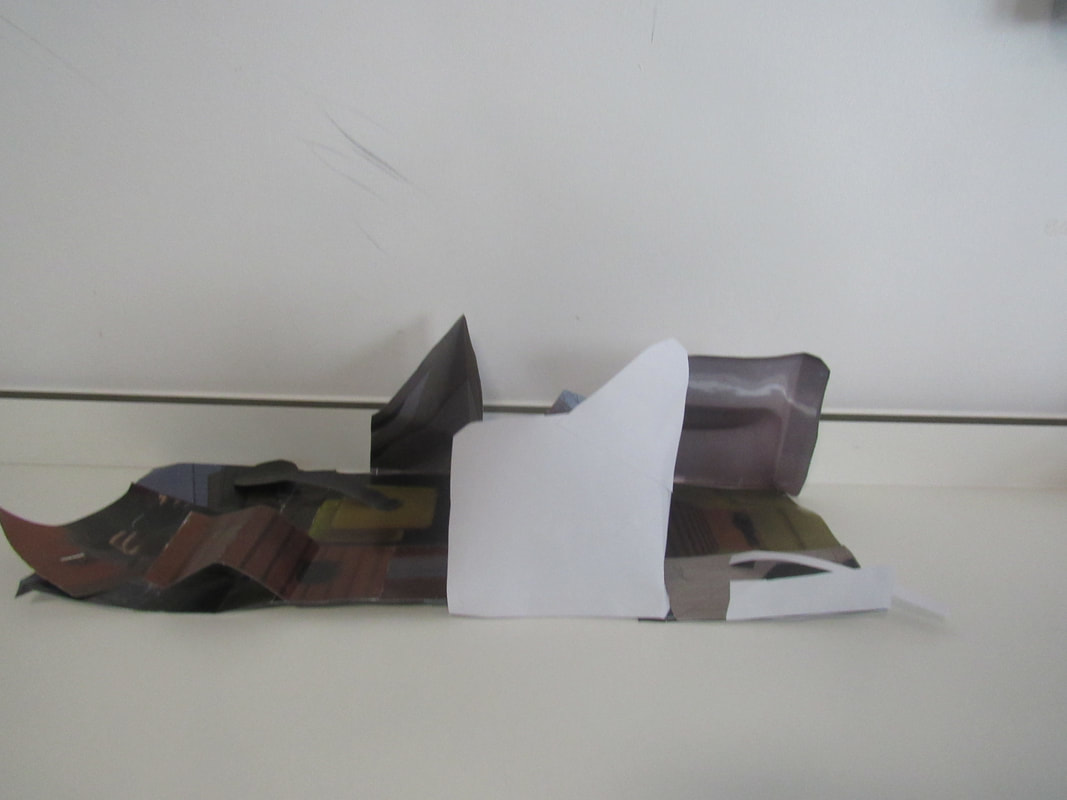
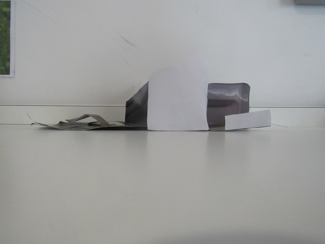
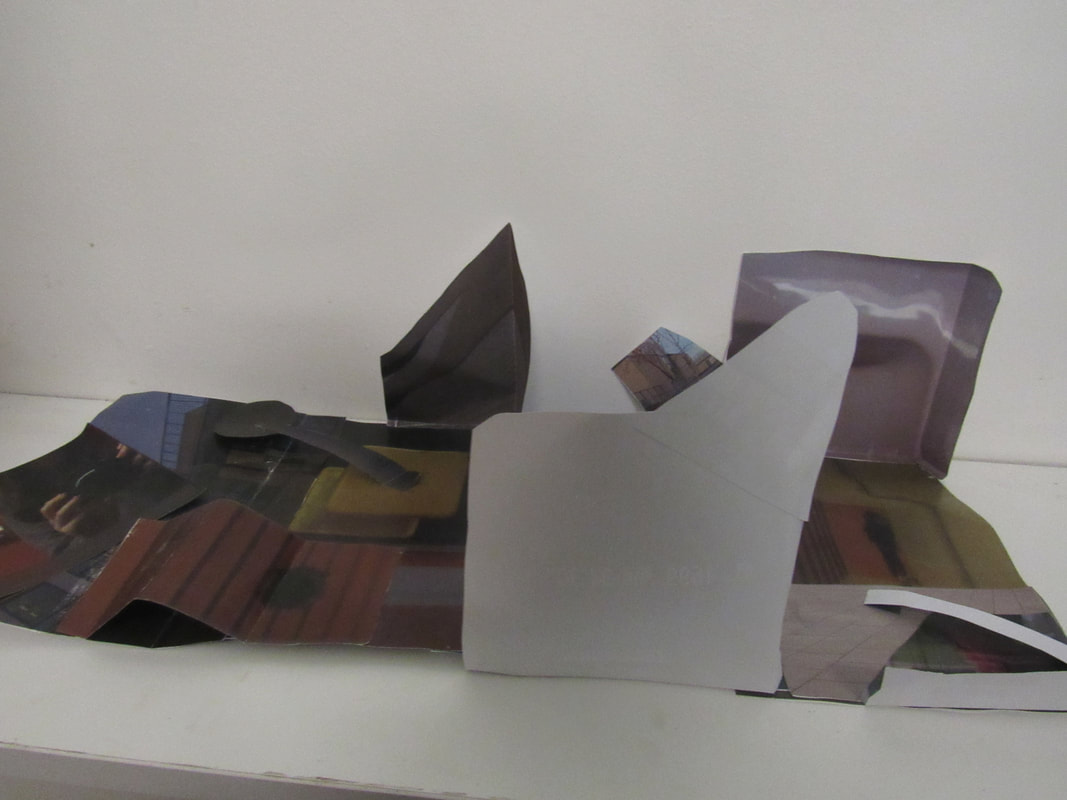
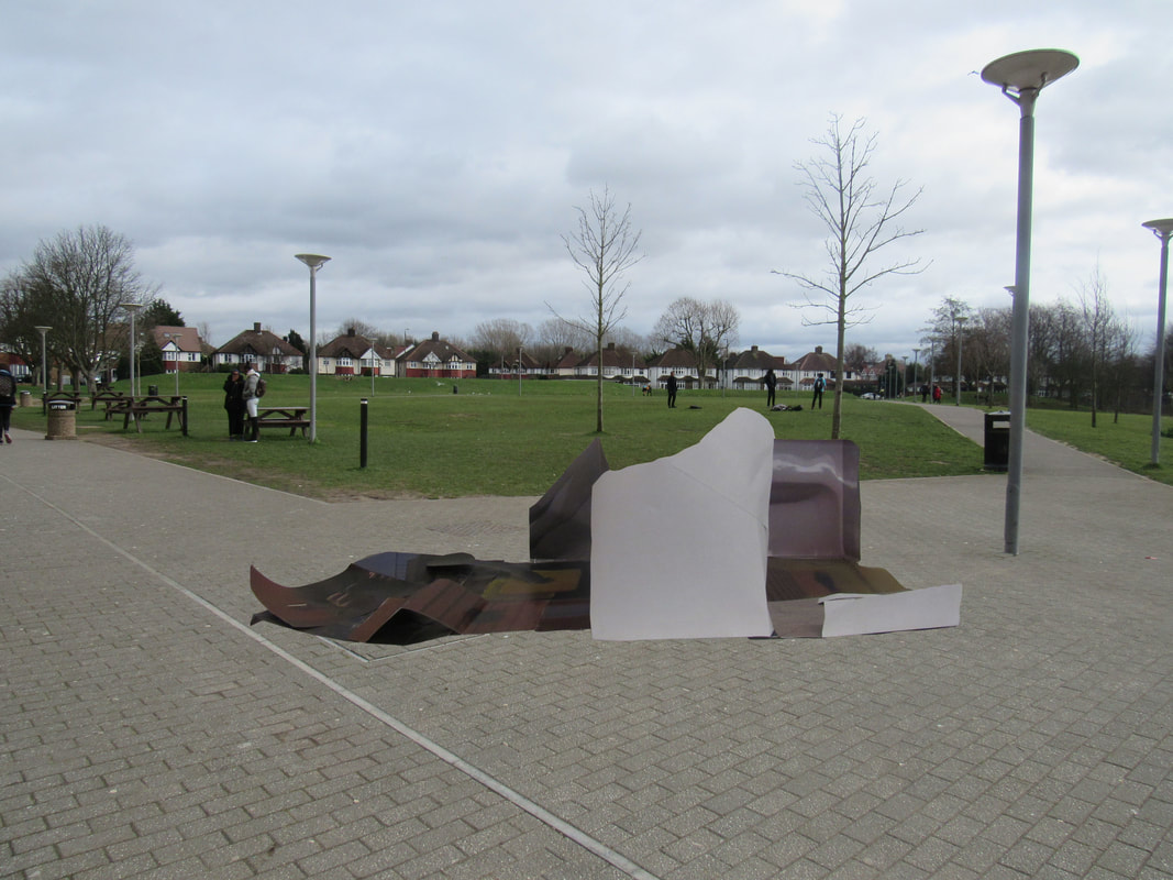
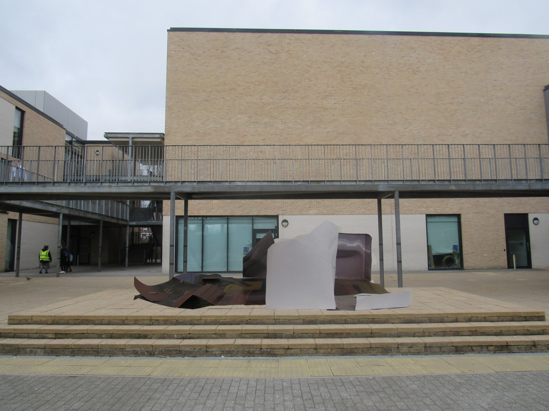
3D Paper Sculptures
Our task was to create a paper model with the theme of edges in mind. My main themes were colour and line. The formal element I was looking at was negative space. I think I approached these by the layout of each photo. A few of the photos I took were very similar in colour, and because my paper model was very bright and colourful, the rest of the photo matched with the colourful theme. If I wanted to frame the image, I think I would have a duller colour, because if I have a bright frame, the image would be too much and it would look bad. I think my images were good because I looked carefully at the key terms and themes and took the pictures based around the ones I was given. However, I think I could improve my images by maybe going outside my comfort zone and taking pictures I usually wouldn't take, or making my pictures a bit duller like Dolores Marat's photos.
I chose the following 20 photos to make my photo sculpture because these are my favourite pictures I have taken so far. The reason is because the pictures are based off of the photographer I was looking at, Dolores Marat. I really like her photo style and I think my photos look very similar to hers, so that is why I want to include these photos. I also thought these images would be good because they all look similar in colour and they would look nice in my paper model together.


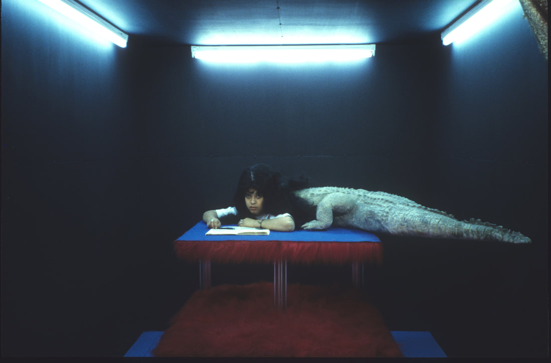
Tate Modern Trip
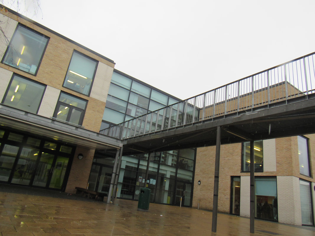
Recently, we went on a trip with the other photography class to the Tate Modern in London. When we were there, we had to take photos of what we saw, and thought looked nice. The images below are some of the photos I took. The artwork I liked most was the room with the lights and TVs. This is because there were parts that were bright and colourful, but there were also parts that were very dark and plain and simple. My favourite photos from the day are; the photo of me with the tower of colourful lights; the dark photos with a light structure in the middle, and the white room with the hair tied together. Overall, I think the tasks we did on the trip were quite fun, easy at times but also challenging to find an angle and piece of artwork that was nice and would look nice as a picture. I really enjoyed the trip and I hope to go back again and take more pictures to put on my website.
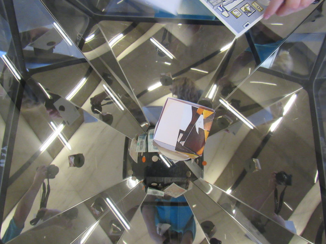
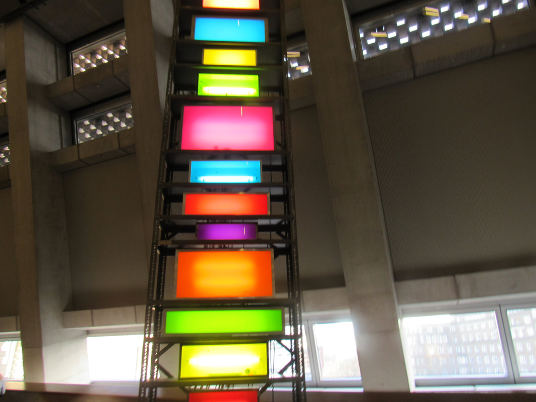
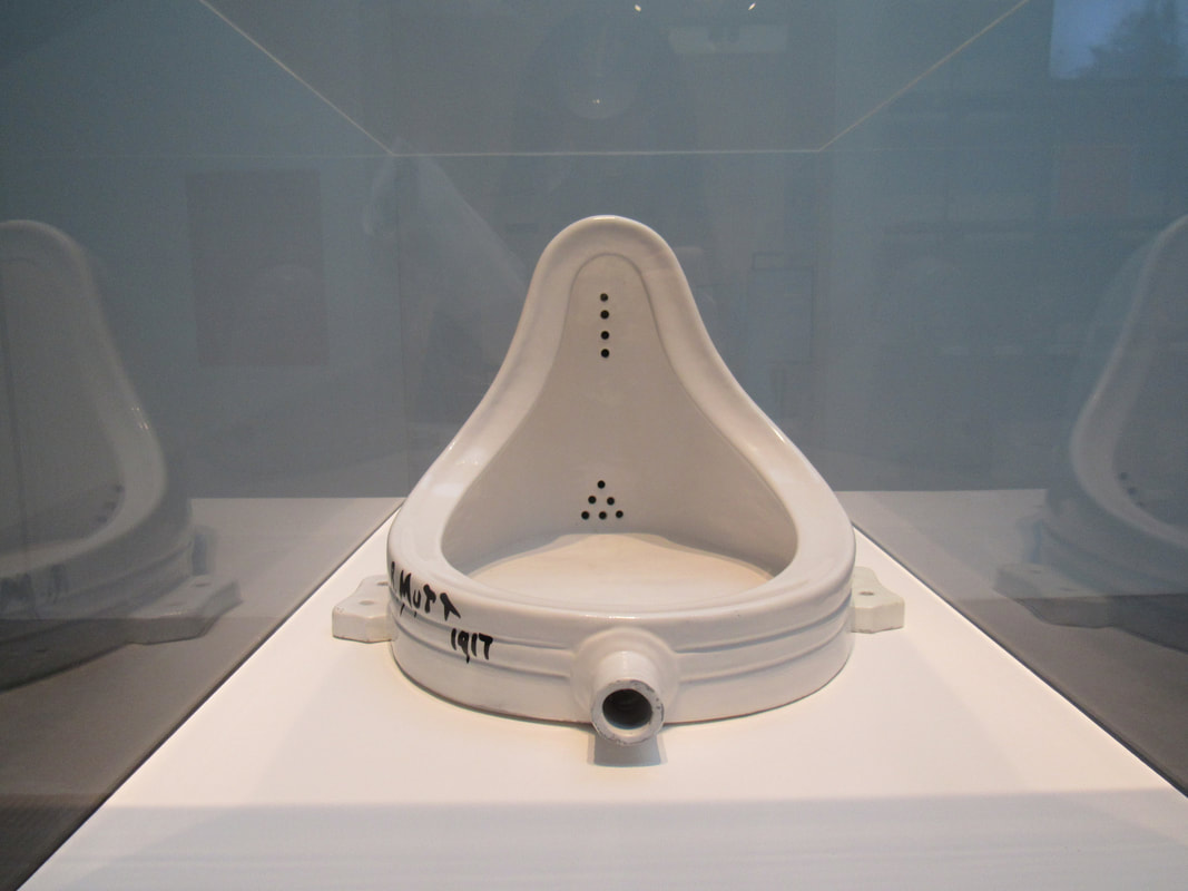
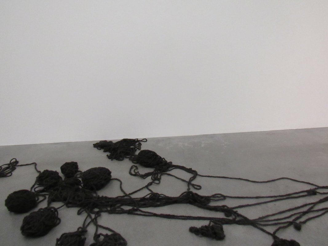
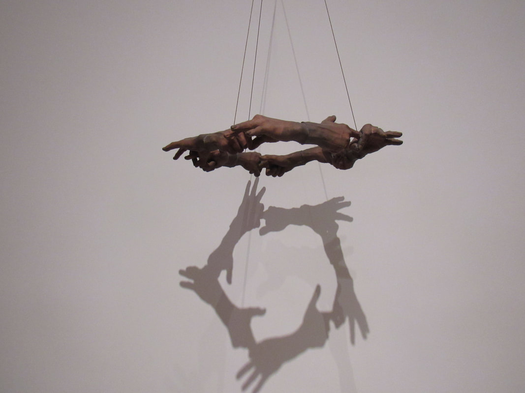
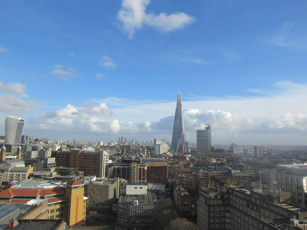
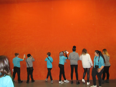
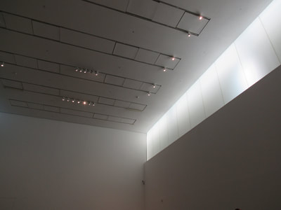
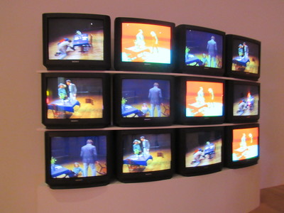
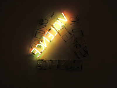
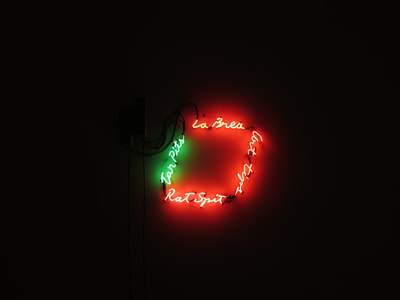
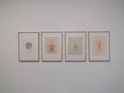
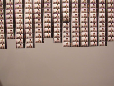
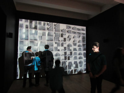
Photo sculptures and backgrounds
Edited photo sculptures
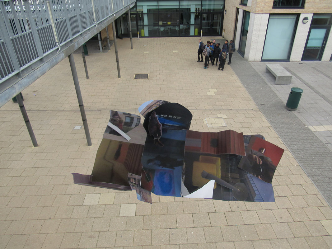
I think this task was quite hard, because you need to get the shape of the photo sculpture right and cut off the right parts of the picture, otherwise it will look unrealistic and unfinished. I chose the images of the sculpture and the landscape above because, for the first one, the photo sculpture was laid flat down and the landscape was just flat land, so I thought it would look good together. And for the second one, I took a picture of the concourse from the view of the walkways and a picture of the photo sculpture from an up angle. I think I'm quite confident with photoshop, because I do media as another GCSE option, and we do a lot of work on photoshop in media, so I know quite a lot of the tools, such as magnetic lasso to cut out the shape of the sculpture. If I were to change anything about my photoshop edits, I would change the second one to make more of a shadow underneath the sculpture.
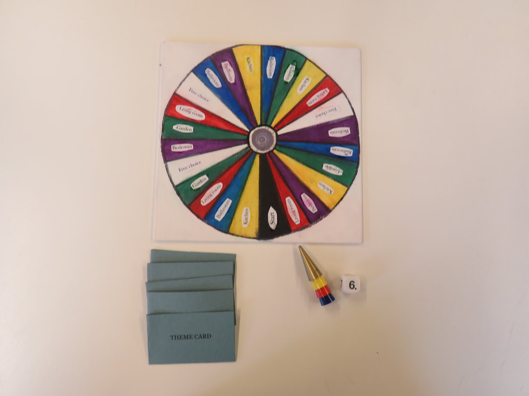
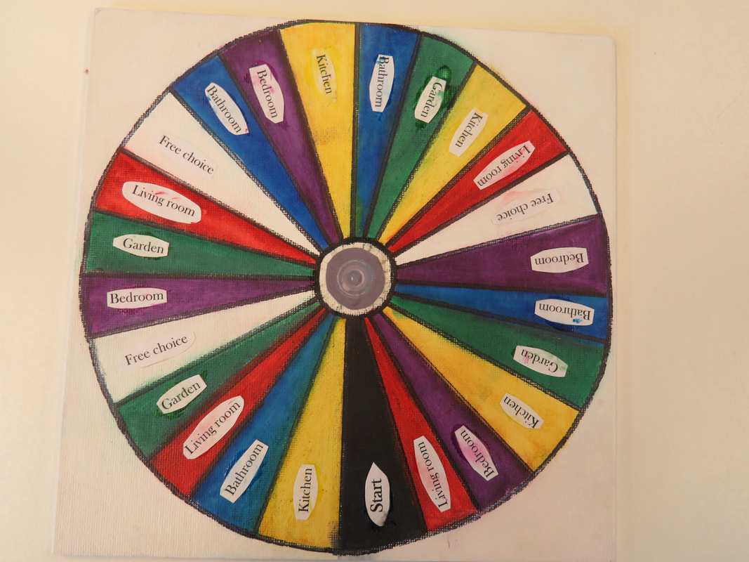
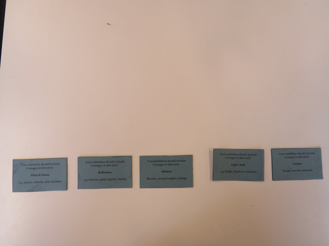
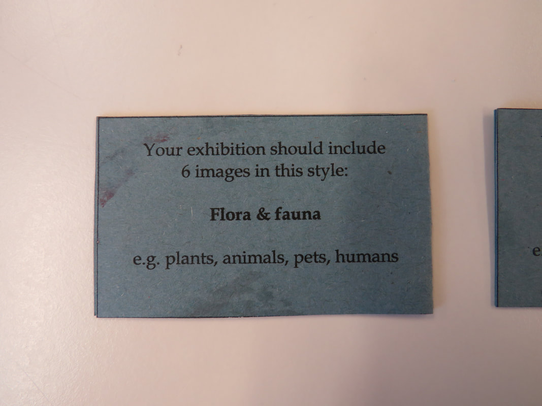
Photo Exhibition
Our homework was to gather up about 10 pictures and place them around in any place and invite people to view our work. I did mine on the stairs in my house, and my family went around and viewed the pictures. Below are some images of the exhibition.
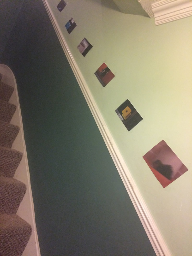
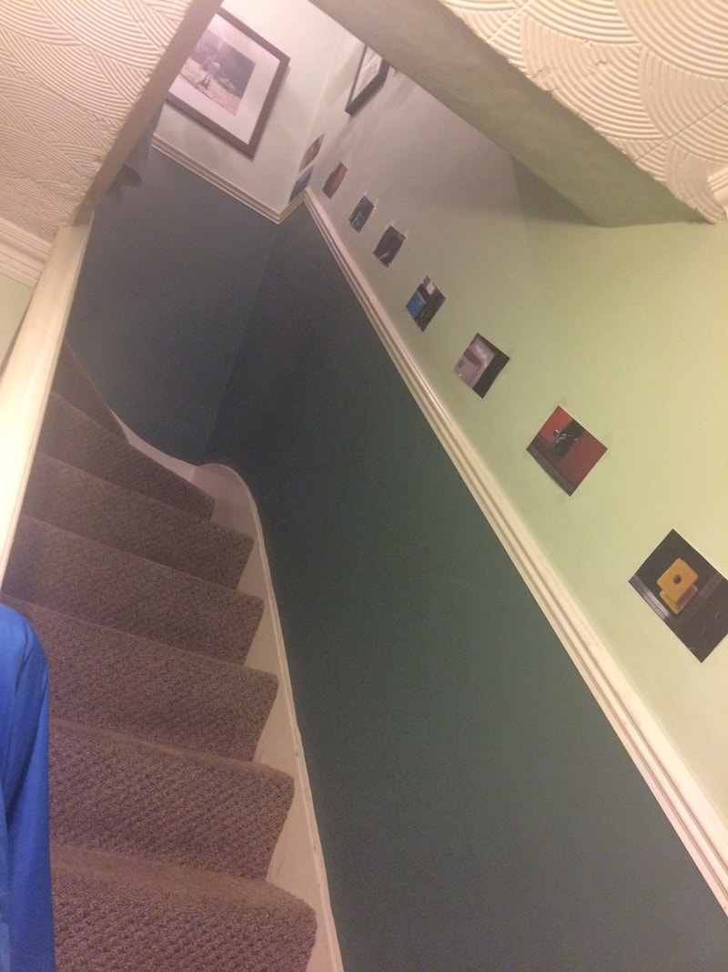
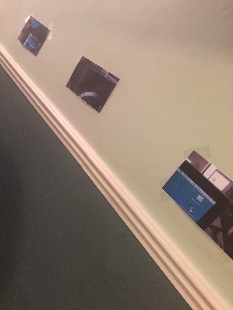
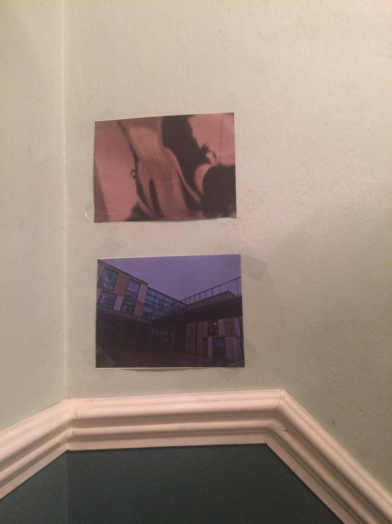
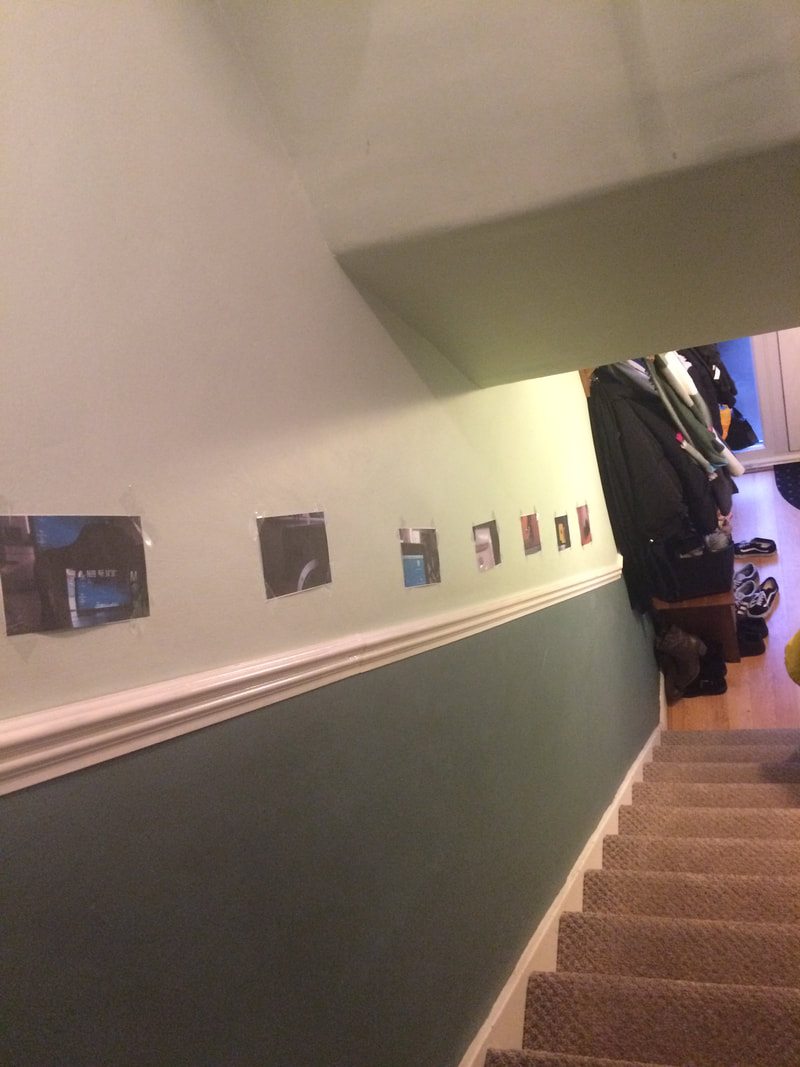
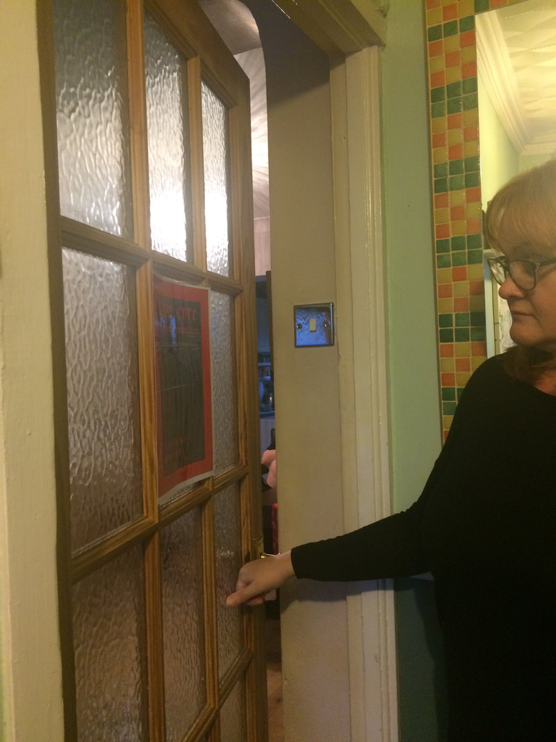
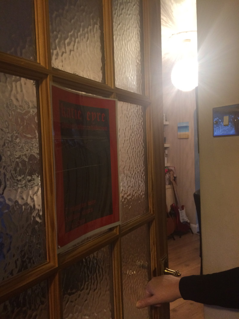
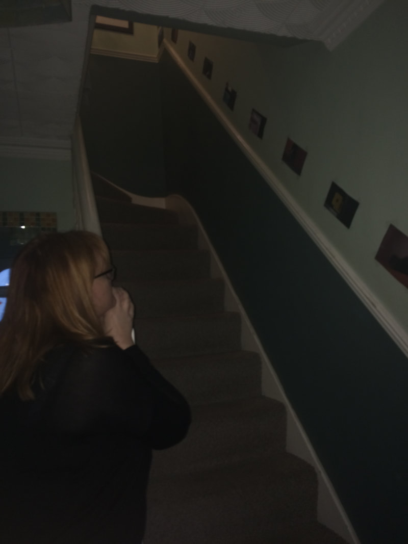
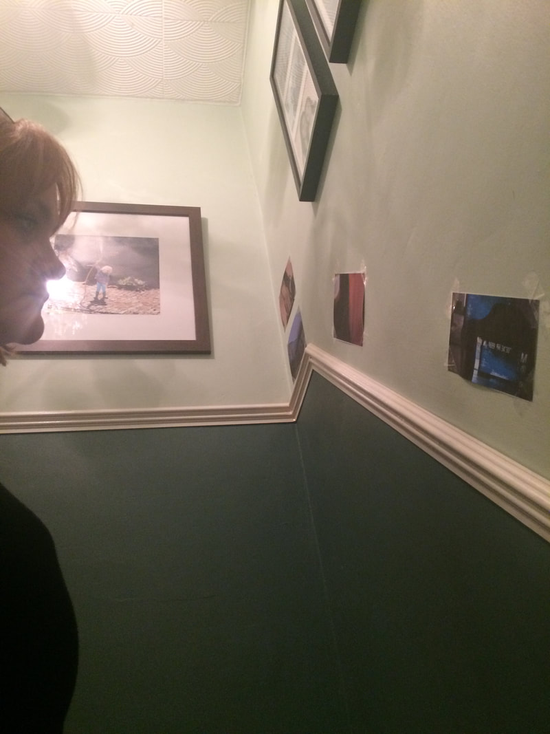
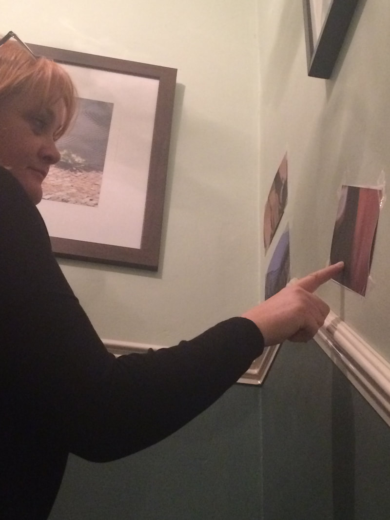
In conclusion, I think that the task was quite hard, because we needed to be creative and have our own imagination, but it was also quite fun because we got to show others our work and own individual photo styles.
Postcard Sculptures
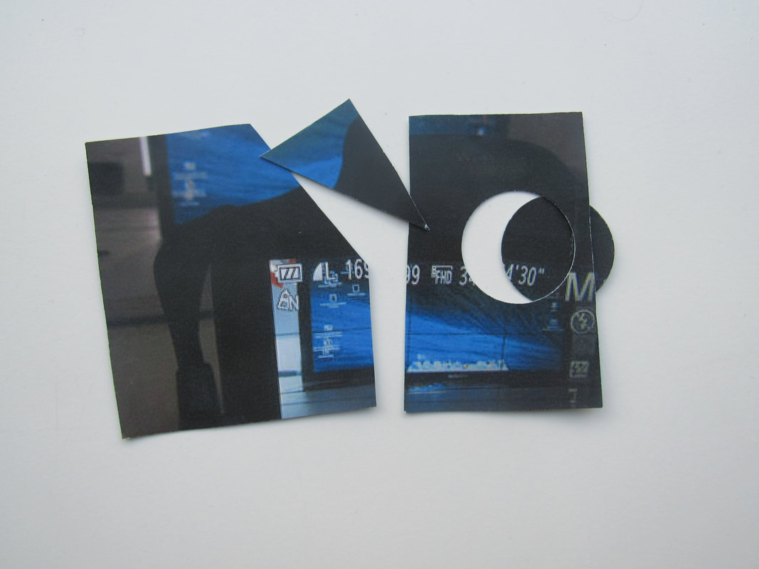
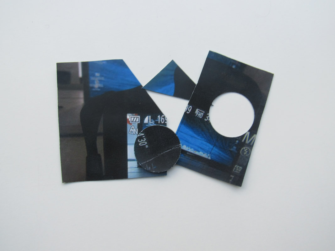
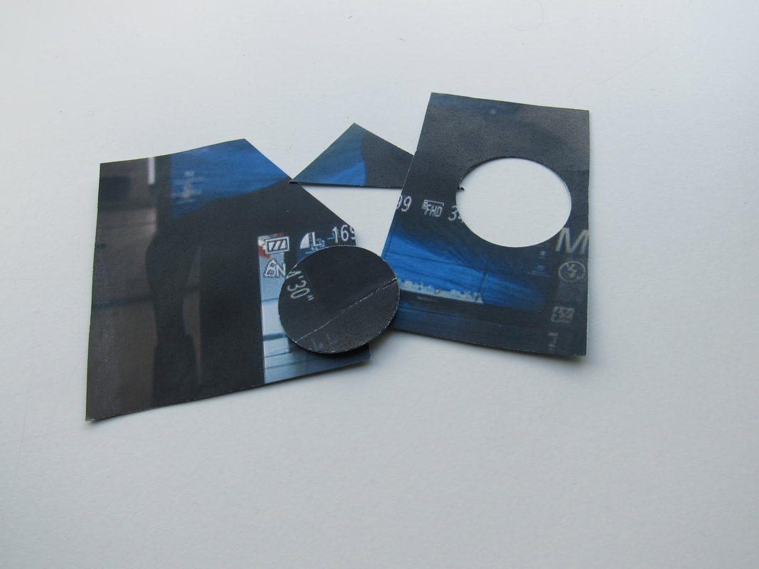
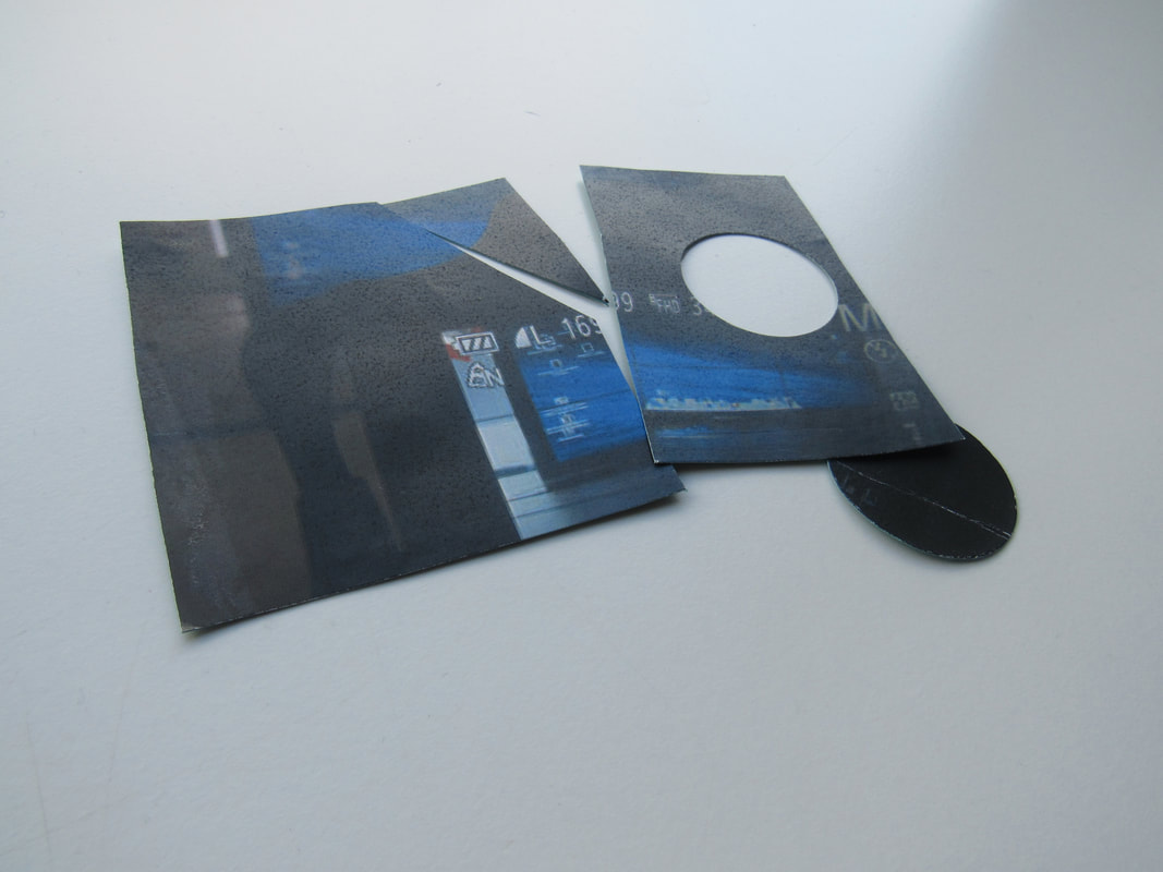
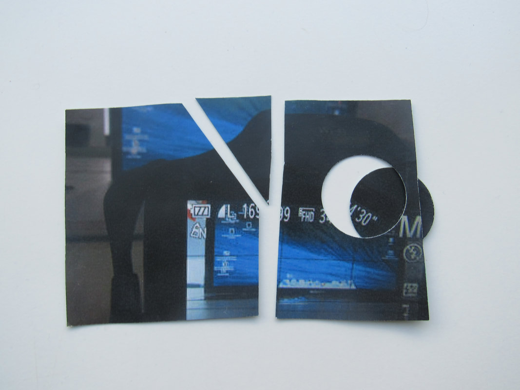
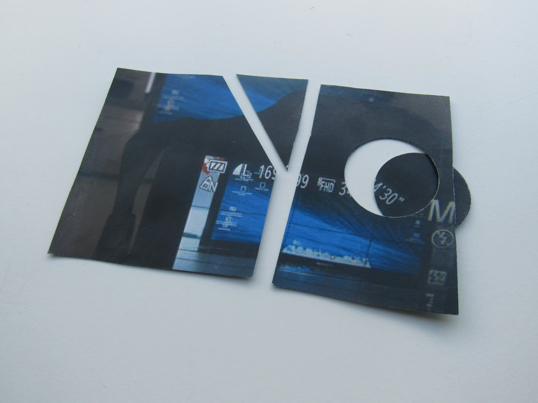
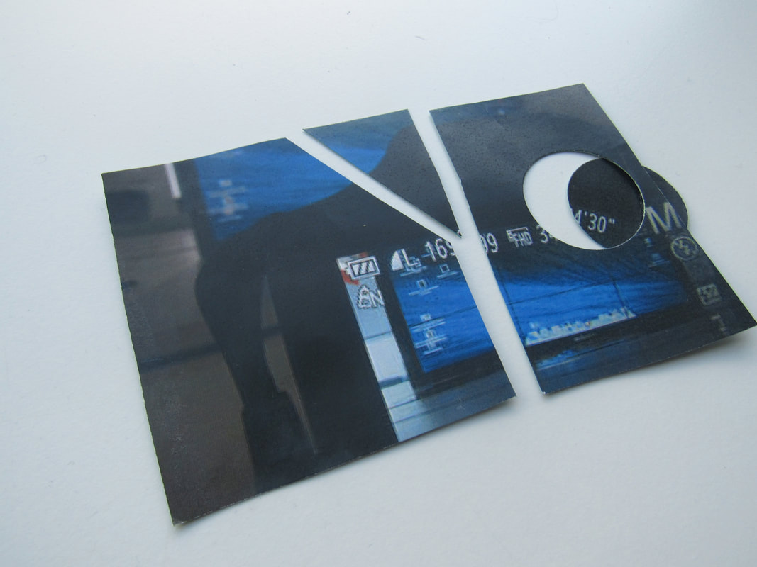
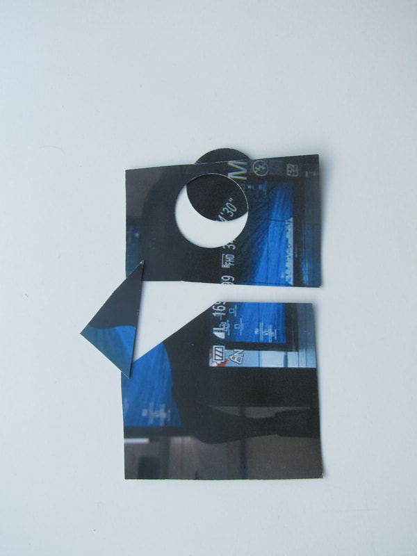
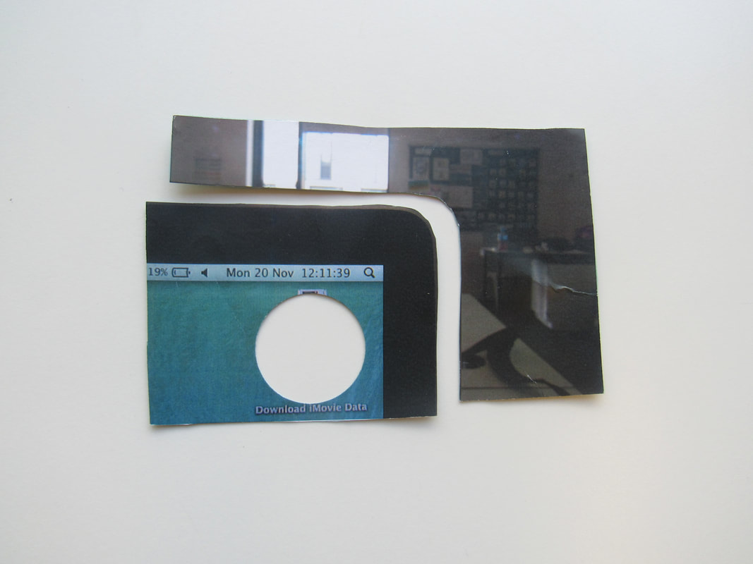
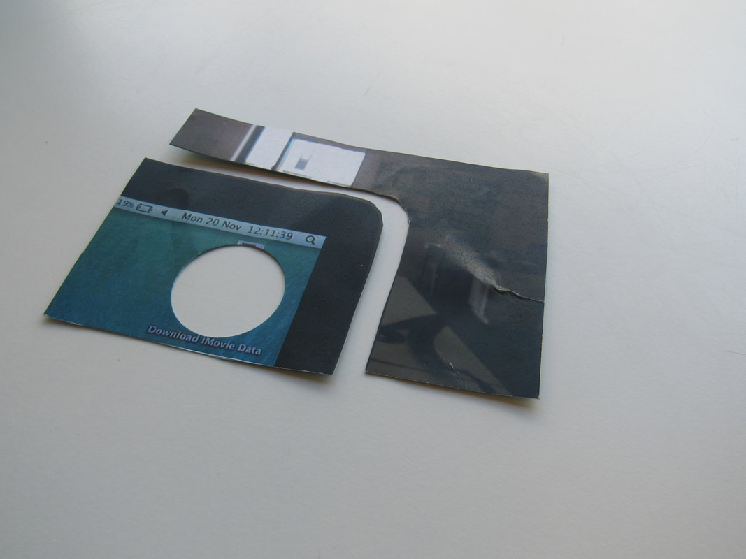
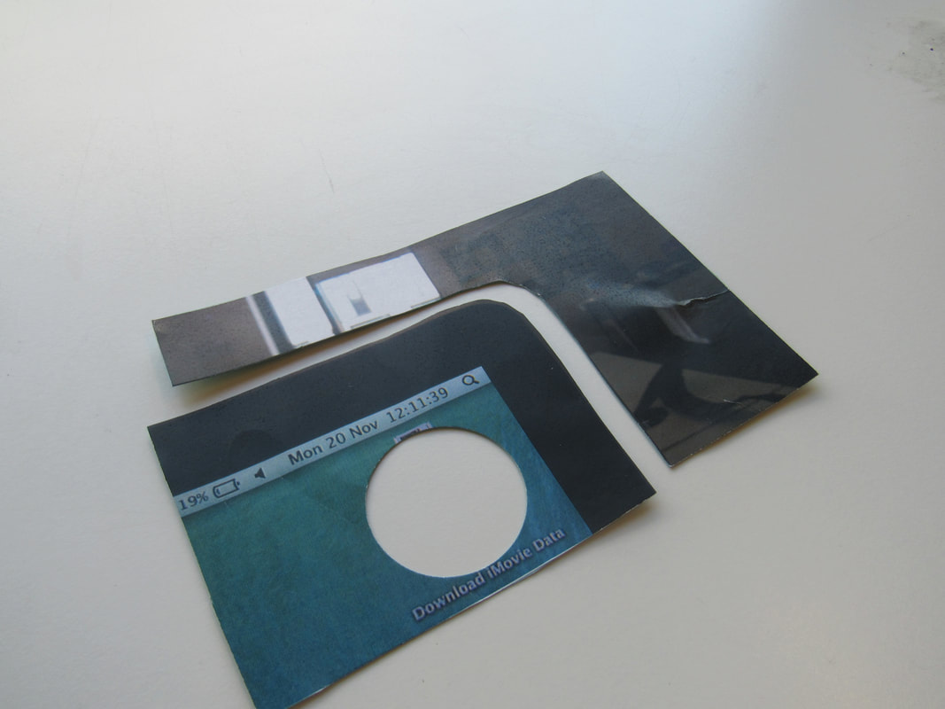
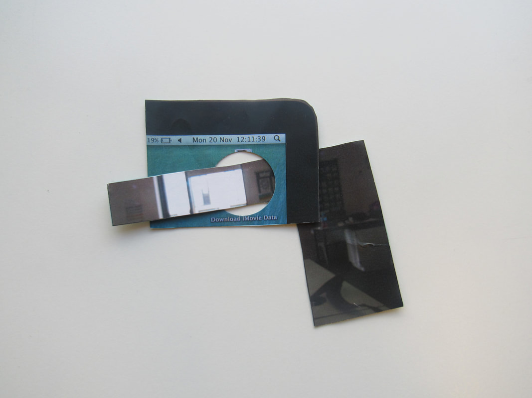
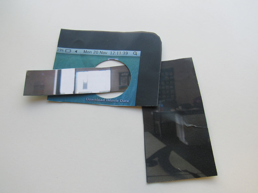
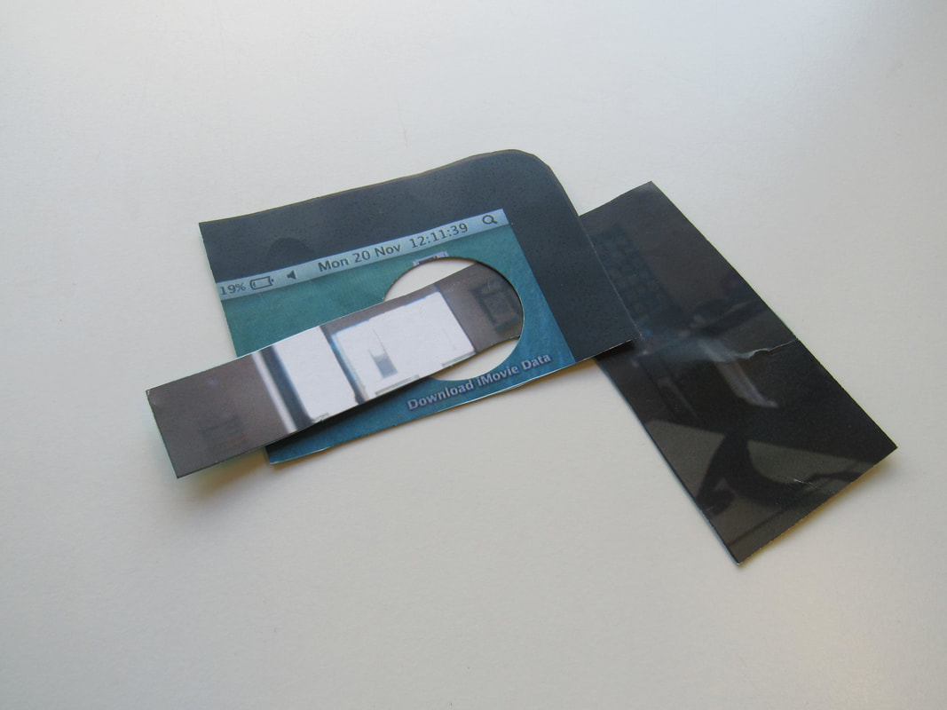
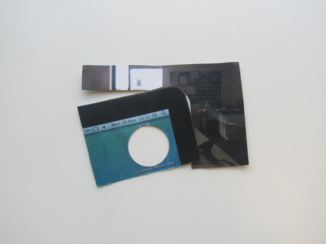
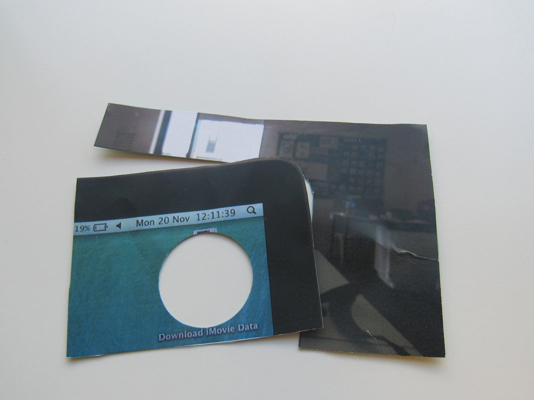
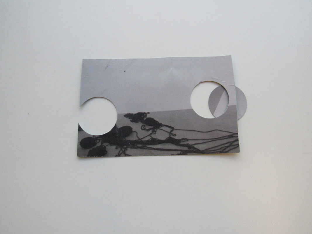
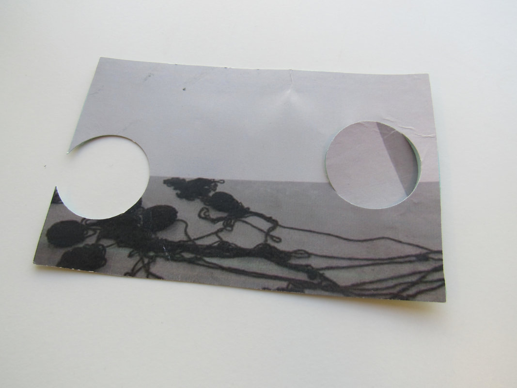
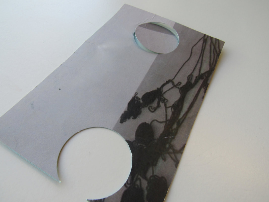
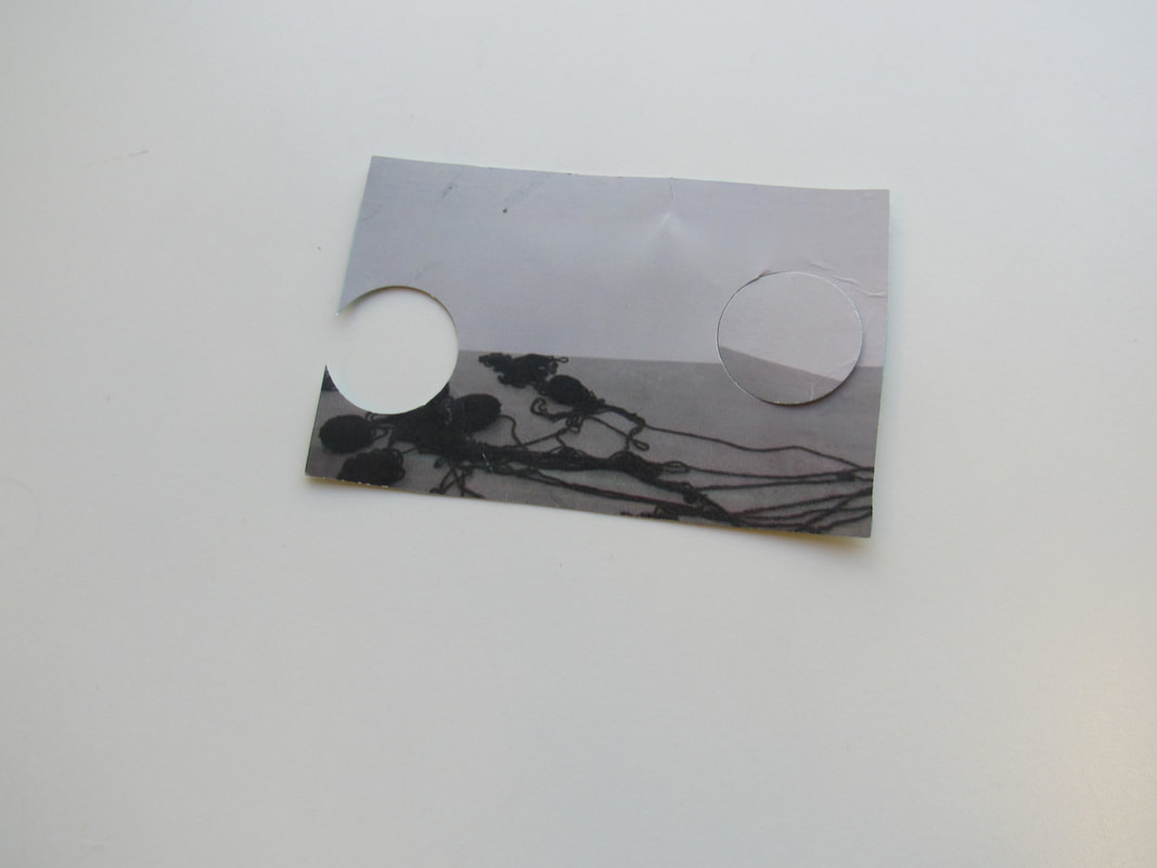
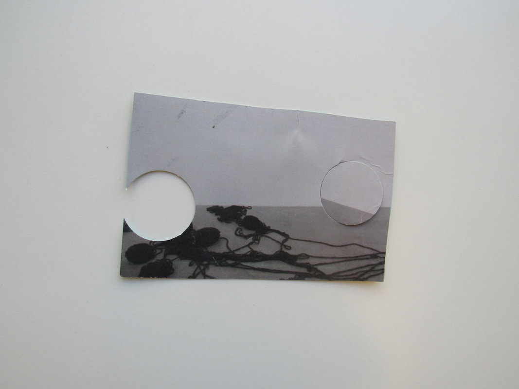
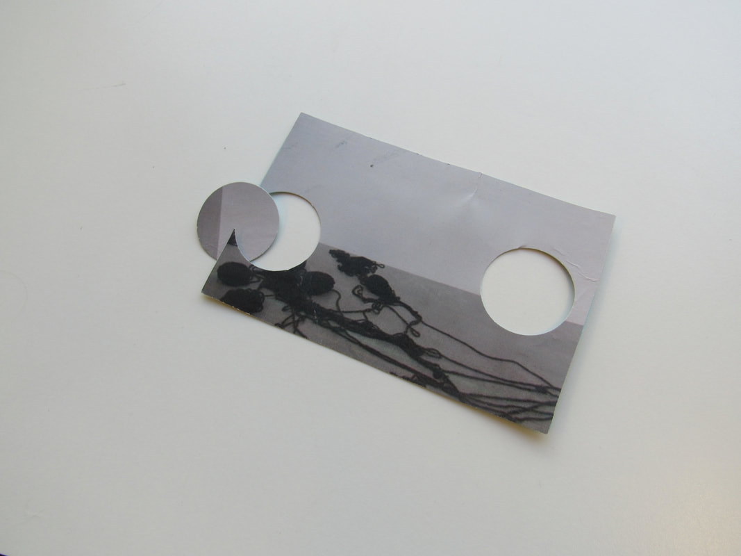
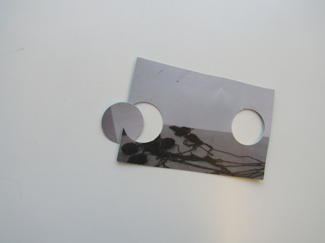
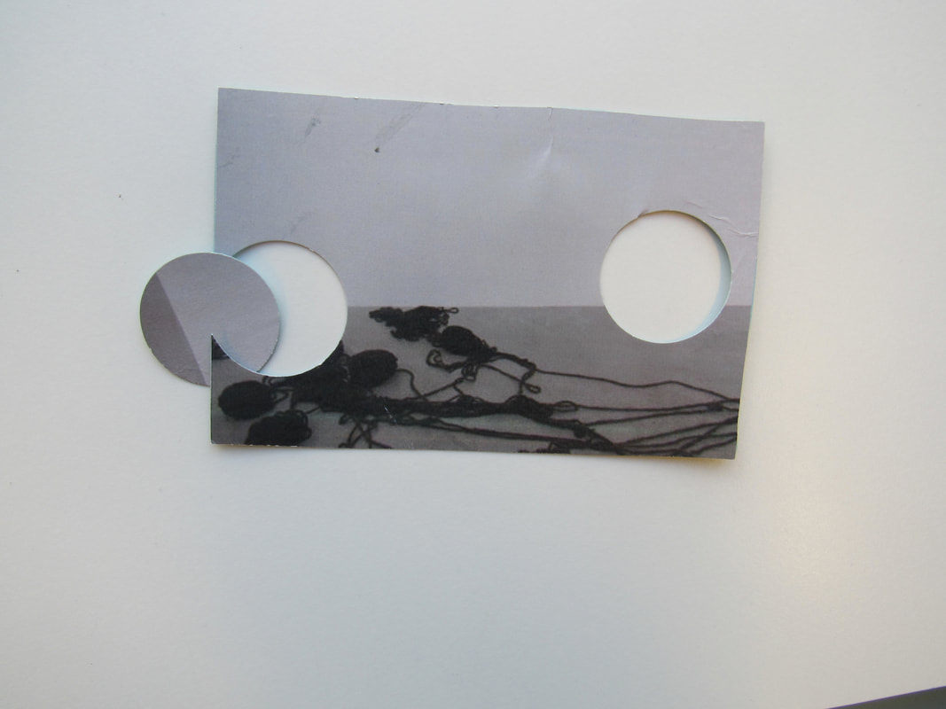

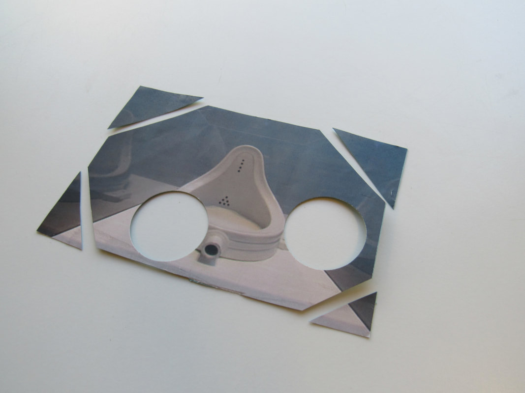
This task was to print out some of the pictures we've taken and stick them onto card. We then had to stick them to a sheet of card and cut shapes into them. I cut circles using the circle cutters and also cut the corners off of some of the pictures to make interesting shapes. As you can see, I have also focused on the composition of the cut out shapes and pictures. For example, in some of the pictures, I have changed the angle of the picture, and the placement of the photo in different ways so that each picture is different. Overall, I think this task was quite fun, easy, yet hard at times. This is because placing the pictures in different ways and expressing your creativity is very fun, but the angles were quite hard to get at some points, as you had to think hard about angles and composition.

I like these two images best because the composition of the second one, in my opinion, is very interesting and unique. I also like the first image because I took the circle I cut out and placed it across the image so it lined up differently, and the colours work well together.
Preparation for our Final Piece
In this lesson, we were preparing for out final piece, which is a personal overall piece of work which we create from our knowledge and understanding of the topic edges. We could do whatever we wanted, so I went to the dark room to make photograms and pinhole pictures. below are the photos of what I did in the lesson. However, this lesson and the next lesson, I didn't get any good exposures. So, to improve, I will go in better lighting, e.g. outside.
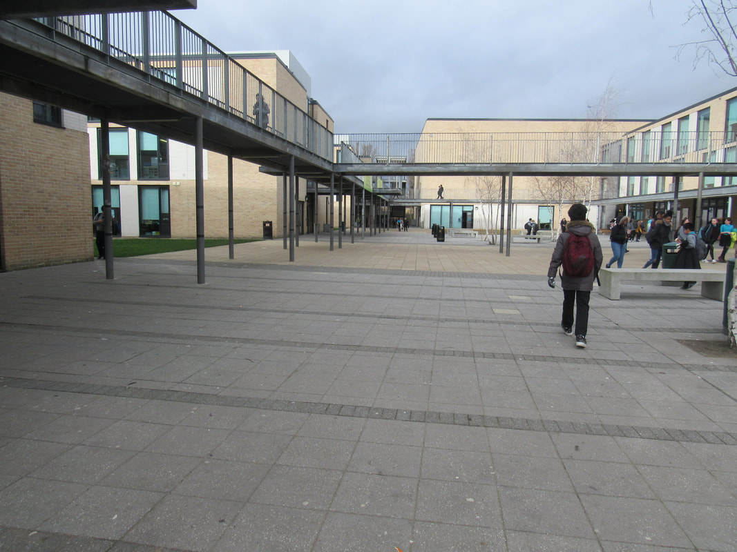
In the next lesson, we did the same thing. I tried over and over to get a successful pinhole exposure, but each time, it would turn completely black. After changing the exposure time, and the location, I finally got one exposure which I am very proud of, but it's a little bit blurry so next time, I would like to get an exposure which isn't blurry. I took my pinhole on the walkway at school and it's kind of clear. You can see the railing lines, but some of the lines are blurred and not as clear.
Today's lesson was quite successful. I got one more exposure but it is extremely unclear of what the actual picture I took was. I did 3 exposures today, so the other two were unsuccessful and turned black straight away. I think that the reason why they did not turn successful was because I left the pinhole open for too long so it got too much light. Next time, I think I will expose it for 3 seconds, and if it still doesn't turn out, I will mess around with the length that I expose them.
After over 3 weeks of getting our photos and work together, today is the last day we have to create our final pieces. I have decided I am going to create a photo book and stick my pinhole exposures on each page and write about what went well with the pictures and what I could have done to improve them or get a positive exposure.
And finally, I finished my final piece book. All the photos that I have used all the photos I made during all the work for this work are in it, which was 6 pinhole exposures. I stuck one on each page and wrote about the exposure, including what I have done well, and/or what I could do to improve my pinhole so I get an exposure next time. I really like my book because it is full of explanations of my photos and what I did and where I took the camera to take the photos. If I could improve my final piece, I think I might make more pinholes to try and get more positive exposures that I could write about, or I might write the things I wrote onto a word document and print it out so the handwriting looks clear and neat.
